Interactive Media without Keyboards or Screens
This is my very favourite bit of fully collaborative digital space: it’s the interactive exhibits at the Museum of London.
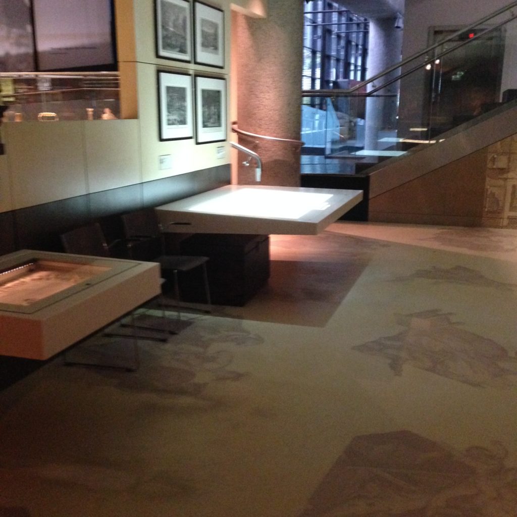
Simple, eh? Not much to it, really. It’s only a white table. Just a white table, with all the digital content projected from the ceiling. It’s really fascinating to watch people interact with it. Because they don’t behave towards it they way people tend to when they’re working with a computer. Here’s a woman with her young daughter experimenting with it.
Good collaborative design just works. It doesn’t require anyone to think too hard about the fact that there are two people giving input to a computer. It’s open, inviting, and no one feels odd about someone else joining them in the experience, very much unlike a workstation situation. There’s no over-the-shoulder issues here. It’s comfortable to work with as a group.
If you listen, you’ll notice that every time the system recognizes someone’s touched the controls, it makes a sound. They all do this, very subtly, but it really gives the systems a sense that they are physical rather than only digital. They are only digital. It just doesn’t feel like it.
The Museum of London constructed their interactive exhibits very, very carefully. They are extremely thoughtful and fit fluidly into the displays.
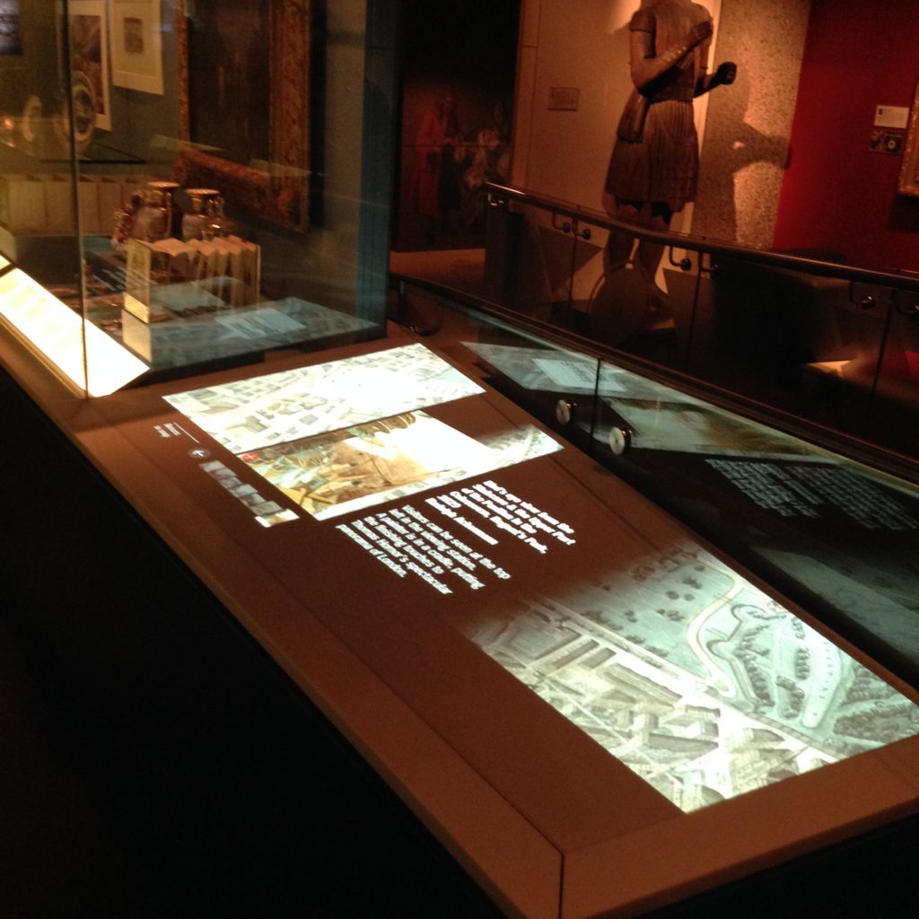
The tables displaying materials are clearly designed to also incorporate a space for digital material to be projected from above. Interestingly, the staff are under the impression that the table is touch sensitive, but it’s actually not. (I tested it!) It’s all being controlled by the projector; it can tell where your fingers are. It’s no ipad, but it’s pretty close in terms of responsiveness.
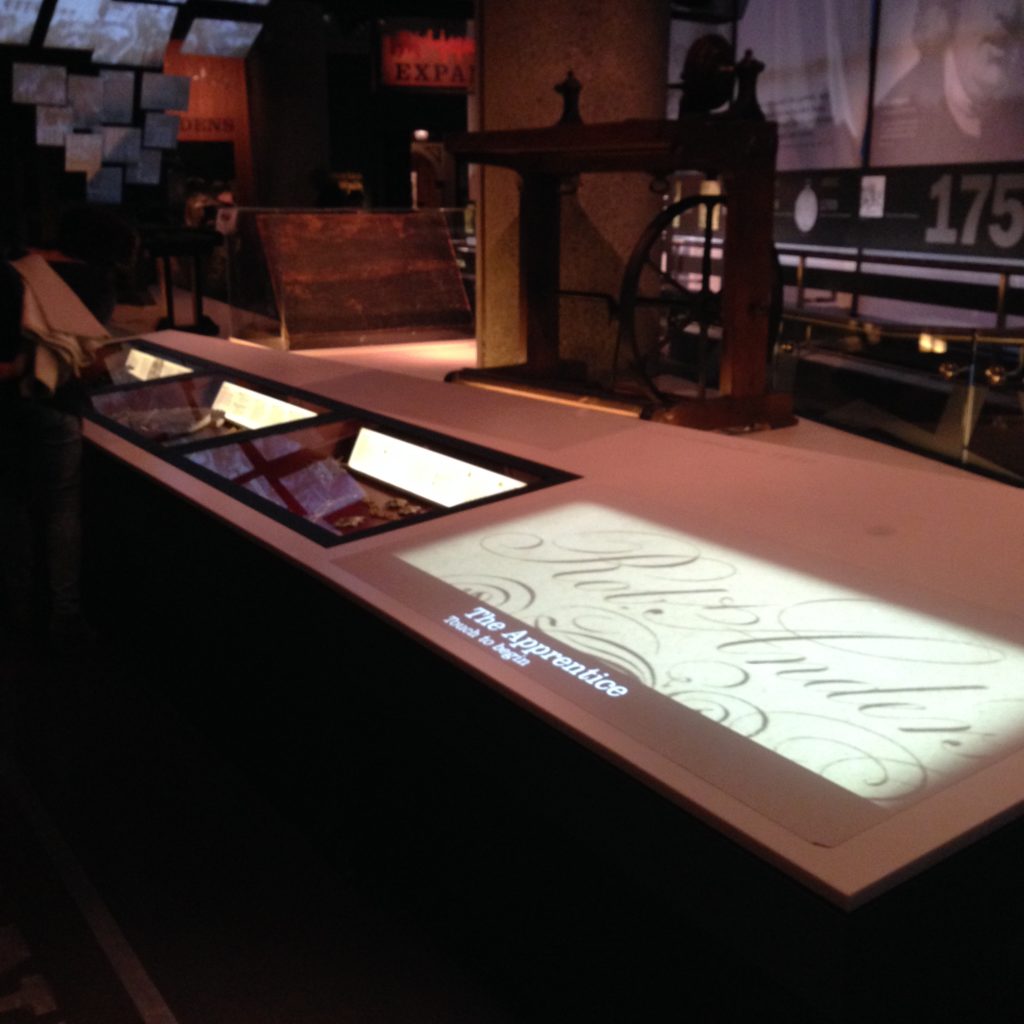
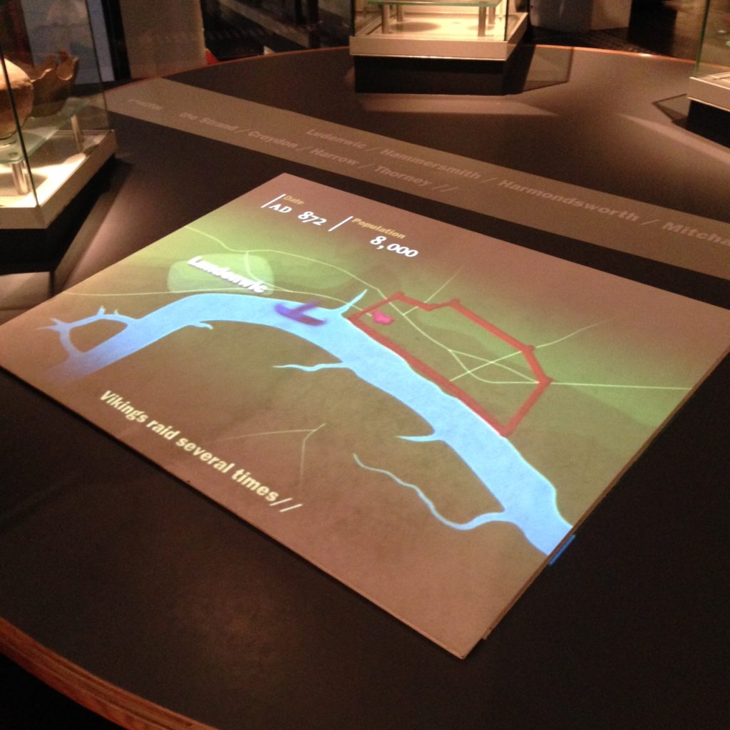
This bit of projection is on a much smaller table, and it’s a bit of a wedge shape. The projection and the design of the content is made to fit. There are physical objects on one side, and digital material right next to it. No screen, no keyboard, just simple, digital content I can flip through without reading instructions. This is genuinely doesn’t feel like working with digital content.
I really love these. The pieces of it are really fairly simple; it’s the design of the tables, installing the projector and the computer in the ceiling, and, of course the coding of the material. I keep thinking, we have content management systems like Drupal that will let us manage website content; it’s a short step to having a content management system for spaces like this. Imagine a space like this for a reference desk, rather than another bloody workstation. You could plug in a keyboard if you really had to.
Projection isn’t the future of touch screens. LCD screens are tons better for clarify and crispness, and even for responsiveness, in the end. But projection lets you do the interesting shapes and massive sizes on the cheap.
This is a video playing on a huge patch on a table. That’s simple and cheap to do with projection. It would be crazy expensive to do with an LCD screen right now. This way, they can easily adjust the size and location of the projection within the museum for practically nothing. An LCD screen, while a better piece of technology, simply isn’t that flexible. It’s also harder on the eyes, truth be told. A projection is a fairly gentle kind of light. As long as the video doesn’t require HD or too many fine details, a basic projection will work just fine.
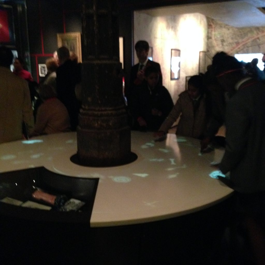
And an LCD screen is just not going to let you make a round interactive space. This is a simulated fountain, where, from all points of the table, you can touch the various fish to get more information. It works from every side, which means you can have multiple people interacting with it at once. And no one here considers the fact that they’re interacting with a computer. No one even looks up to see it up there.
I really love the work the Museum of London has put into these really innovative computing spaces. They’re demonstrating something really valuable and important here. If you want people to feel comfortable walking up to a display of digital information with no preconceptions about how they’re meant to use the space, you have to break the rules and create something that doesn’t look like a workstation. Workstations don’t fire the imagination, and they aren’t especially approachable. They dictate the kind of work that can be done at them.
I know it’s not comfortable to do any lengthy computing while staring down at a table. This is why I’m not convinced the tables formerly known as Surface (now called PixelSense) are as functional as they should be. But I think, if we want people to be able to, say, search through digital materials with the aid of someone else, or with a group of classmates, we need to break down some barriers to make it easier and more natural. The examples at the Museum of London are spectacular.