Browsed by
Month: November 2013

Timberyard: The Value of Variety
Timberyard: The Value of Variety

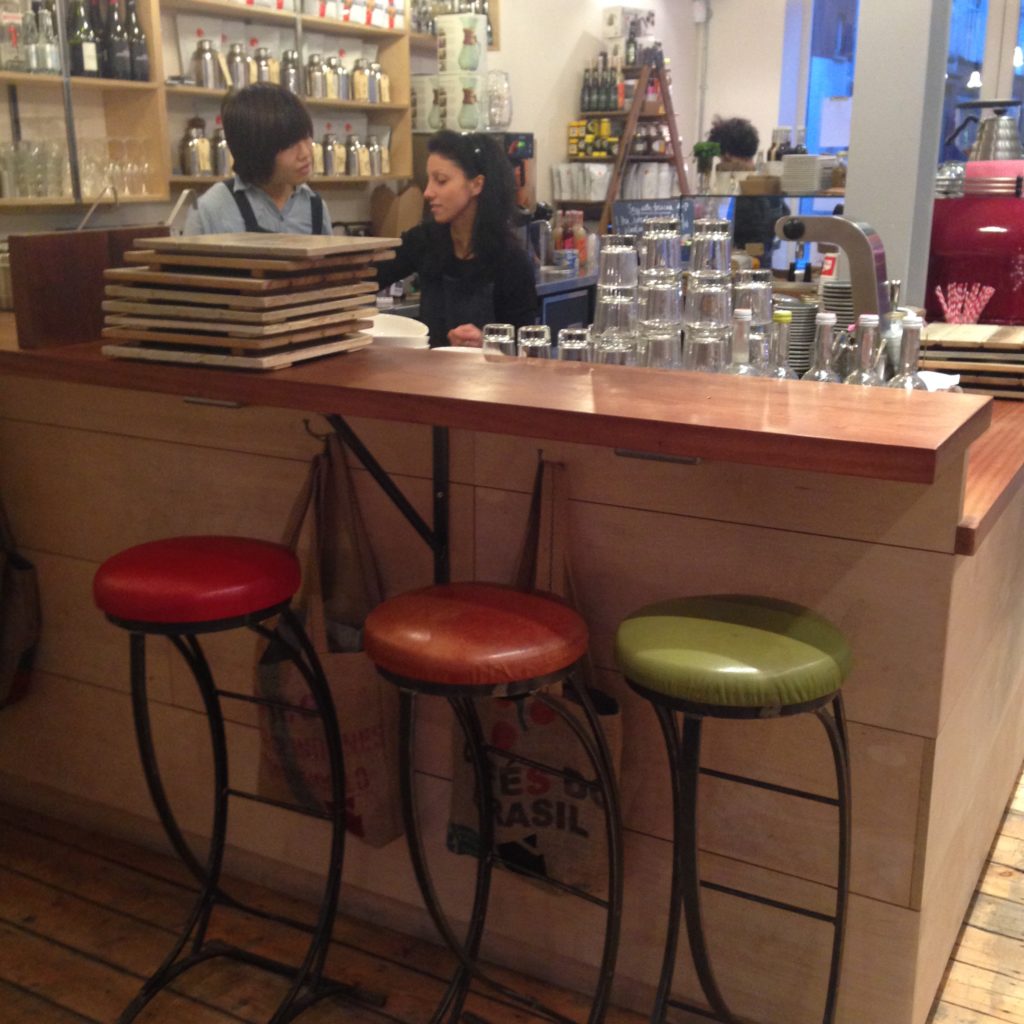
bar seating at Timberyard, Shoreditch, London

This is Timberyard, a very successfully-designed café that’s a big hit with students and other independent workers in Shoreditch. What strikes me about the places that have hit the right note with students is that incredibly wide variety of different kinds of seating, different kinds of spaces, and a thoughtful variety of configurations that acknowledges that not only do different people have different preferences, but one person generally has a variety of different needs from a space depending on their current task, mood, or circumstances.

The front of the house at Timberyard contains a modular shared couch, old suitcases that act as coffee tables, and plenty of outlets. Enough outlets for everyone.
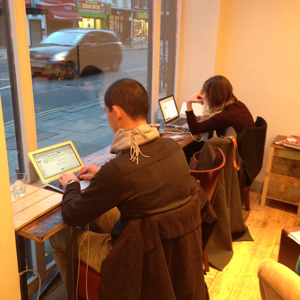
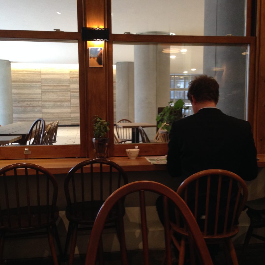
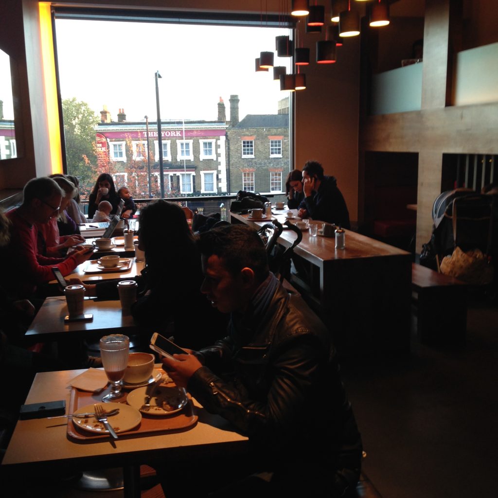
Bar seating facing out a window

A sight I’ve become accustomed to: bar seating by the window. This kind of space is almost universally understood as individual, private space within a public space. I’ve started to notice that in libraries that don’t build spaces like this, patrons will drag a chair over to a window, face it against the window, and create it. I think this kind of seating might be the most accessible and least threatening to people entering a social space like this alone. Facing outward is a kind of message that indicates that a patron is not only not looking for a conversation, but is here on their own for a reason. Again: notice the easy access to power.
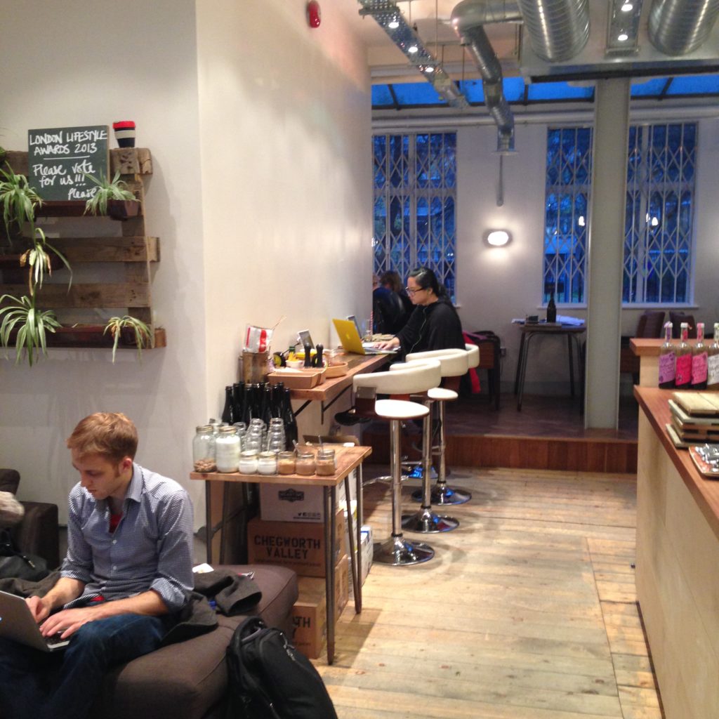
Bar seating facing a wall, which is less popular

A second band of bar seating, facing the wall. It’s more space that’s comfortable and available for individuals coming in alone and intimidated by the big, shared couch. But there’s another interesting thing about this bar seating:
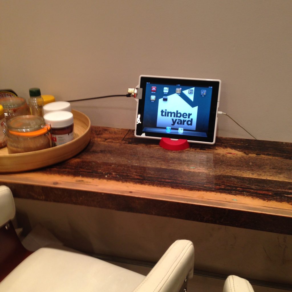
An branded ipad on a bar table, ready for use

The café provides not only wifi, but ipads for the purpose or browsing the internet while drinking your coffee or having your lunch. I’ve never seen anything like this outside of a library. When I wander through our library and see how students are using our computers, a good percentage of the time I see keyboards shoved up under the monitor and a laptop or book sitting in its place. A fixed ipad like this probably isn’t a bad replacement for a catalogue terminal, when you think of it. It makes that table far more multifunctional. It’s very generous of them to provide them, really. I found three of them around the café, admittedly none of them in use.
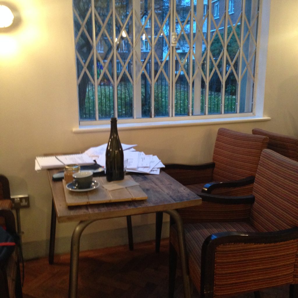
A small table for four

We’ve got individual space, very much shared, common space with the couch, and also more traditional shared space for groups: three tables for four. These are small enough that they aren’t shared by strangers; these are for people who know each other, are working together, or have decided to come here together to share the space as a group.

From above, a hint of what lies below:
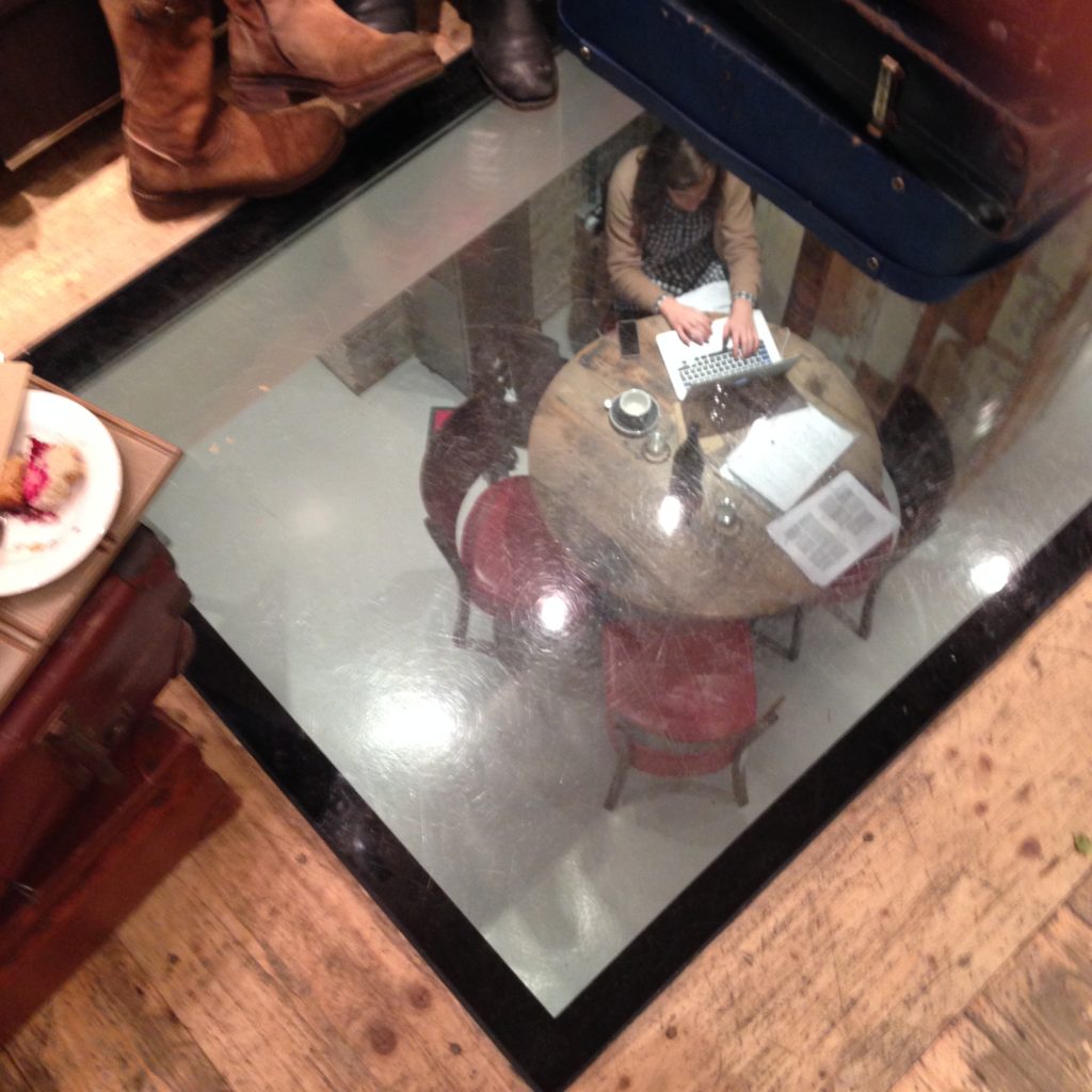
A small table for four occupied by one person on a laptop, viewed from above through a window in the floor

Downstairs, more kinds of space, all of which seems to be designed with students in mind:
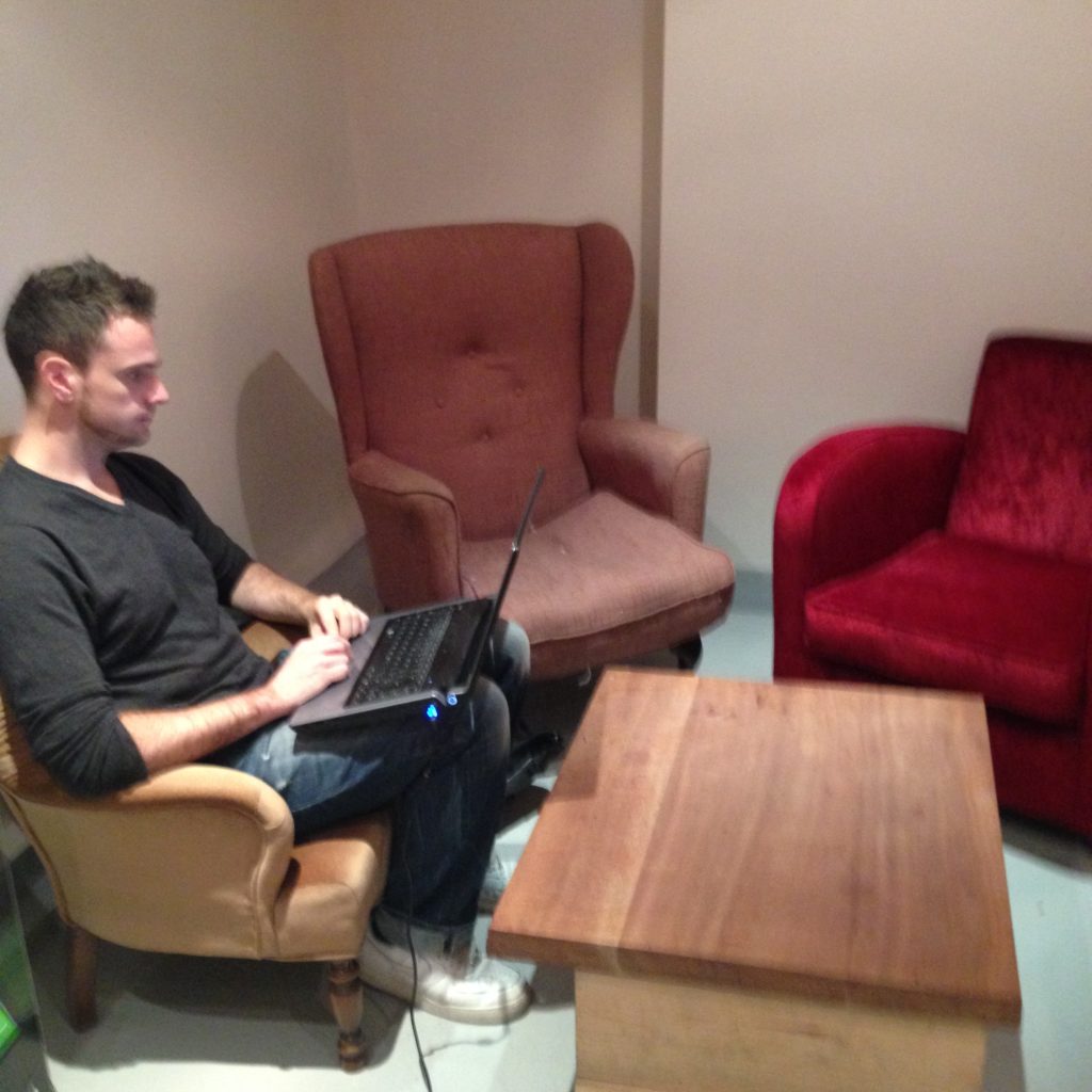
Assorted armchairs and a man working on a laptop perched on his knees
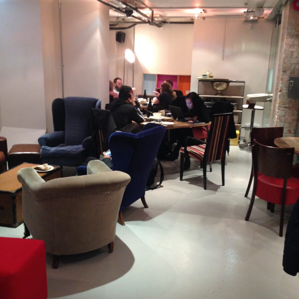
Assorted armchairs, and tables where two students sit together working quietly, and a group of four are collaborating.

Quirky, mismatched, soft seating, in a variety of different configurations! Here they’ve got armchairs you can use as an individual, or with a group. Full-sized tables that, as you can see at the back, encourages group work. This furniture can move, but it doesn’t appear to, especially. If you don’t like one configuration, this café has many more to choose from. That’s another form of flexibility, one that doesn’t require reconfigurable tables or casters.
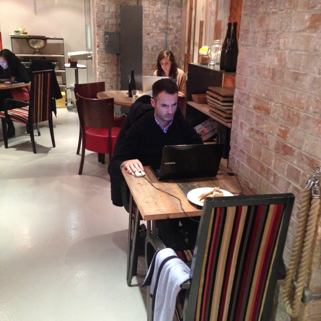
A table for two with one person working on a laptop, and a small table for four with one person working on a laptop.

These group spaces, filled with the noise of people talking, also includes spaces that patrons use for individual work. As we know, there are many people who don’t like to work in complete silence or solitude. Being alone in a group is more productive for them, and you can see the evidence of that in places like this.
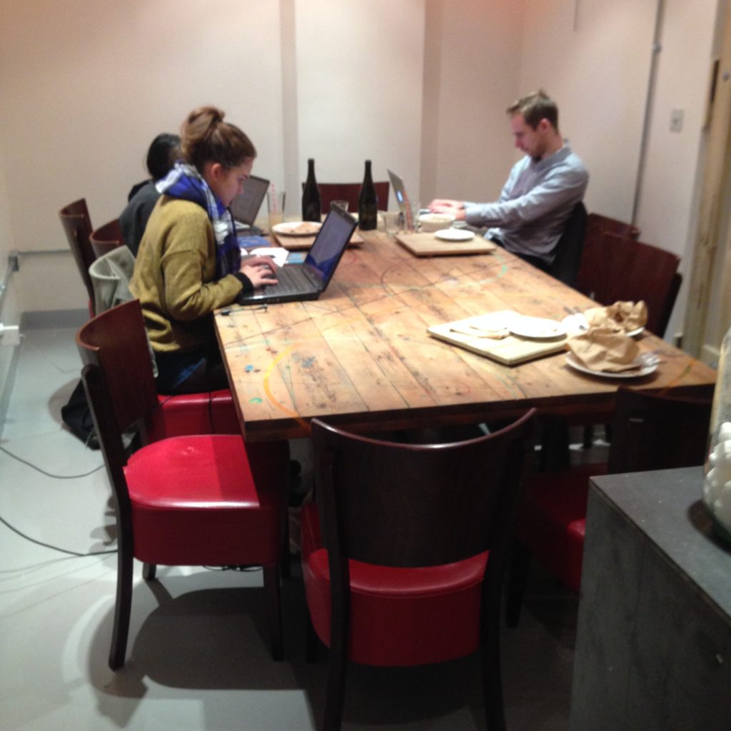
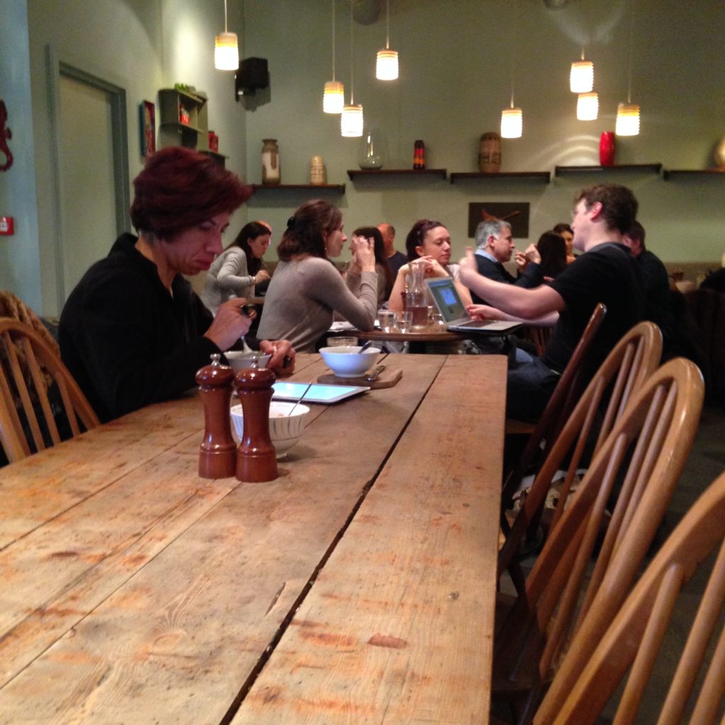
A communal table fowhere three people are working independently.

As in most places I’ve seen, there’s also a communal table. Interestingly, in spite of all the other available spaces at Timberyard, these folks prefer to work independently together here, with ready access to power. Communal tables are tricky, and interesting: there are signals that tell patrons they can share the table, but I don’t think they’re as simple as the size of the table or the number of chairs. That factors in, certainly, but I think the affordances of the rest of the space contributes as well. If everything else is sharable in a space, a communal table will be more shareable, even if it’s thin or smaller. I wish there were a ready and easy science to this, but I’m not sure there is. I’m really fascinated by the communal table; it’s potential is so tantalizing. For me it is the definition of flexible. It can support group work, become an instant conference room, and be a place for individual work as well, all without shifting the layout at all. It can support high tech work and digital collaboration as well as work with paper and post-it notes. It’s simple, familiar, and comforting. But I think it’s also the layout most sensitive to the context of the room and the hardest to get right. I’ve seen communal tables on my travels that I suspect don’t work that well. This isn’t one of them.

Cafés in the UK are especially interesting because they don’t have much of a culture of throwing people out if they stick around too long. In that sense, they are closer to libraries than almost anything else. We also create spaces and encourage students to stick around. Because of that, I feel like we have an incredible opportunity to create really terrific spaces without worrying about turnover. I knew I wanted to look at cafés as part of this project, but I really didn’t expect the parallels to be so strong.
Popular Study Haunts

Popular Study Haunts

Finding out where students like to study, and visiting those places, is really fascinating. That’s been my project for the last few days.
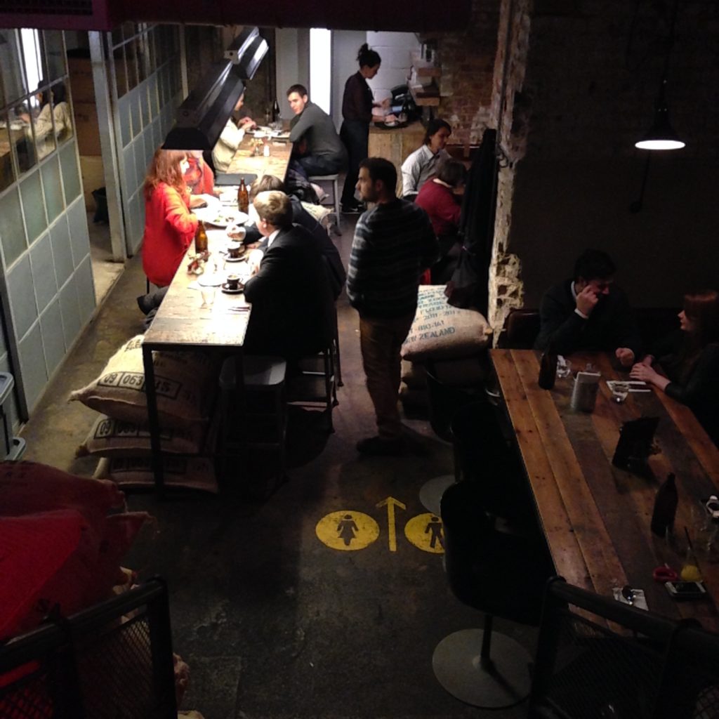
This is a place called Ozone Coffee Roasters. It’s a combination coffee roasting place and café. This is a view of the lower level: as you can see, it’s pretty much all communal tables. There’s the long thin one on the left, and the wider tables against the walls. 

Here’s some of the window seating upstairs. As you can see, pretty much every flat surface in this place is unstructured and communal. How this space gets used depends entirely on the people who sit down at it. It might be two people sitting together, or an individual sitting down with a computer. Unlike most bar seating up against windows, this table is really wide. It’s about as wide as the communal tables downstairs. Once I took one look at this space, I could understand why it was rated so highly as a study space. Students like to be able to spread out.

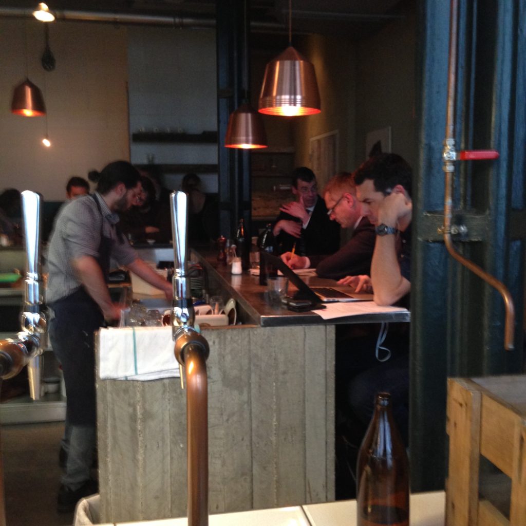
Bar seating at an actual bar

The bar. As you can see, this place has a culture of sitting down and digging into work. No one’s the slightest bit bothered that they’re looking into a busy working area rather than against a window.

I have to say, this place is loud. I imagine the students who come to work here really like that, because you’d have to. It’s a very trendy kind of industrial vibe, with lots of word. Very hip, loud, busy, and designed with serious coffee drinkers in mind.

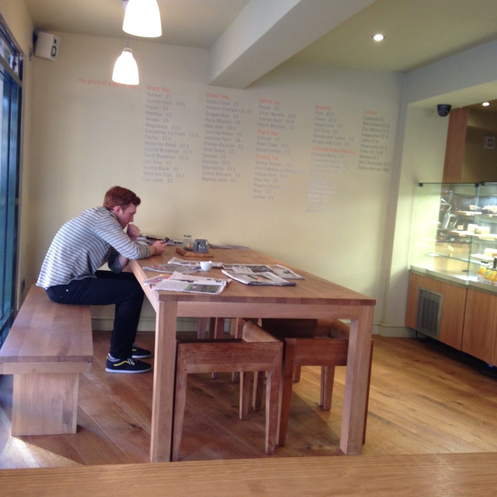
Around the corner from Ozone is Salvation Jane, which is a way quieter, more chill kind of place. Much less polished, much less deliberately hip, but still funky and cool.

Long communal table and group tables

Here I think I saw some actual studying in action. Tables beyond, and the communal table in the foreground. This is a very slim communal table, and based on that I’m surprised it works. But it does.

Solitary bar seating

More bar seating. This ledge table is quite slim, and sitting there definitely seems like a more solitary experience.
Salvation Jane has an extended outdoor area as well. It’s covered, so students could sit out there if it were warm enough, in spite of any potential rain.

What I can’t help but notice in spaces like this is the old-timey kitchen table feel they have. It’s almost ubiquitous, the big farmhouse tables and classic chairs. It’s furniture picked for vibe rather than comfort, which is interesting. (Though: to be fair, they’re not uncomfortable.)

Walking between one place an another, I spotted another, modern take on this layout:

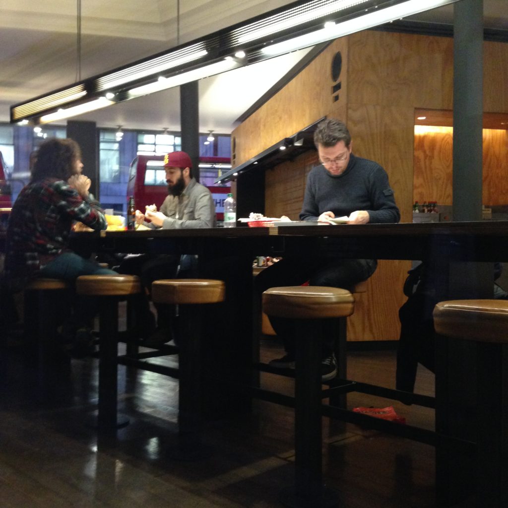
Fast food communal table

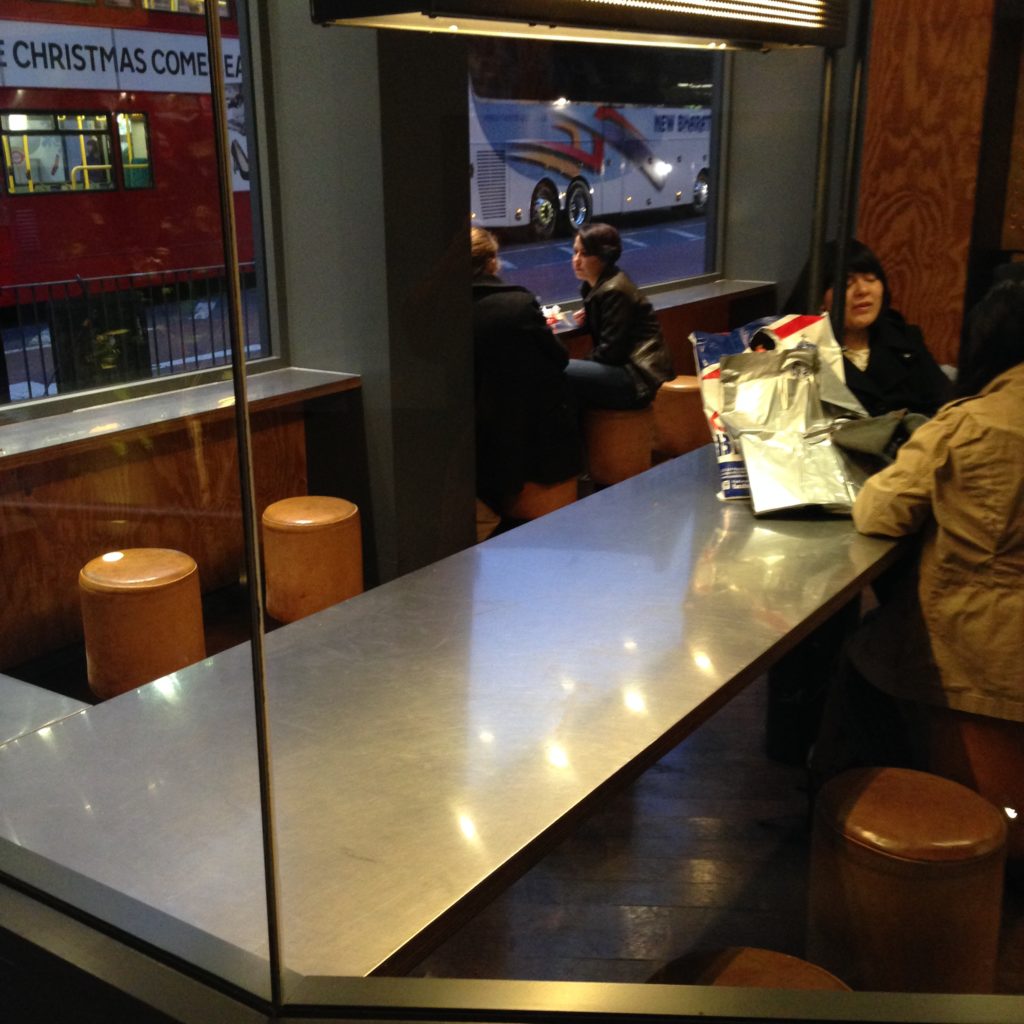
This is sort of fast food chipotle place. Nothing fancy, but walking past, I couldn’t help but notice the same themes, just less quirky-traditional style and materials.  Here, like in Ozone, is a long, thin communal table.

Fast food communal table

Bar seating by the window, as is practically standard in nearly all libraries and cafés alike. And belowo that, something interesting: it’s a curved table. I didn’t get a good shot, but you can see the woman with the dark here and the light coat, with her back to us, in both pictures. The tables has a long straight end and a curved bit that goes into the restaurant. 

Another interesting play on a communal table theme.

Communal table

This is a popular communal table in Penarth, Wales (just outside of Cardiff). I thought the single bench along with the more moble chairs was an interesting touch.

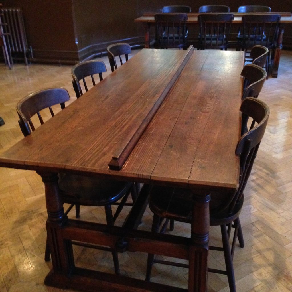
What’s interesting in all this is that I bet they got the communal table meme from us:

Historical wooden communal table

This is a shared study table in a library on display in a museum. Antique shared tables: not that much has changed, really:

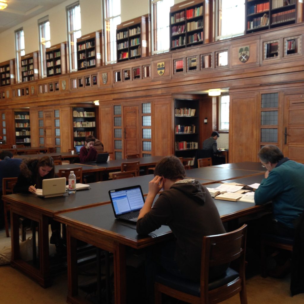
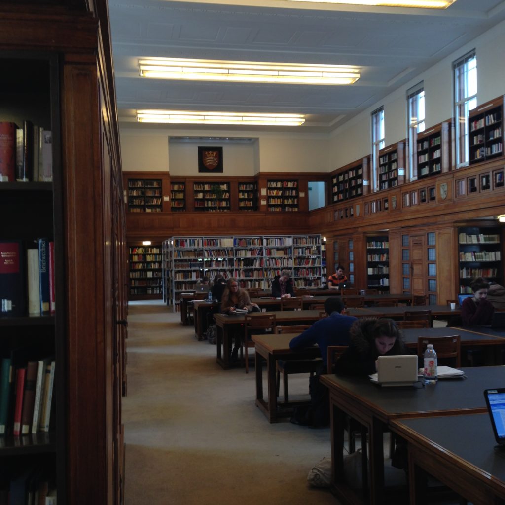
Senate house reading room

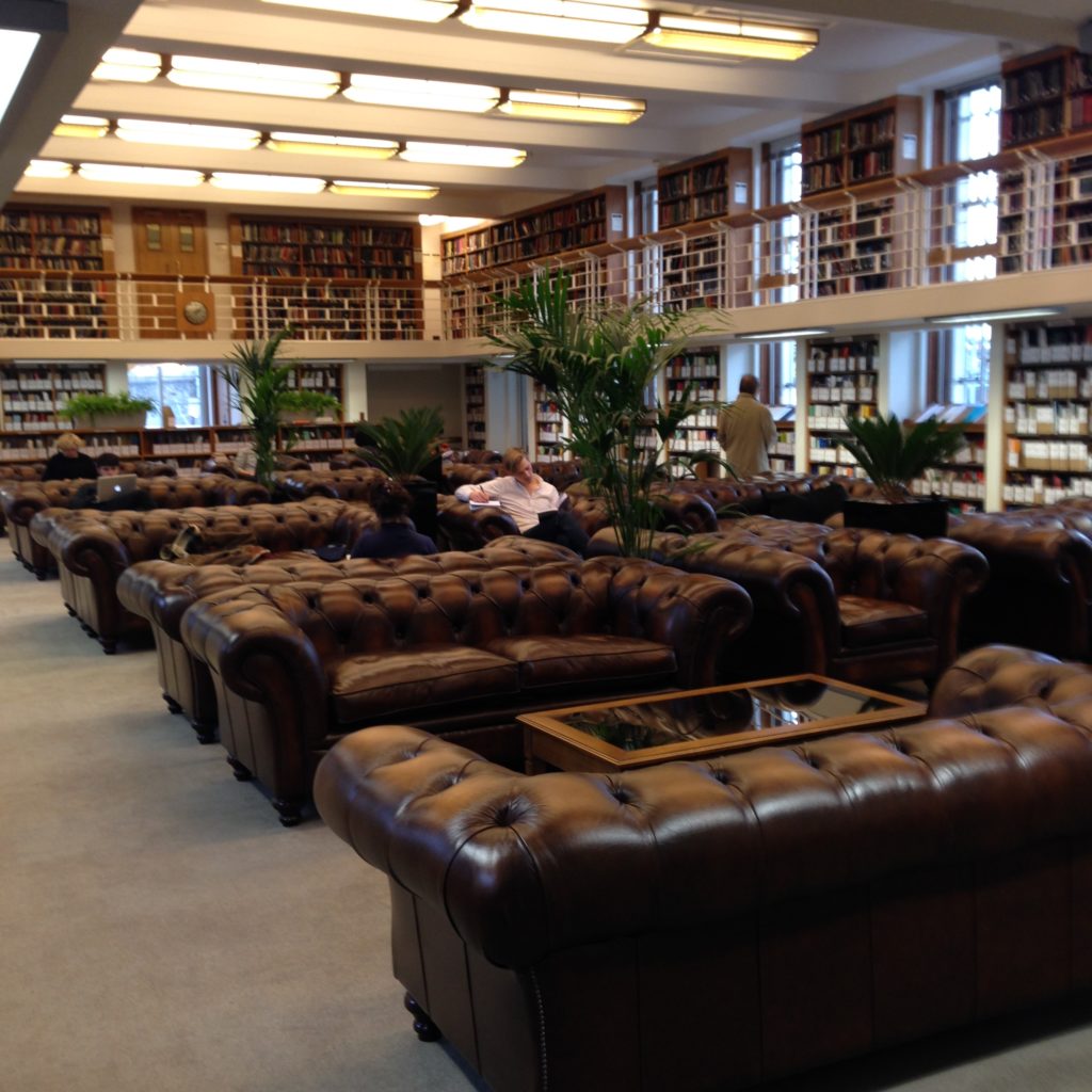
This is one of many reading rooms at the Senate House library, University of London. We were on this communal table thing from the beginning, weren’t we? And check out this periodical reading room:

Big, tufted leather couches

Is it just me, or is this room going for “high brow living room”?

I’ve got more popular study joints to check out. The trends are already poking through, though: quirky, cosy, flexible (not necessarily on casters) space, free wifi, no pressure to finish your drink and get out, and, there’s no getting around this, food. Food is the unifying theme of all the places I’ve visited that students like. Though many of them buy one coffee and sit for hours. the proximity to food, the ability to get food and coffee easily should it become required, is a key factor here. Many libraries have a very firm distinction between a café and the library proper. I’m starting to seriously question the wisdom of that. And I’m not the only one:

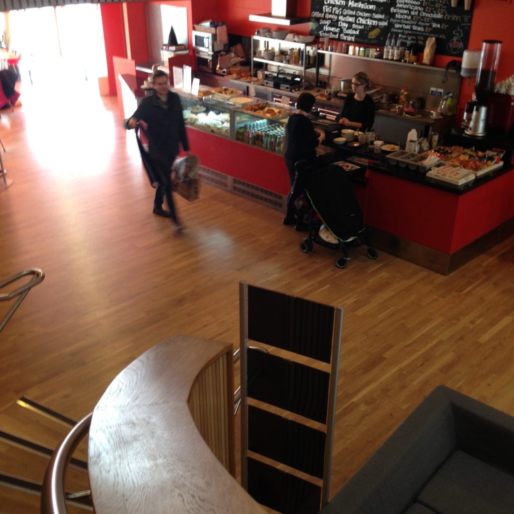
Library cafe

The café at the Canada Water library is in pride of place: right as you walk in, at the base of the stairs, in the atrium with its ceiling all the way at the very top of the building. Either because of this design, or, as the librarian at the desk told me, a problem with the ventilation system, the entire library smells like coffee and baked goods. Which may or may not be a good thing, really. But still: the café is an integral part of the library experience here.

“Eat in or take away,” inside the library. How about that?

I’ve written about the Whitechapel Idea Store café before, because it’s spectacular. They put it at the top of the building, alongside a news-watching area and current popular periodicals.

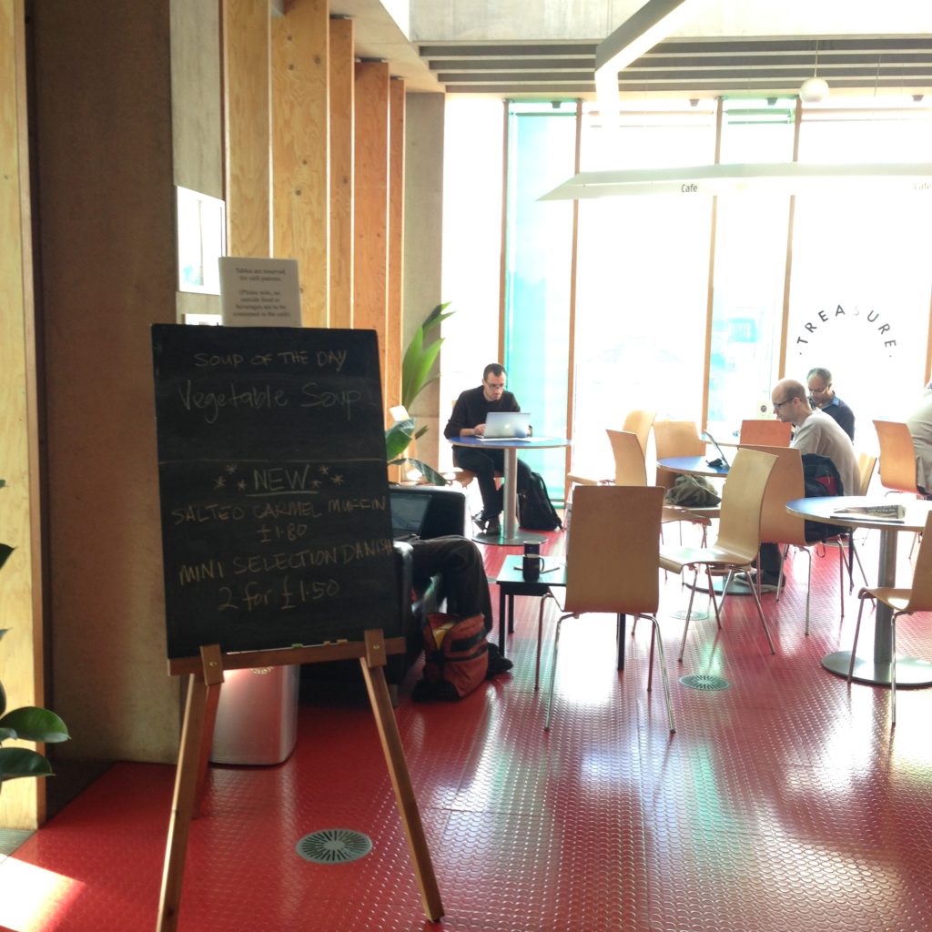
Library cafe
Library cafe with round tables and people reading

Food and thinking go together, which might be why cafés are such popular and comfortable places for students to dig in and study. We’re taken a lot of ideas from them, and they’ve taken a lot of ideas from us.

The Spaces People Choose

The Spaces People Choose

The spaces people have the choice to inhabit are, I’m discovering, often the most interesting when it comes to innovative design. But there’s so much to choose from! It’s relatively easy to find popular libraries and see how they’re laid out. What I’ve been investigating lately are the places where people choose to work. Fortunately, because locations are rated, tagged, and reviewed on Google Maps (via Google Plus), I’m able to see which locations are considered the best places for studying and working.

Which brought me to two places: the first is Tinderbox.

Tinderbox is a coffee shop in Angel, Islington. Based on the reviews and the photos online, I really thought this place would be bigger than it is. But I think that’s part of its charm. From this view, mostly what you see is the typical split between the common table and smaller tables for two. But there are a few more really unique and interesting spaces in this place.

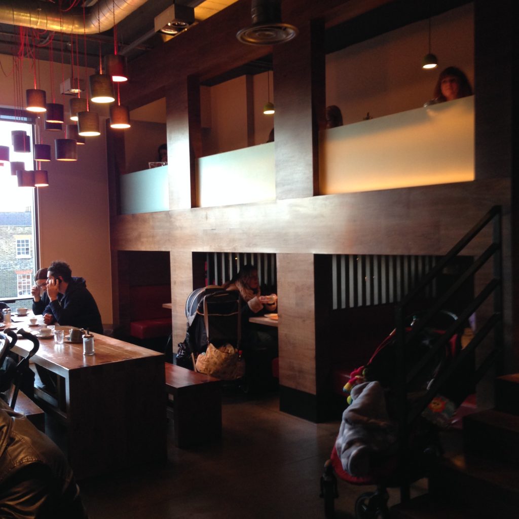
These two spaces tucked away along the side of the main room are, I think, what make Tinderbox a winner with students. Below, there are three roomy booths with a very low head height. It’s a seated head height, and not much more, though no one’s hunching in there and no one seemed uncomfortable. On the contrary, all these booths are taken (I thought I could sneak into that last booth, but no, it’s taken too.)

There’s something about a cozy space. I met a student here who told me they call Tinderbox the Nook Café, because of all the interesting little spaces in it. Given that it’s a warehouse conversion, that’s quite a feat. All the nooks in it are entirely retrofitted from an open space.

I’ve seen several takes on the low-head-height approach, mostly with furniture. Psychology isn’t my area, but the idea that we tend to find smaller spaces comforting and comfortable resonates with me. A friend of mine (Lucas Barber, Project Manager at UTM Library and all-round good guy) once told me that his father, who builds houses for a living, always builds small bedrooms with attached sitting/dressing rooms rather than gigantic master suites. He says we don’t tend to sleep well in big, open rooms. That idea has always stuck with me; small, cozy rooms feel safe and comforable, even when we think bigger is better. I’ve noted this as a bit of a trend in the most popular studying spaces, too. Ensconced up in the rafters, facing outwards, looking down, with a lower head height; spaces like that seems private, safe, comfortable, and quiet. Does it help students to concentrate? To feel comfortable? At home?

The people inside these booths definitely seemed to be in rooms of their own without being entirely cut off from the larger group. Maybe that’s part of the appeal; alone in a crowd, off to one side, sheltered. Alone together.

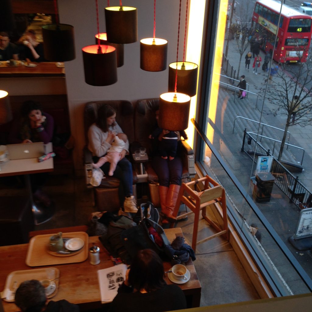
The second (of several) interesting spaces at Tinderbox is the mezzanine level above the booths.

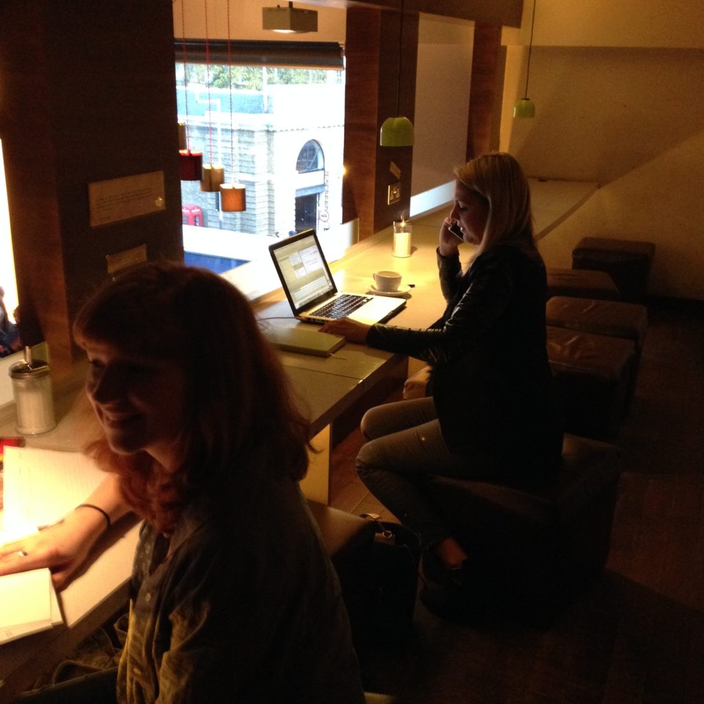
The low buzz of the café crowd below, a view and streetscape, low ambient lighting but good direct light on the table in front of you, power for your computer, and coffee. This space genuinely couldn’t be better designed for the student crowd. Tinderbox also has free wifi, so it doesn’t take much to see why this place is so well-loved and well lived-in.

The view from the mezzanine, and the third interesting space: a set of old, worn, ratty airplane seats. I found this area really interesting, because it breaks the rules for creating seating for two. Generally you arrange to have people face each other. But the two new mothers sitting in these seats were quite comfortably and happily having a chat the entire time I was here. For all the self-conscious “conversation areas” I’ve seen in libraries and elsewhere, this might be one of the most successful. It’s quirky, interesting, and completely conductive to long conversations, particularly placed as it is by the window. It’s interesting that they didn’t try to put seating right up against that terrific windnow, but I guess this way the whole space shares it uninterrupted.

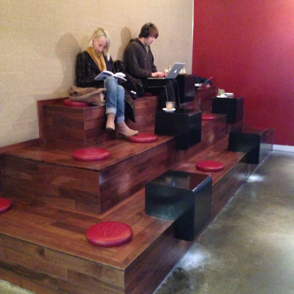
And on the other side of Tinderbox’s front till:

I genuinely don’t know what they thought was going to happen here, but I’m fascinated. I’m not sure why you would put a cushion down on a place where, if you tried to lean back, you’d end up with a wooden corner digging into your spine. But I like the built-in table and the sheer uniqueness of this thing. It’s the opposite of the booths; wide open and tiered, visible to everyone walking in, perched above the crowd. I’ve seen steps in use as seating areas all over the place, so I can see the appeal of adding them as deliberate seating.

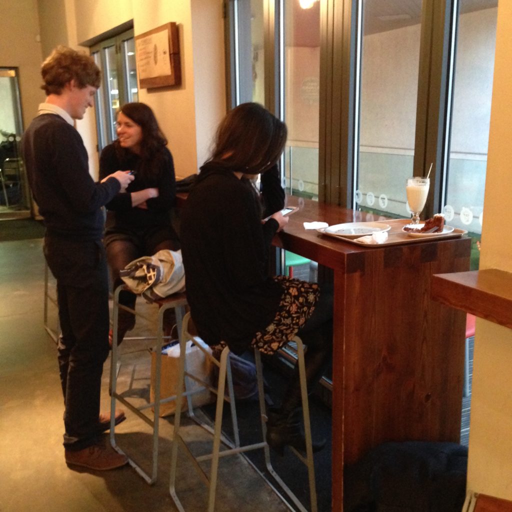
And in front of the cash and the pastry case, traditional bar seating, facing a small patio area.  No power that I saw, just a simple wooden ledge-table and stools. Interestingly, as with many spaces like this, patrons feel free to strike up conversations, often with one person standing and another sitting. Personally, I really like seating like this in areas where patrons frequently need help and input from staff, because of the ease with which a standing person can interact with a seated patron. It looks and feels natural.

I think, as far as cafés go, the variety of spaces contained within Tinderbox is closer to a library than any I’ve ever seen. But its touches are more homey and quirky than libraries tend to be. It’s small, cozy, warm (lots of wood filling up what is essentially an industrial space), with low ambient lighting but good task lighting. Librarians tend to design things in orderly lines, with bright spaces we can easily peer into to ensure that the right kinds of activity are going on. We design spaces that are less quirky and more efficient. I understand why students choose to work at Tinderbox; it covers all the bases. It’s homey and comfortable without being a junky living room. It’s an interesting mix of shared spaces, any of which can turn into collaborative ones.

Another place I got a look at today is a co-working space down the street from Tinderbox called The Hub Islington.

HUB-Islington

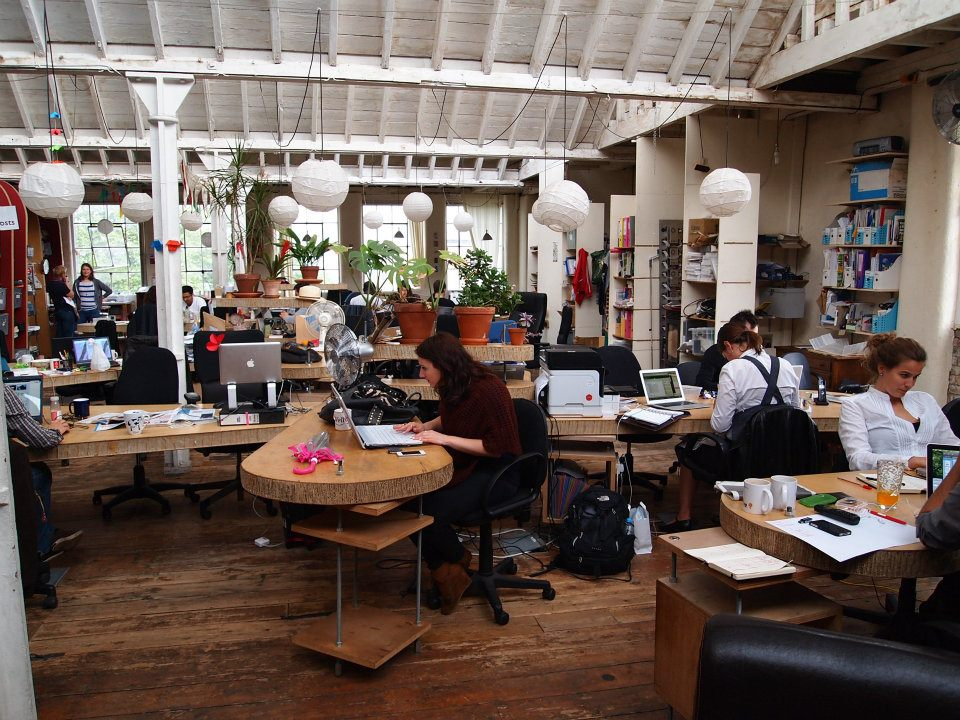
I didn’t take this picture. I was there, but I didn’t want to bother the full house working there at the time, so I’ve borrowed this one. The Hub is a co-working space on the top floor of an old warehouse in Angel. It’s designed by and for freelancers who want an office to go to rather than sitting at home all the time. They apply and pay a fee to work here. If we want to learn anything about deliberate choices of the best working spaces, co-working collectives might be the best place to turn. Not only because the people who use them tend to be innovative and design-oriented, but also because these are road-tested, and people vote not only with their feet, but with their membership fees.

The Hub Islington co-workers hotdesk. Hotdesking means that no one has a permanent desk; you choose the kind of spot you need when you need it and set up there. Therefore the Hub includes a variety of different kinds of spaces for the co-workers to shift between. The petal-like desks and chairs on casters allow each person to set up laptops as they like and need. Without monitors on the desks, they can pick how much open desk space they want at any give time. It also means they can deliberately work with someone else close by, or more independently. I like the way they have connected pieces as well as independent pieces; it makes “zones” out of thin air, and stops the place from being a hive of cubicles.

The Hub Islington includes a “library” (a nook in the left corner, by the windows, with two walls covered in books and cushioned benches. Because the library is a bit obscured, I think this space might fill the gap for those who want to work in a public place with a bit more privacy. Maybe for intensive thinking, or other kinds of private, quiet time. The Hub also includes a kitchen, and a dining booth area, presumably for having lunch as well as for impromptu brainstorming.

There’s a running thread in these chosen spaces of “home” metaphors. But it’s not like taking someone’s house and making it a public space; it’s not like an Ikea show room. It’s home with a significant professional twist. In fact, I’m starting to think that “home” isn’t the right metaphor, given how far afield these spaces get. People generally don’t have spaces like this in their home. The idea of a couch, a kitchen table, the ability to shift from one kind of space to another, that’s some of the home-ness of it. But the layout and structure itself is far from “living room” or “dining room”. The idea of “home” imparts the idea of different kinds of comfortable space, but it’s more formal than home. It’s just a more thoughtful office space, really.

Co-working spaces traditionally contain a conference room as well, like any other worksplace, as this one is no different:

french-course-london-hub-islington

It’s a dining room metaphor. This is a space you use when you’re deliberately in meeting mode. This space has a door on it that can be closed, unlike any other part of the space.

These are two spaces that have been deliberately chosen by those doing individual work. The first was designed by business owners developing a commercial enterprise; the second, by co-workers themselves, originally drawn on the floorboards in chalk. Both are an interesting mix of comfort, connection to other people, ability to share with close collaborators or friends, and a strong thread of individual space.

So these are the kinds of spaces that people chose for themselves: no individual offices, and no permanent stations, no complete privacy. There’s a connection to other people there, always, even if you’re not speaking to those people, or know them at all. They aren’t silent spaces, but they’re not excessively loud, either. They both have a buzz of work going on, in and around the casual talk. They are both flexible spaces, not because the furniture necessarily shifts around a lot, but because it supports a wide range of different kinds of activities, individual and collective, and the ethos of the space embraces the idea that different moods, tasks, or projects need different kinds of configurations, different furniture, and different affordances. In both, you’re not stuck in one kind of chair looking at one kind of view for all the work you do. You get to choose.

Interactive Computing

Interactive Computing

There is a monumental shift going on in computing. It’s a technical change, a software change, and most importantly, a change in the way we think about and approach a computing device. This change has to do with what a computer is.

We’re familiar with the more radical end of this change as the smart phone revolution. It used to be we had two very distinct devices: a computer (which sat on a desk, had a screen and a keyboard, and required us to bring a chair up to it so we could rest our fingers against the keys) and a phone (which could be attached to the wall, sit on a table, or, eventually, fit into our pockets, has small keys, or, increasingly, software-only keys). The rapid merging of these two devices has left us with some very confused metaphors for computing. As librarians, we’re not entirely sure anymore how to signal to a patron that we have set aside a device for their use. We set up computing so that patrons can use them, but we struggle to break free from the workstation metaphor, even when it would behoove us to do so.

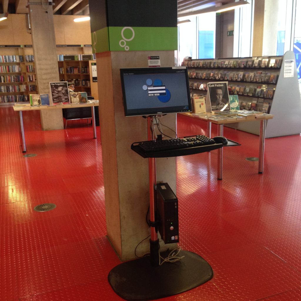
A catalogue-browsing station at the Idea Store Whitechapel. The attempt is clearly there to get rid of the workstation and move into a more flexible approach to bringing digital search and information into the physical world, but of course you still need a keyboard, a mouse, and a monitor, right? (Horseless carriage, anyone?)

Not to point fingers only at the Idea Store. This is tough, a lot of people are struggling with it. This is a tough one. But this terminal is just a stand up desk, really. You can’t put your stuff down on a table, and you can get stuck in for the afternoon of checking your email and writing an essay. It’s not comfortable enough to be a workstation. It says, “You, patron, may use this computer to do simple things, like looking something up.” Patron in that case is most definitely singular.

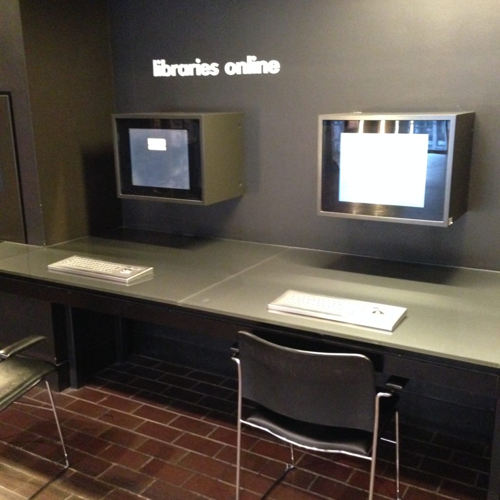
Here’s the not-especially-innovative interactive stations outside the Barbican library. Here we haven’t even moved away from the idea that you have to sit down to interact with digital media. At least they’ve got those steampunk keyboards with the included mouse to avoid all the extra wires. Rollerball for the win!

Once again, the layout is telling us how many people should be using these stations; one person per. If you were to bring the second chair over to look at something with a friend, you’d be depriving someone else of the use of a machine. Without intending to, we shout out our belief that computers are single-person items.

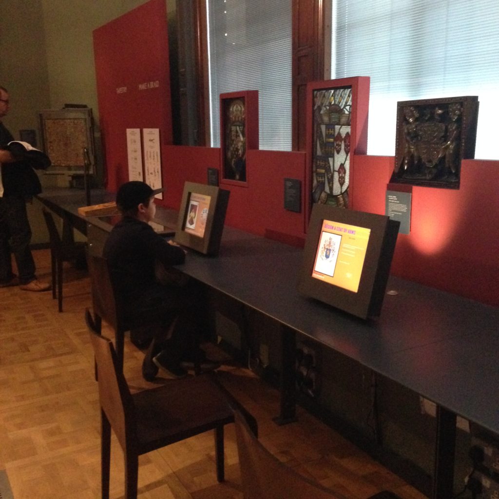
Everybody really likes the idea of bringing digital information into an experience; there’s just so much of it, and there’s no way any space, library, museum, or otherwise, can have any hope at all of bringing all or even most of it to its patrons without using screens. But very often you can see innovative spaces, like the Victoria & Albert Museum here, resorting to screens and chairs, in keeping with ye olde workstation metaphor. Is this the best way to bring digital information to patrons? It’s certainly the easiest. And the simplest for the patron to understand.

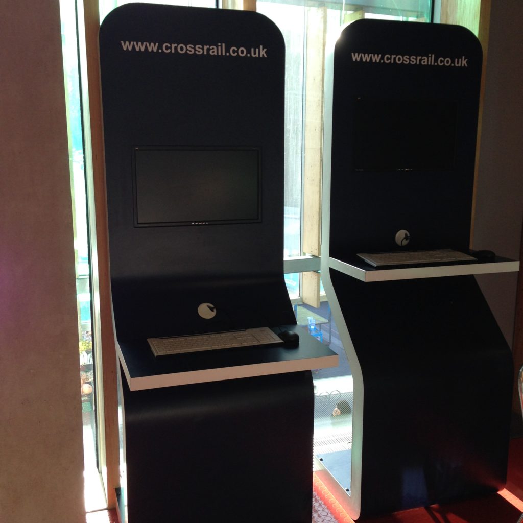
And not to say that these stations aren’t interesting and thoughtful; a lot of them are. These are the Crossrail information terminals at the Idea Store Whitechapel. As profiles go, these are pretty slim. For a workstation that’s been straightened out so you can approach them while standing as use them, yeah, they’re great. But this metaphor is wearing very, very thin. One person per screen, please. We started out that way in computing, and we keep reproducing it.

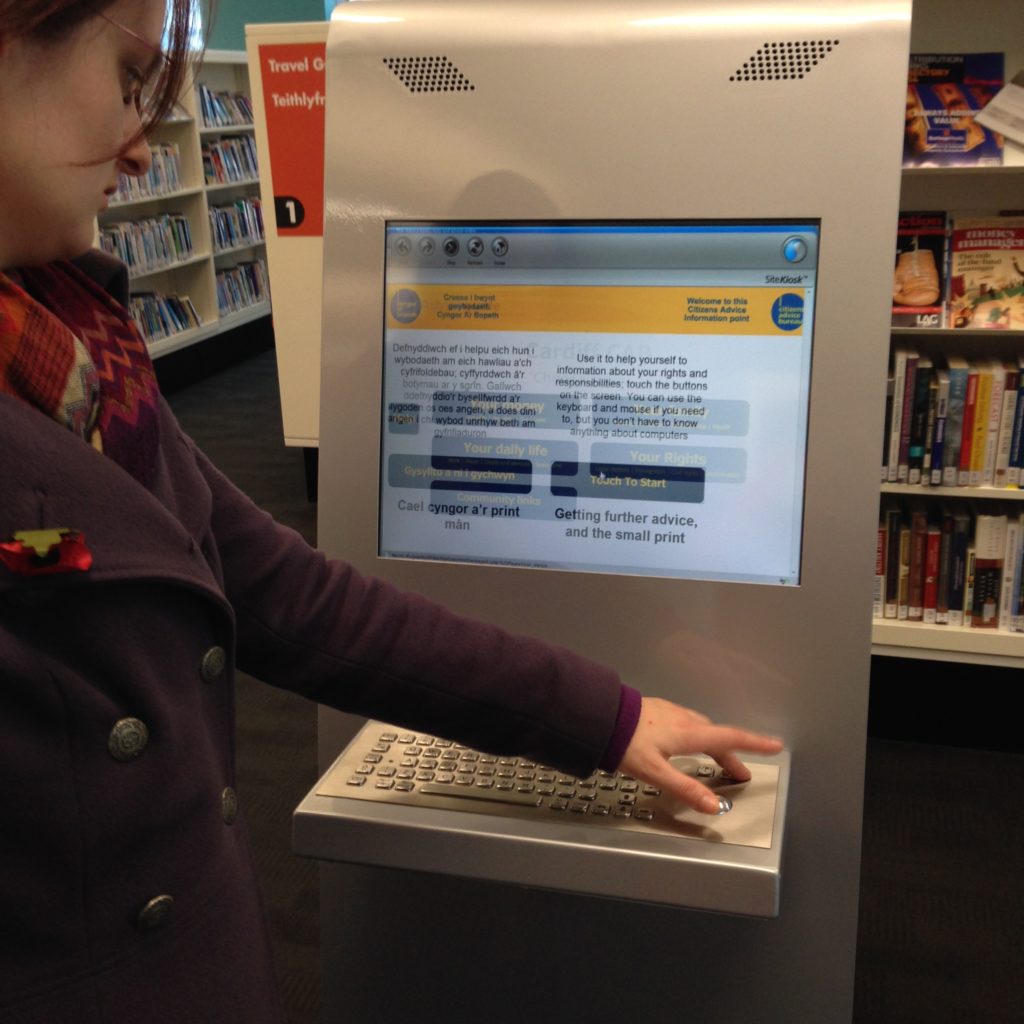
This is a really nice monitor/keyboard/rollerball mouse set up at the Central Library in Cardiff. That’s my friend Imogen; she went straight for the keyboard, because it was there, so she assumed it was required to use the machine. That’s a touch screen, though, as I showed her. (I can tell it is: of course it is! It’s high tech! This is a standing totem terminal, of course it’s a touch screen!) Because the affordances of the set up return the patron back to the workstation metaphor, all the interesting affordances of the touch screen go flying out the window.

The touchscreen, which replaces the keyboard and the mouse pretty effectively, is not a new technology anymore, and a lot of libraries (and museums, and all kinds of other spaces) have them. But libraries may be the last ones holding on so strongly to the keyboard. I understand why we do it; it’s true that you have a lot more scope with a keyboard. You can short-circuit whatever the designer thought you were going to do at this terminal with a keyboard and do what you need to do. It’s flexible. It makes that terminal ready for anything, and we really like to be ready for anything. We hate restricting what a patron can do. But unfortunately that flexibility  puts the device, and by extention the patron, in a very tight metaphorical box. In trying to make sure a patron can do anything they want, we often don’t use contextual and layout clues help them do the thing they’re probably there to do.

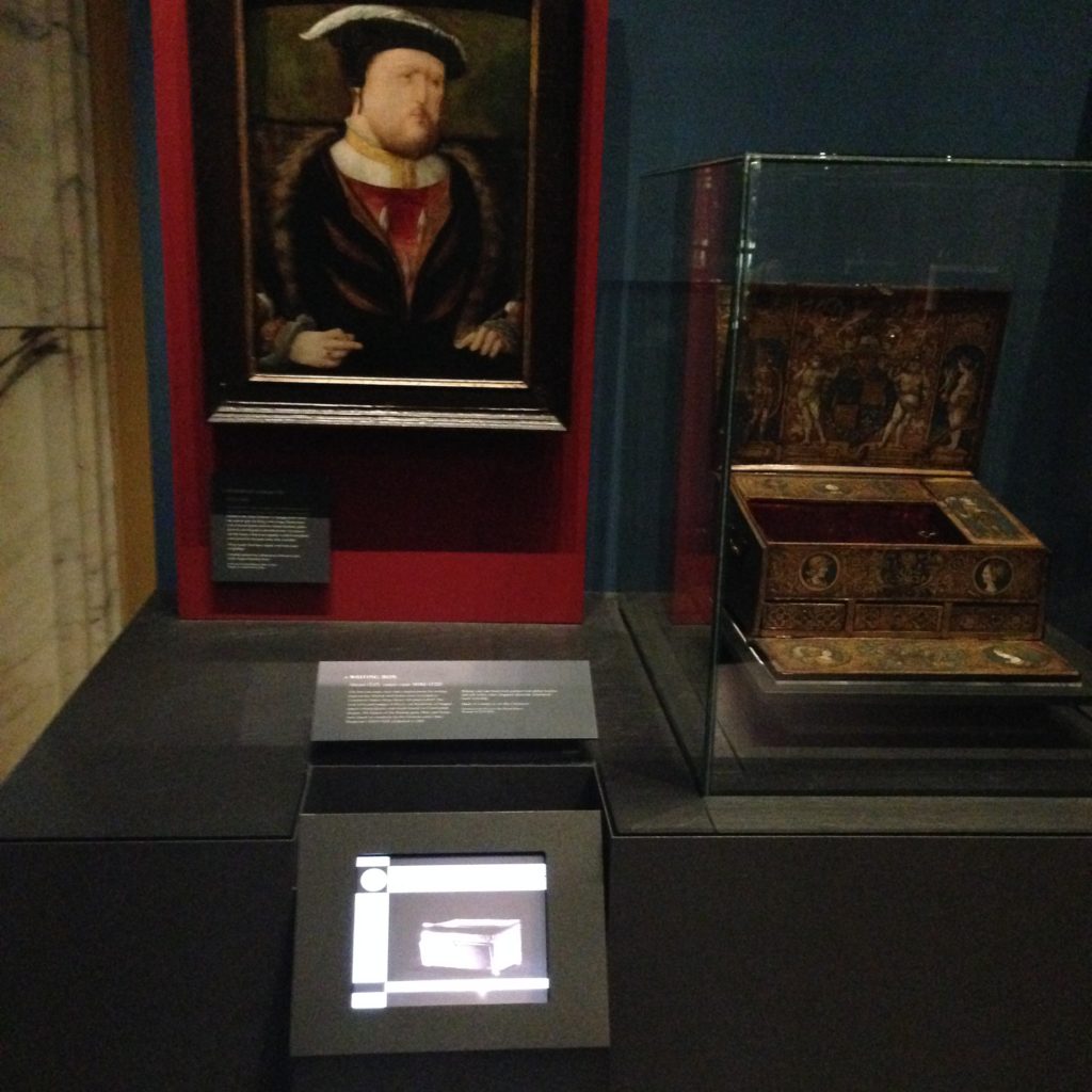
Here in the National Portrait Gallery they’ve got images, objects, and digital information all threaded together. The digital information is relevant and interactive, though interactive in a very limited way. But it’s not pulled out and stripped of its context, which is key. It’s the [read more] of the museum world, attached to the exhibit without overwhelming it. The patron has navigated to this piece of information not through clicking through a web page, but by physically moving through the building. Because of the physical location of the patron, we can make all kinds of assumptions about what information they want or need. It’s those few steps before search that they’re tying into here; anticipating information needs and incorporating them into the space itself. That device on the Henry VIII portrait isn’t as flexible  as the terminals with keyboards above, which can do absolutely anything, but it’s more targeted, specific, and in that moment, useful. It’s not expecting the patron to do any work at all. There’s no keywords, because the patron has indicated the keywords by moving to this point of the museum.

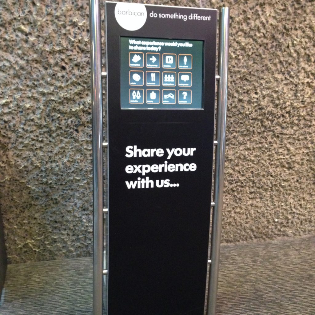
This is a fully interactive totem terminal at the Barbican, designed specifically to gather feedback from users. There’s no question that that screen is a touchscreen (obviously). No keyboard, you’ll notice. No mouse. (You don’t need a mouse with a touchscreen, because your finger is the cursor.) It’s not a computer you can hijack to check your email or jump into a search engine. It has one purpose, and it does that one purpose well. As computing has become cheaper and cheaper over the years, we’ve had more opportunities to include computing with limited purposes like this one. I think we often fail to notice that computing has become cheaper, and thus our relationship to it can now change. When a computer cost you five thousand dollars at minimum, it made sense that you wanted it to be as flexible as possible.

But that might not but the problem; lots of libraries have catalogue-only computers. We tend to make them stand up terminals to express this, and lock the software so that only that one activity is possible. We get the idea of the single use computer, we just haven’t made the jump to creating things like this:

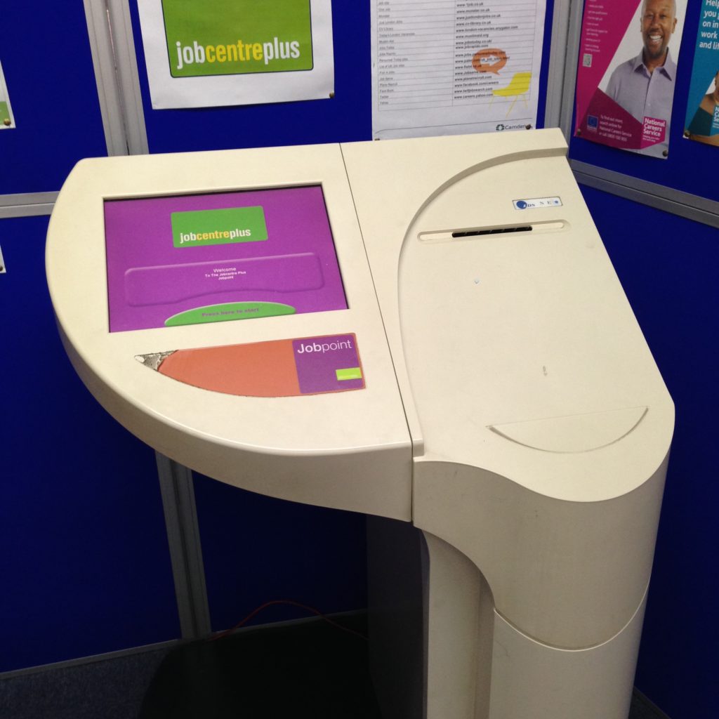
I found this Jobpoint terminal at the St. Pancras Library in Islington. It’s a small library attached to a branch of the borough council, which offers a range of services to residents, from issuing parking permits to housing benefits. The jobpoint is, as the name suggests, an interface to view job postings. Public libraries are frequently the centre of support for job seekers, but I haven’t seen such a sophisticated job searching terminal before. No keyboard, no mouse, but there is a small printer.

This is a terminal that’s sensitive to its context; job seekers can print out the details they need of a job that interests them. This terminal brings the riches of one particular database to its userbase, and one which, in this case in particular, isn’t well-known for being especially computer-savvy. Now that I’ve seen this one, I’m surprised that catalogue terminals in libraries don’t look more like this. The needs are strikingly similar. Minus the workstation metaphors, you can see how much easier it would be to provide support to someone using a terminal like this. It’s design doesn’t tell you how many people can use it at once the way a keyboard and a mouse do. It doesn’t invoke a private, personal computer. Anyone walking up to it knows it’s not somewhere they can sit down and read a book, or work on their essay, or send some email. It’s computing, but it’s not a computer the same way catalogue terminals often are.

I keep looking for the holy grails of collaborative-friendly computing spaces, and they are few and far between. I know they exist, I’ve only just started my explorations, but even seeing attempts has been helpful to framing what it is we’re doing, and how we might consider creating different kinds of spaces and interfaces.

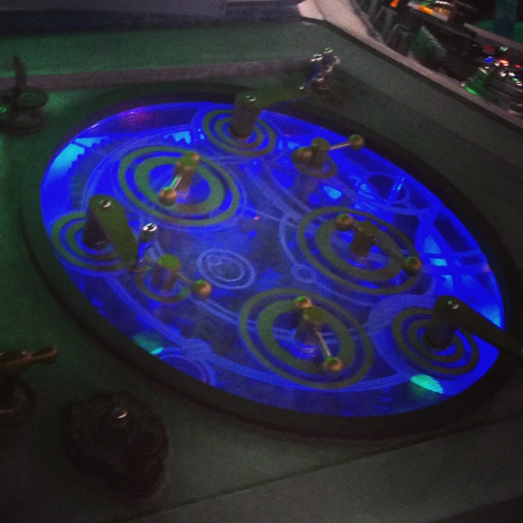
I visited another high-tech place this week, which looked like this:

As we know, the TARDIS can be operated by a single person. It’s a Gallifreyan workstation, as it were. But we know it works better with a crowd.

Lecture Benches: Audio in Museums

Lecture Benches: Audio in Museums

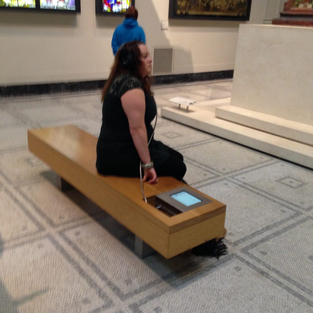
I’ve decided to call this a lecture bench. Sit down, select your content, listen while you look upon the objects described. Two birds with one stone: learn something, and have a rest. (Hey: those floors are really, really hard. Everyone’s feet need a rest in big museums!)

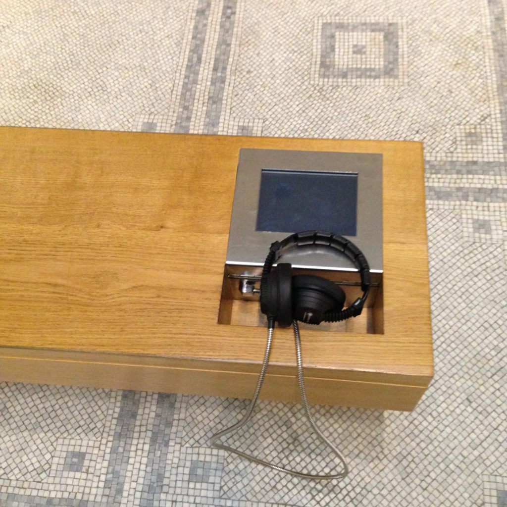
It’s an audio brochure controlled by a touch screen and delivered through a set of headphones.

This is the high-tech version, I discovered later, because of the touch screens and the fancy headphones. (Is it only me, or does sharing headphones seem a little…intimate? Headphones seem like a personal item to me, for the most part. I’d rather plug in my beats, but maybe that’s just me.)

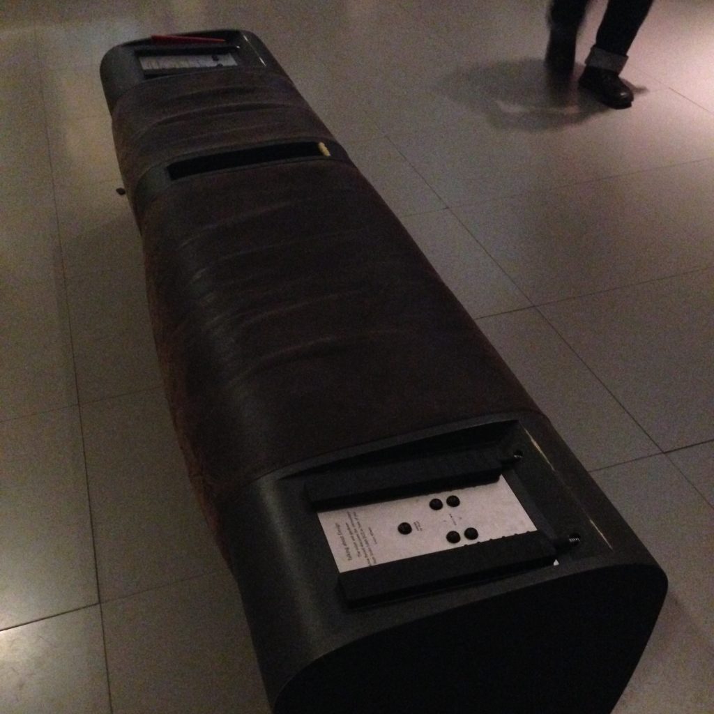
This is, I think, the older version of the lecture bench. You hold the big plastic handset to your ear to listen whilst sitting on this lovely leather bankette. No touchscreen control, you’ll notice. Just some knobs.

Museums are unique in that people come to see their stuff, and if their stuff were converted entirely to digital stuff, no one would visit anymore. Because the point really is to come see the stuff. Okay: maybe museums aren’t that unique, because a lot of people think the very same thing is true of libraries. But libraries don’t curate in the same way that museums do. Frankly I think that’s a bit of a tragedy. What these audio benches attempt to do is bring different media into the space to sit alongside the more physical objects. People don’t go to museums to listen to things, they think, but of course if someone’s there telling you all the interesting stories behind the objects you see, you absolutely are there to listen.

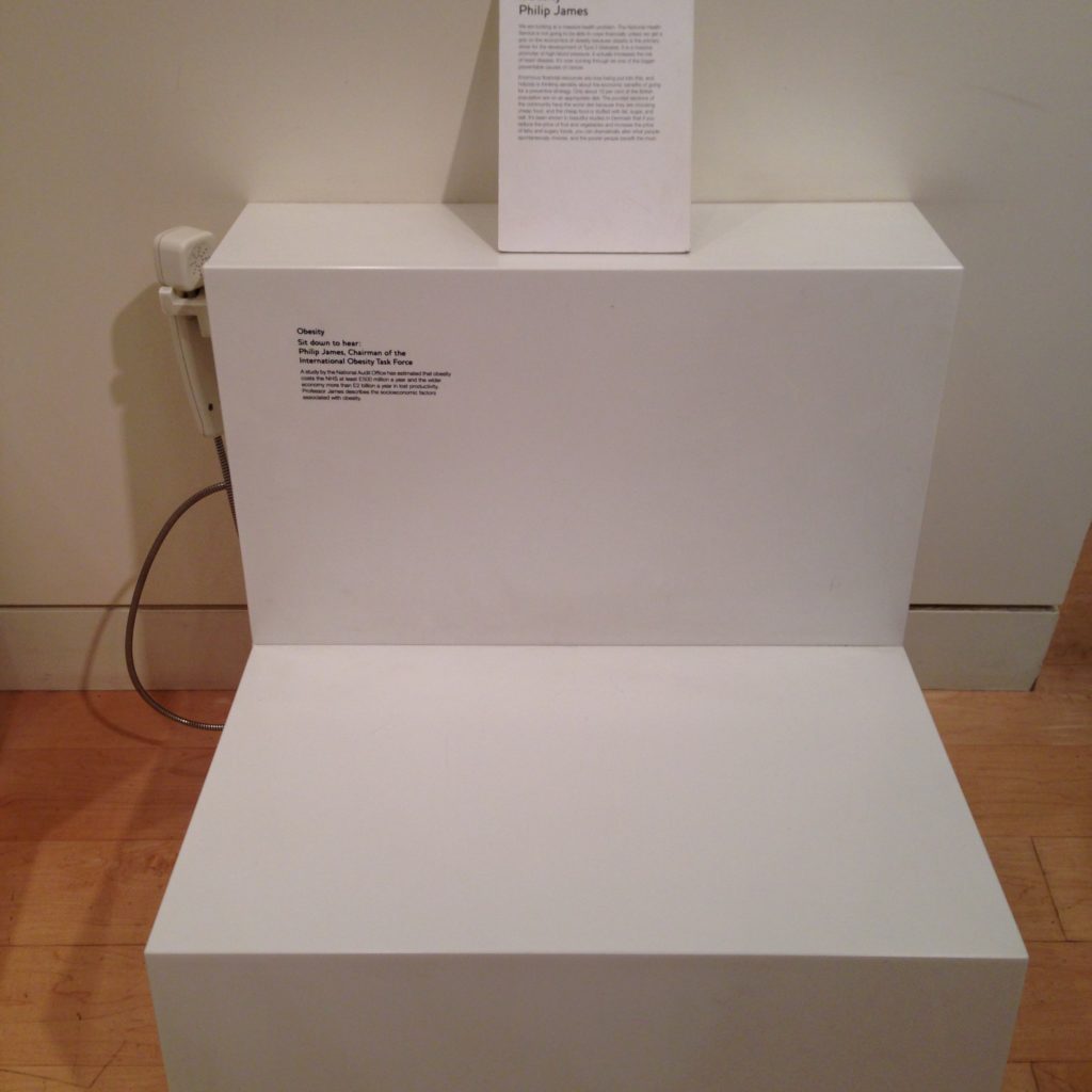
Here’s a very stripped down (and far less comfortable) version at the Wellcome Collection, with a telephone handset rather than headphones. What’s most interesting about this one to me is that the surface they’ve left for you to sit on sort of makes it look like you’re part of the exhibit when you sit down on it. As if you’re there to be looked at, with a label on the wall over your head. Not quite as inviting, obviously. But interesting.

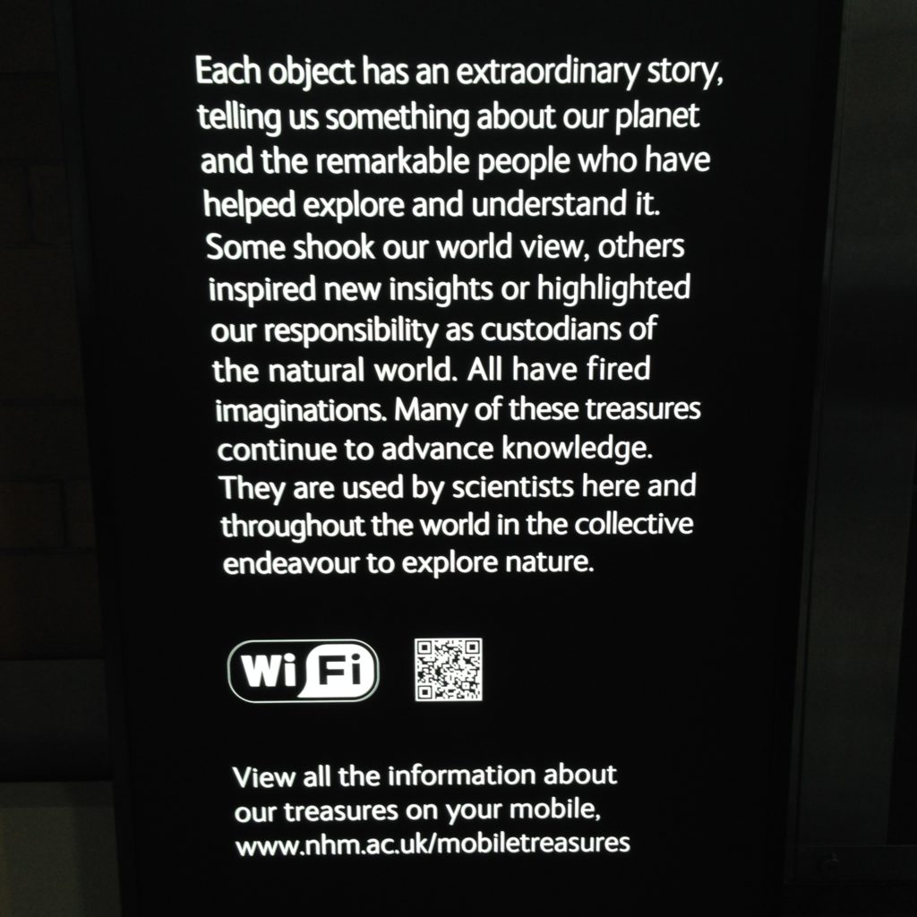
At the Natural History Museum, they’re trying a similar thing through QR codes. You can look at the skulls and minerals and models of ancient animals while you’re there, but they want to knit more context and more information into them. There is so much information, and it seems like everyone is trying to find ways to knit it into a physical experience. You can’t write entire monographs on the walls. People won’t read that much text. It’s very interesting to see the variety of ways curated spaces are trying to bring digital media into their midst.

Interactive Media without Keyboards or Screens

Interactive Media without Keyboards or Screens

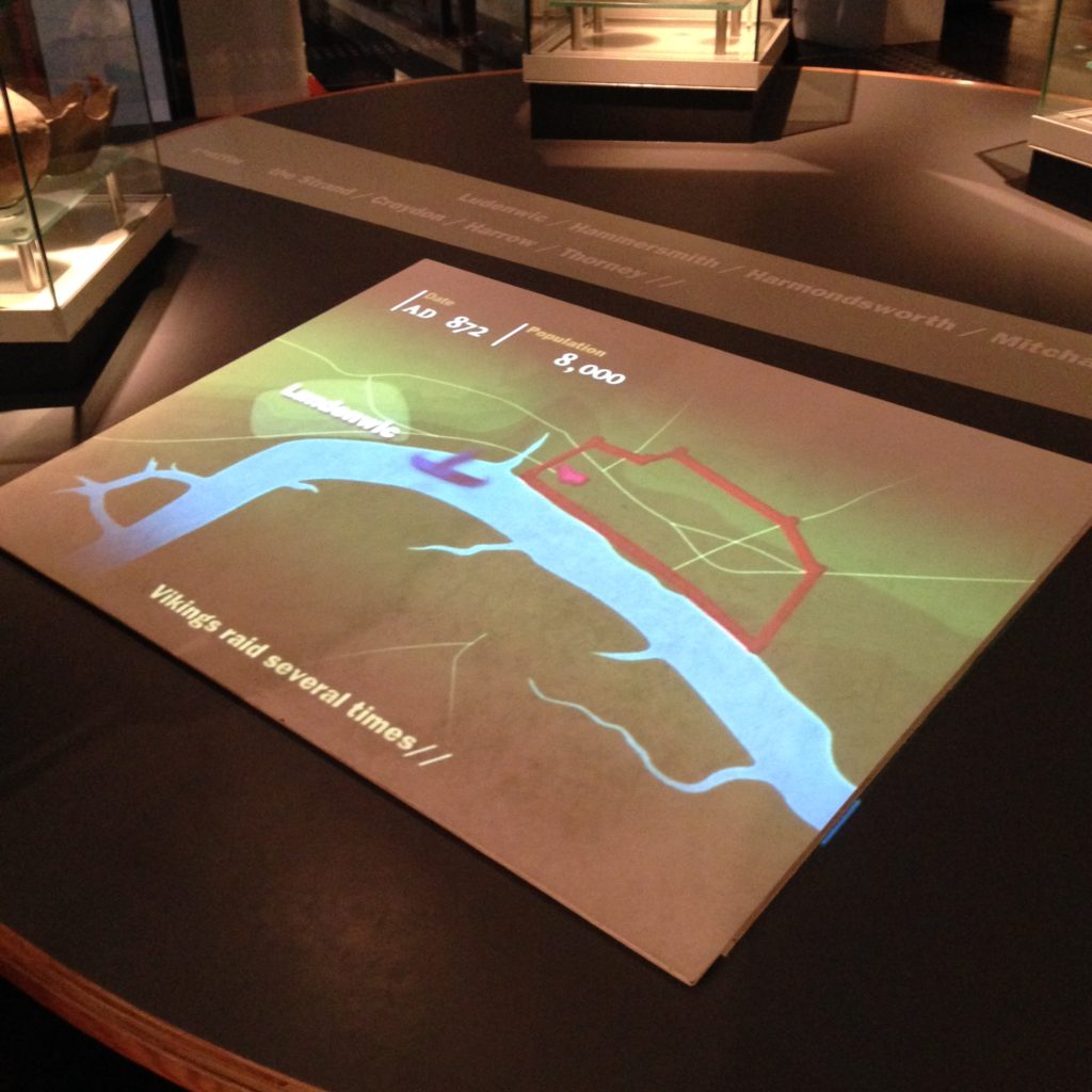
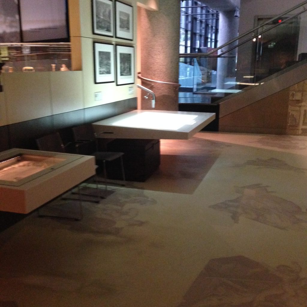
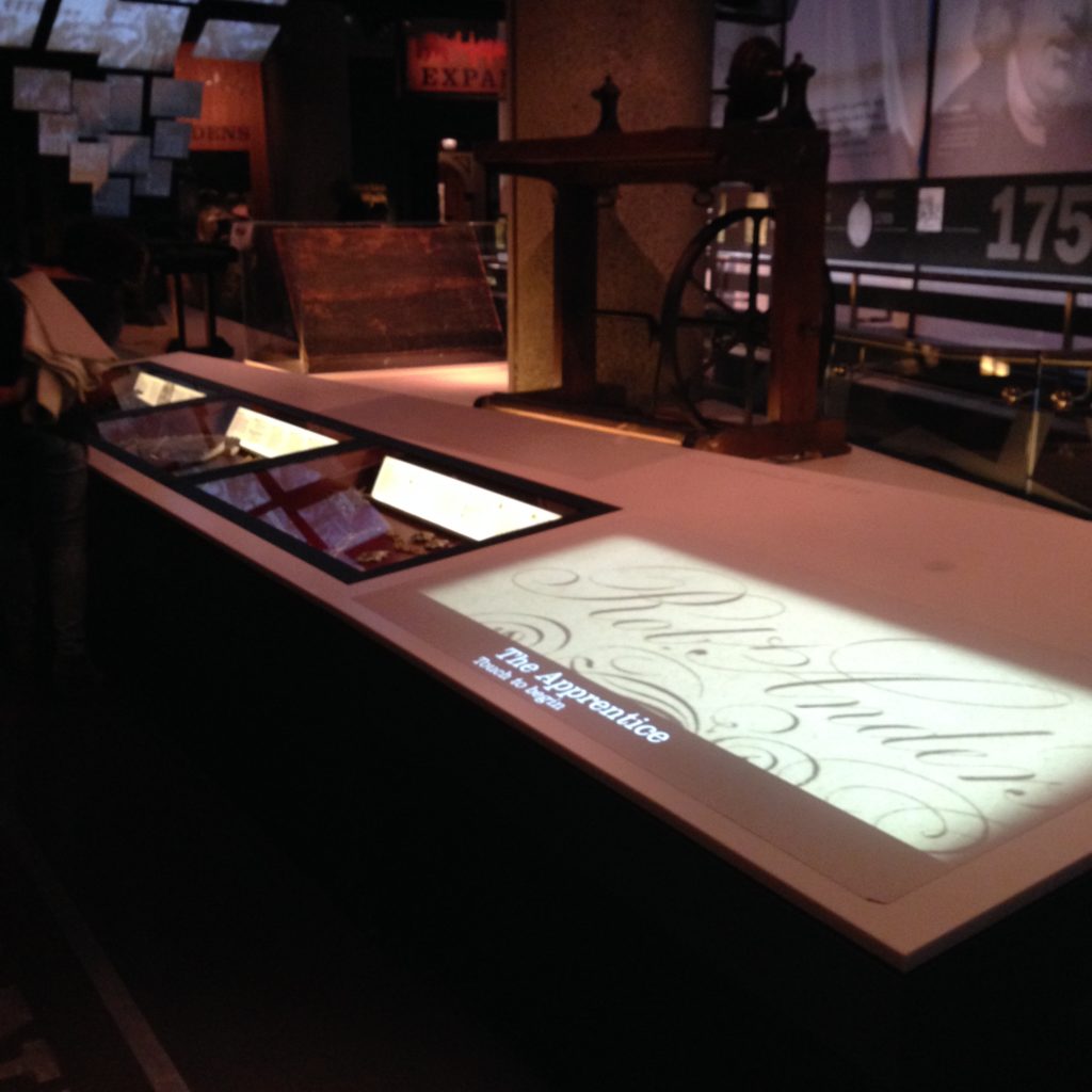
This is my very favourite bit of fully collaborative digital space: it’s the interactive exhibits at the Museum of London.

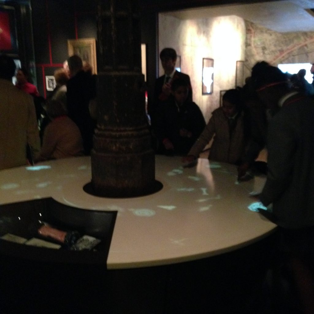
Simple, eh? Not much to it, really. It’s only a white table. Just a white table, with all the digital content projected from the ceiling. It’s really fascinating to watch people interact with it. Because they don’t behave towards it they way people tend to when they’re working with a computer. Here’s a woman with her young daughter experimenting with it.

Good collaborative design just works. It doesn’t require anyone to think too hard about the fact that there are two people giving input to a computer. It’s open, inviting, and no one feels odd about someone else joining them in the experience, very much unlike a workstation situation. There’s no over-the-shoulder issues here. It’s comfortable to work with as a group.

If you listen, you’ll notice that every time the system recognizes someone’s touched the controls, it makes a sound. They all do this, very subtly, but it really gives the systems a sense that they are physical rather than only digital. They are only digital. It just doesn’t feel like it.

The Museum of London constructed their interactive exhibits very, very carefully. They are extremely thoughtful and fit fluidly into the displays.

The tables displaying materials are clearly designed to also incorporate a space for digital material to be projected from above. Interestingly, the staff are under the impression that the table is touch sensitive, but it’s actually not. (I tested it!) It’s all being controlled by the projector; it can tell where your fingers are. It’s no ipad, but it’s pretty close in terms of responsiveness.

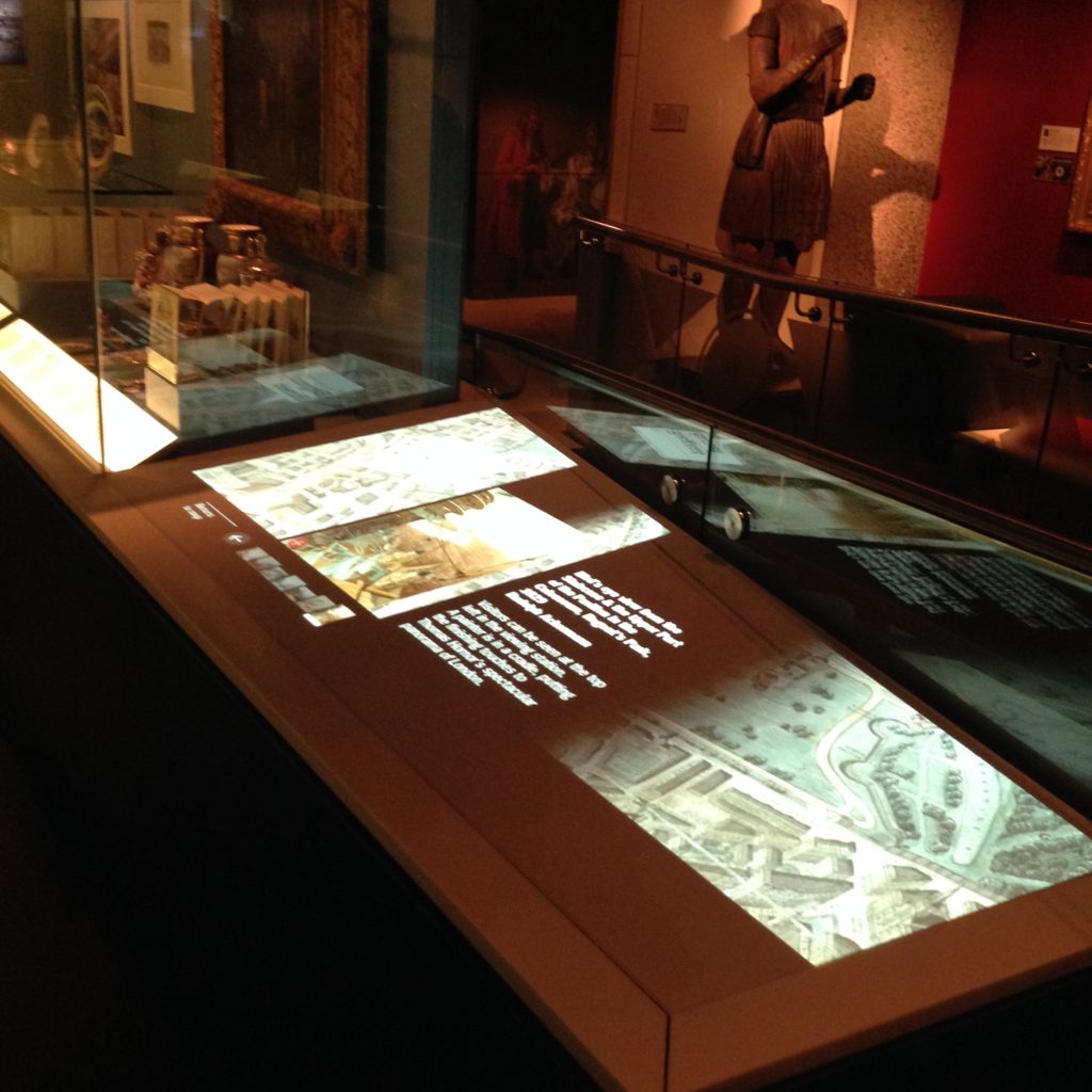
Projected digital media

This bit of projection is on a much smaller table, and it’s a bit of a wedge shape. The projection and the design of the content is made to fit. There are physical objects on one side, and digital material right next to it. No screen, no keyboard, just simple, digital content I can flip through without reading instructions. This is genuinely doesn’t feel like working with digital content.

Digital content projected onto a table as part of an exhibit.

I really love these. The pieces of it are really fairly simple; it’s the design of the tables, installing the projector and the computer in the ceiling, and, of course the coding of the material. I keep thinking, we have content management systems like Drupal that will let us manage website content; it’s a short step to having a content management system for spaces like this. Imagine a space like this for a reference desk, rather than another bloody workstation. You could plug in a keyboard if you really had to.

Projection isn’t the future of touch screens. LCD screens are tons better for clarify and crispness, and even for responsiveness, in the end. But projection lets you do the interesting shapes and massive sizes on the cheap.

Several square feet of projected digital content

This is a video playing on a huge patch on a table. That’s simple and cheap to do with projection. It would be crazy expensive to do with an LCD screen right now. This way, they can easily adjust the size and location of the projection within the museum for practically nothing. An LCD screen, while a better piece of technology, simply isn’t that flexible. It’s also harder on the eyes, truth be told. A projection is a fairly gentle kind of light. As long as the video doesn’t require HD or too many fine details, a basic projection will work just fine.

And an LCD screen is just not going to let you make a round interactive space. This is a simulated fountain, where, from all points of the table, you can touch the various fish to get more information. It works from every side, which means you can have multiple people interacting with it at once. And no one here considers the fact that they’re interacting with a computer. No one even looks up to see it up there.

I really love the work the Museum of London has put into these really innovative computing spaces. They’re demonstrating something really valuable and important here. If you want people to feel comfortable walking up to a display of digital information with no preconceptions about how they’re meant to use the space, you have to break the rules and create something that doesn’t look like a workstation. Workstations don’t fire the imagination, and they aren’t especially approachable. They dictate the kind of work that can be done at them.

Digital media everywhere you look

I know it’s not comfortable to do any lengthy computing while staring down at a table. This is why I’m not convinced the tables formerly known as Surface (now called PixelSense) are as functional as they should be. But I think, if we want people to be able to, say, search through digital materials with the aid of someone else, or with a group of classmates, we need to break down some barriers to make it easier and more natural. The examples at the Museum of London are spectacular.

Help Points

Help Points

These are interesting, so I can’t help but keep snapping pictures of them and writing about them. Help points, or reference desks, or information desks: they are common in a variety of different locations, and they wear so many guises. At the Apple store, they did away with the furniture and turned a massive staff into uniformed, technologicaly-equipped help points themselves. To be honest I’m undecided on how well that works. It works when the staff come to you exactly when you need them, switching the tables on “just in case” information points. (In the Apple store, the information points come up to you!) What’s required to make that work is a) uniforms, and b) a tremendous number of staff. Have you ever counted how many staff there are in an Apple store? It’s twice as many as you think. And then there’s the people behind the scenes we don’t even see.

For locations who can’t hire that many staff, or who can’t dictate a uniform for the staff they, furniture and lighting often steps in to create an obvious, approachable point for people to find and move toward when they have a problem or a question.

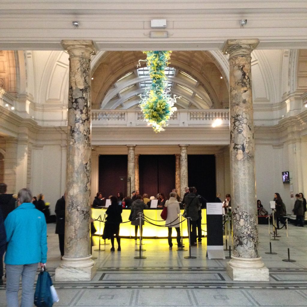
Here’s the main desk at the Victoria and Albert Museum:

I know a lot of forward-thinking librarians are anti-desk. Especially anti-big-desk, and anti-“just in case” staffing. I can’t stay I’m anti-desk or pro-desk. I don’t think these things can exist without a solid, proactive service model behind it, and I think whether a space requires a designated desk, and what kind of designated desk in that case, is entirely dependent on the context of the institution. If it’s purpose is to act as that gravitation point, almost like a meeting place, an architectural feature so obvious you can’t miss it if you tried, ideally tied to a well-considered service model, a giant yellow desk might be just what you need. If your space requires a staffed visibly beating heart, then you might as well take to 11. That’s obviously the direction the V&A took.

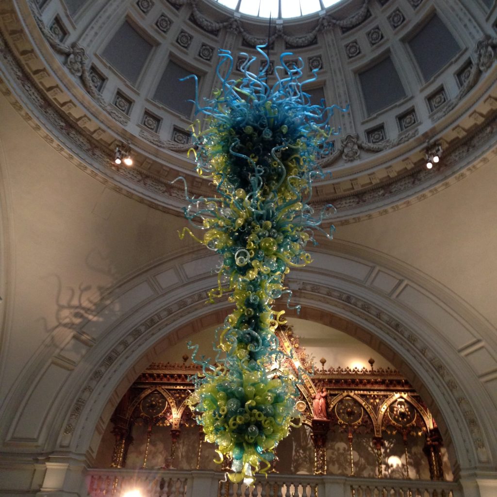
You cannot miss this information desk at the V&A. For one, it’s glowing yellow. If you had to direct someone to it from another part of the building, it would be pretty easy to know you’ve found the glowing yellow desk. The second key element of this desk, for visibility, is the outrageous light fixture above it. I’ve seen this trick on a much smaller scale in a variety of other libraries over the last few years; when you want a space to be designated as unique by your patrons, one way you can do it is with big, bulky furniture. Another is with dramatic lighting.You really can’t miss this blown-glass bit of drama:

Nobody’s missing that. These are all visual cues to highlight a point in the building where patrons should direct their attention. Given the size and scope of the building, the drama of their help points has to step it up and make a scene.

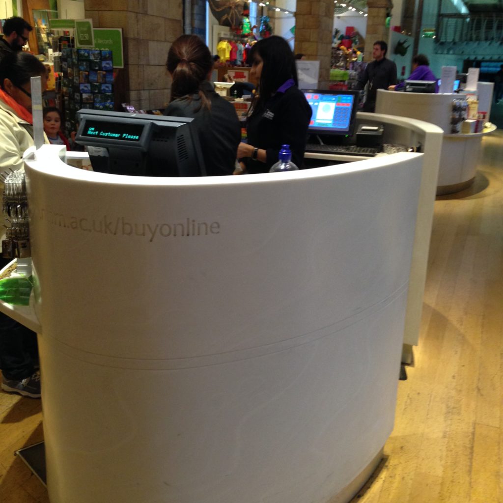
But as I said, context is everything. There are many other interesting forms of help point. This one is in the gift shop of the National History Museum:

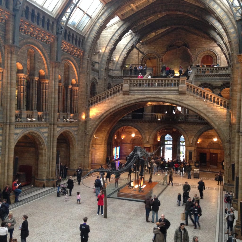
These are tills. They’re small, unlike the glowing yellow desk at the V&A. They’re slick and low-profile in a tight space, but right smack in the middle of the merchandise. It’s impossible to miss them, in spite of the fact that they’re not flashy, glowing, or under a halo of tremendous lighting. The Natural History Museum is a building dominated by stone. It’s got a very obvious look about it, and hasn’t especially modernized all that much.

The interior of the Natural History Museum

So those ultramodern, slick, white pods in this space really stick out.

It’s all fine and good to have easy-to-find tills in a gift shop, or a glowing yellow front desk in a large, well-regarded museum. But what about places where there isn’t one obvious front door, or one big foyer? What about big, sprawling spaces where different kinds of help are required all over the place?

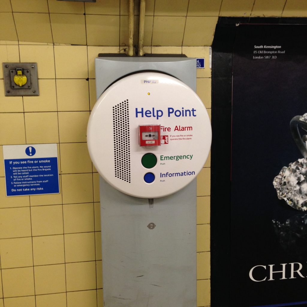
Transport for London Underground Help Point

This is a help point inside the tunnels of the tube. You find them all over once you get down into the many tunnels that lead from one line to another. It’s the physical version of the online help chat widget we place on pages of the library’s website; press the blue button if you get lost and want some help working out where you should be heading. Unlike the Apple store, Transport for London doesn’t have enough staff to litter help through the miles of tunnels, stairs, escalators and elevators that make up the London Underground system. But you can access someone by pressing a button.

These are obviously not as friendly or approachable as dramatic, staffed desks. There’s no one smiling at you, encouraging you to come over. But it’s all about context; most people walking very quickly through these tunnels knowing exactly where they’re going and don’t need the extra obstacle of a desk, a smiling face, or fancy lighting. Context really is everything.

A Place to Sit

A Place to Sit

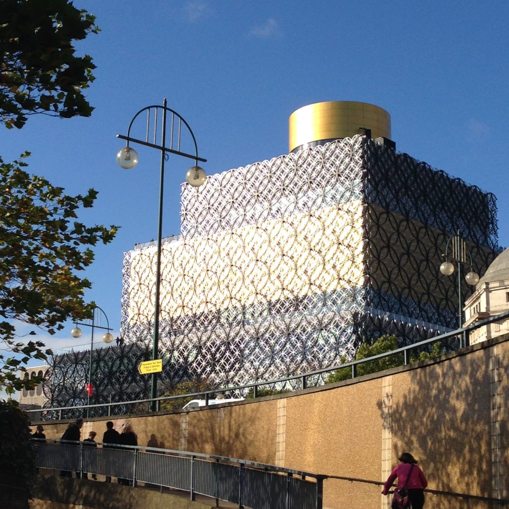
I went north last week to see the brand new Library of Birmingham. It’s only been open a few months, and it’s stunning. It’s nice to see something beautiful in this country that isn’t over a hundred years old or a nod to its illustrious past. This is a defiantly modern structure, and I absolutely love it. I made the perhaps ill-advised decision to visit during a school break, but I certainly got to see this library full, busy, and full of noise. So perhaps not a completely terrible decision.

There are many wonderful things in the Library of Birmingham, including a well-designed children’s library and event space, a lovely front lobby where they sell crafts made by local artists,  thoughtful (and gender-segretated) prayer rooms, to say nothing of the two beautifully functional roof gardens (the main one, and the secret one). Stunning.

But you can already see where the seams are going to burst for this library. Not enough power, and not enough collaborative spaces. This problem is most obvious in their study spaces.

I have to admit, I hadn’t expected study space to play such an important role in public libraries, but it clearly does. Every public library I’ve visited so far has been packed full of studying students, which certainly makes me feel at home. It’s obviously not a new phenomenon, because each of these libraries has been designed to accommodate them. Canada Water library has it’s charming ring of study space perched along it’s upper floor, Idea Store Whitechapel has it’s little tables up against windows, and the Library of Birmingham has an impressive variety of study spaces.

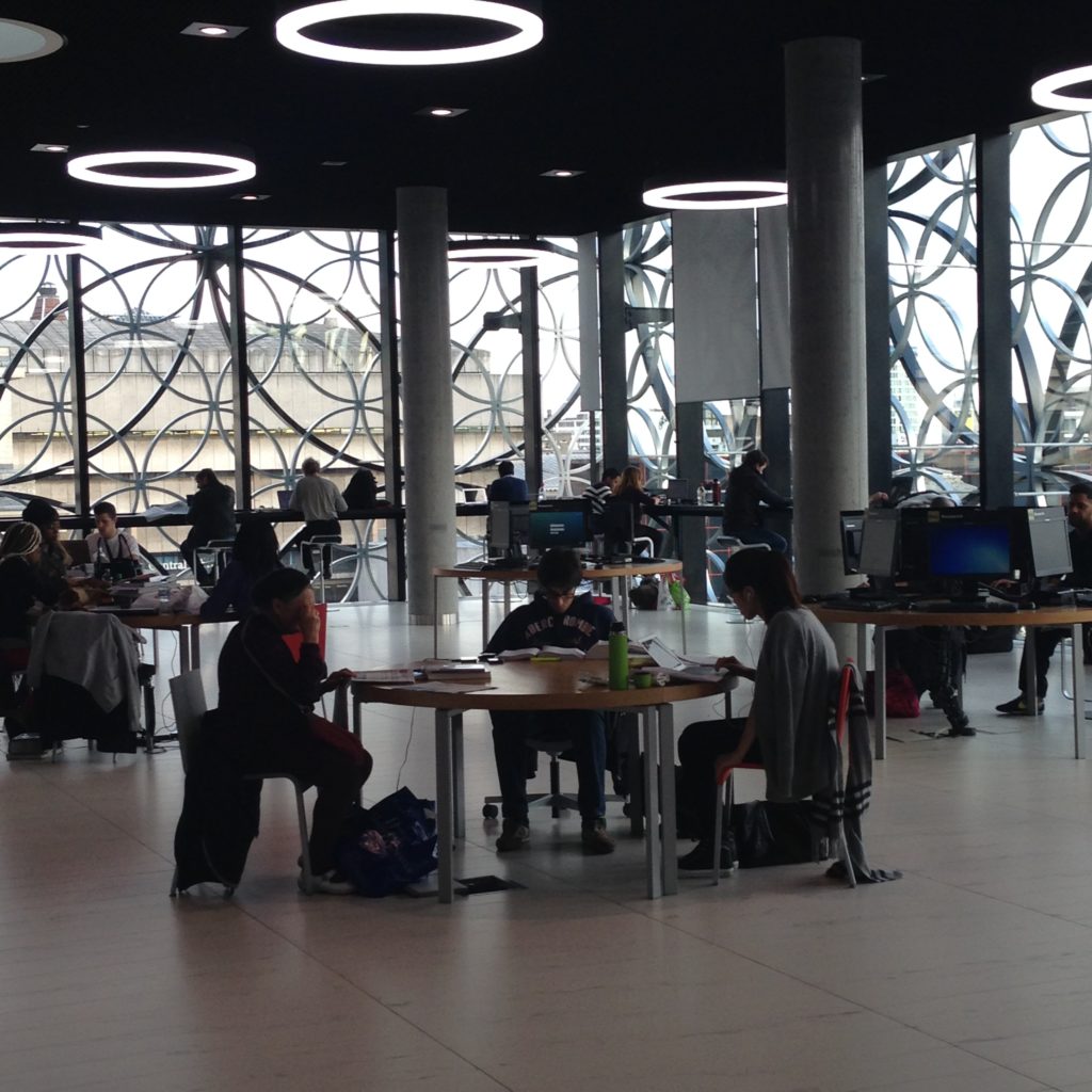
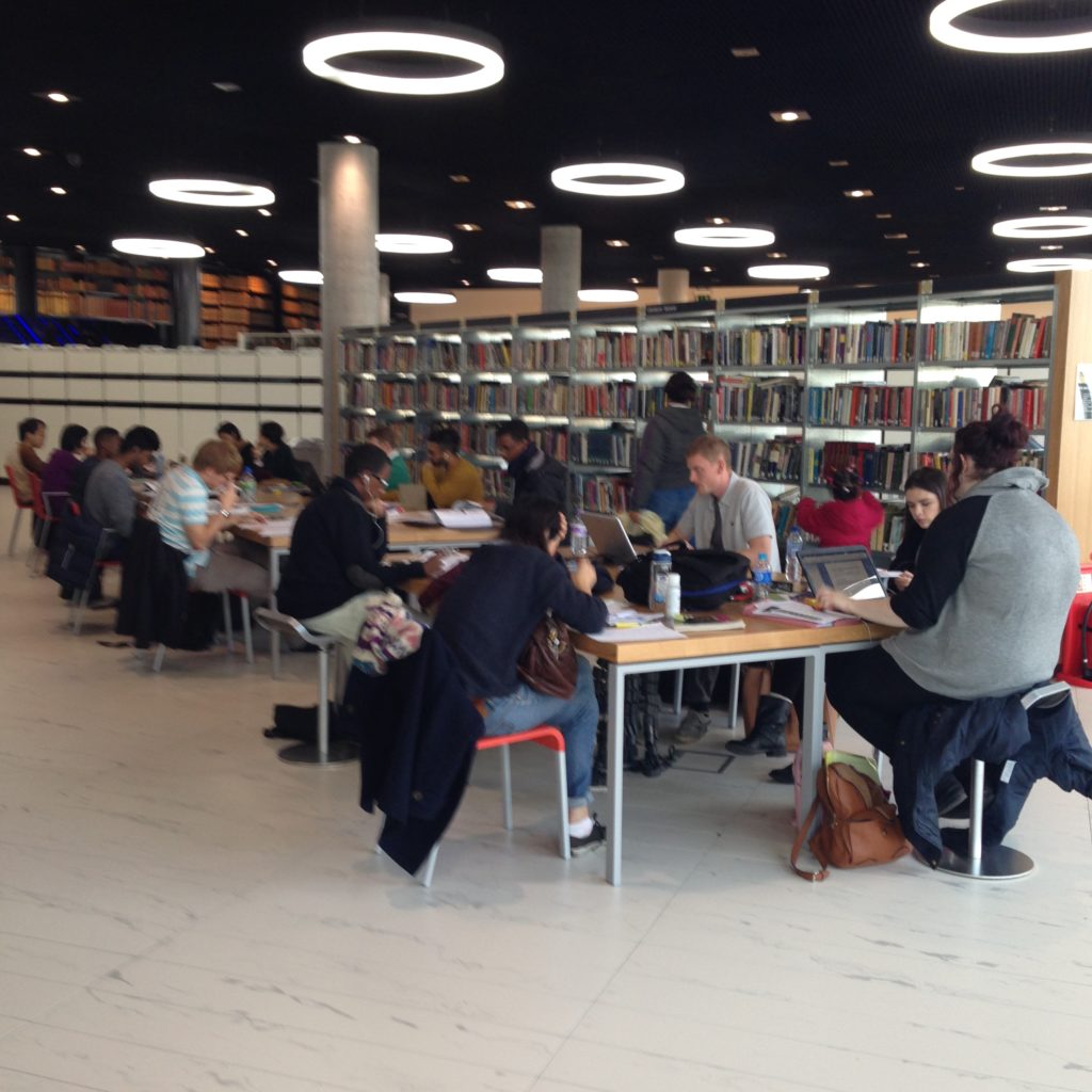
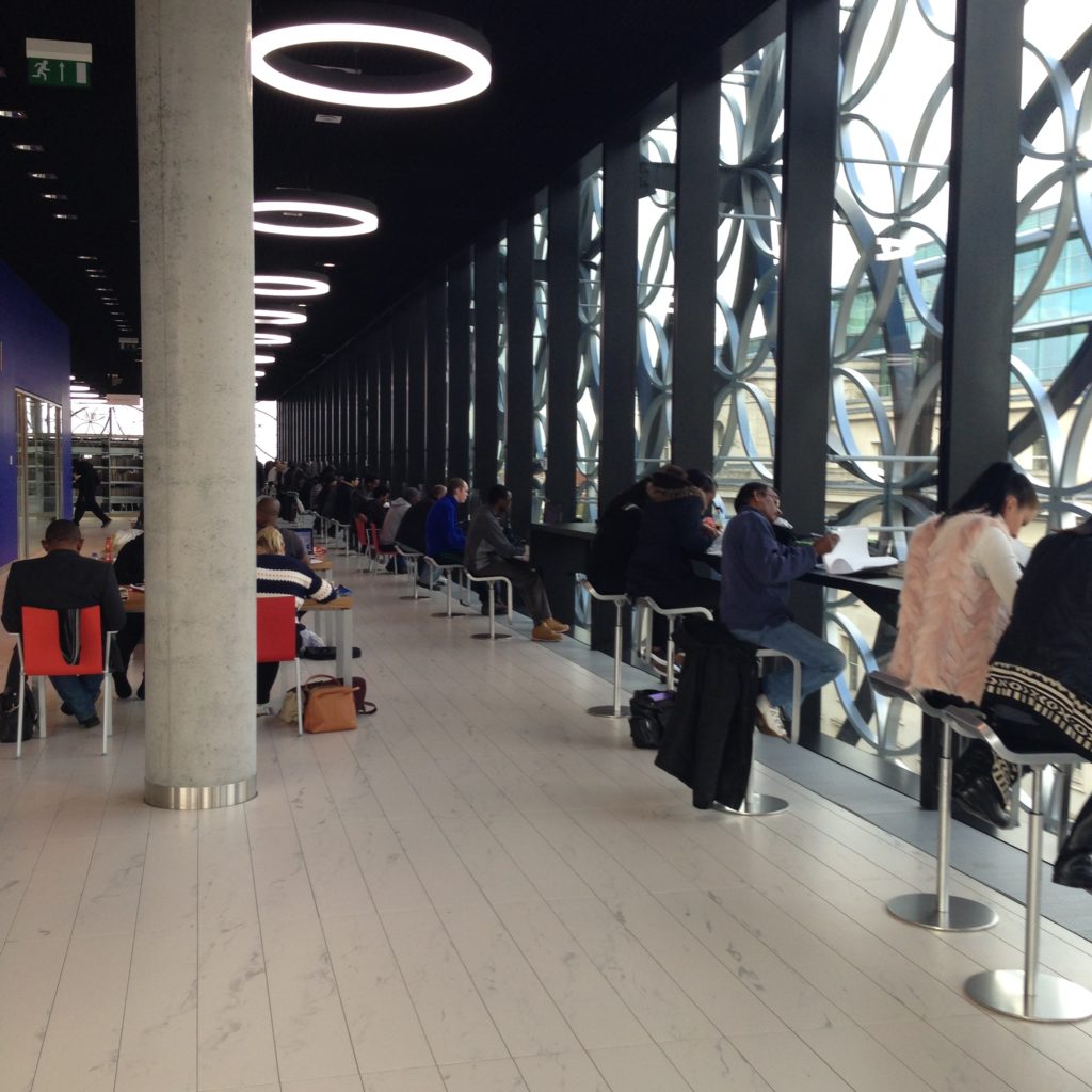
You can see three different kinds of study space here, all of it in use in spite of the unholy racket emanating up from the ground floor. Tables with supplied computers, similar tables minus computers, and the bar seating along the length of those solid glass walls. (I really love bar seating, and apparently I’m not alone in that. I haven’t seen a library without bar seating yet.) All those spaces are well used, but what you can see in this photo is that the fixed computers are perhaps the least well-used part of the space.

Those of us watching computing have been waiting for the moment when the other shoe drops and patrons visibly begin to prefer to use their own computers in public spaces rather than use public terminals. This is a natural development, and frankly I’m surprised it’s not more in evidence back home at UTM. But here, it seems pretty apparent to me that personal computing is just that, and the people of Birmingham have no issue bringing in their own devices and computers. Because there are no chairs around that pod in the middle of the picture, the one with the fixed computers on it. The computers have been left to sit on their own, but the chairs have gone off to places patrons would rather use.

This might be where some of those chairs have got to. I think this is where we start to see some of the gaps in the space emerging. This is a private study area ringing a stairwell. (If you can call it a stairwell when it’s full of blue-glowing escalators.) I’ve seen this in other libraries, and I think it’s really good use of space. Having private study space in a public traffic area but looking outwards (either to the view outside through glass, or into a vast internal space like a central stairway) makes for a really nice happy medium, I think. Lots of people want to work on their own but feel connected to the activity going on around them rather than in total silence. This kind of space provides that, and also provides a kind of dampening effect over all. When people come up the escalator, they see the patrons with their noses down working, and that’s a cue to lower your voice.

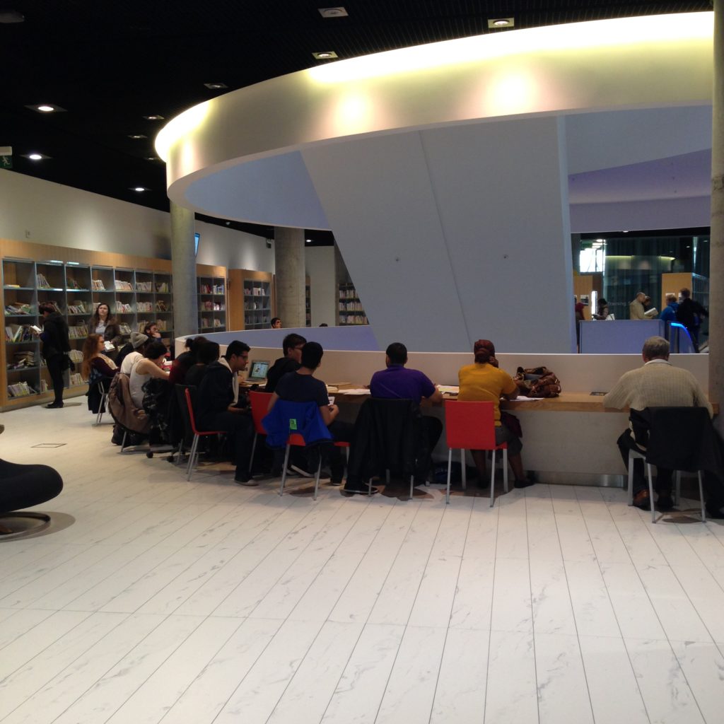
But you’ll see those red chairs, the ones I’m pretty sure don’t belong there. They’ve been dragged over from other areas, and the boys are sitting together. They’re sort of working together, but the space isn’t really allowing for it. You can see they’ve shoved their chairs back a bit in an attempt to create a space for more than one. They’d probably rather be at a place like this to work:

But it’s full up. And to be honest, quiet as a tomb. This space, in spite of the “collaborative” look to the tables, is being used as a reading room. Each of these people are working independently rather than collaboratively. And, if you note the stool pulled up to the first table, it’s got a chair problem as well.

Why would that young lady bring a stool that belongs to the bar seating area, and thus is completely the wrong height for the table, to a table where she’d have to crouch over to use her computer? She’s not doing it because there’s a failing in this space. She’s doing it because of a failing in the other areas. She’s there for the power. These are all powered tables. If you’re sitting at one of these tables, you can be sure you’ll be able to plug in. Strangely, in the areas designed for more individual study, the power outlets are only every third or fourth slot.

Maybe this space would be better for collaborating:

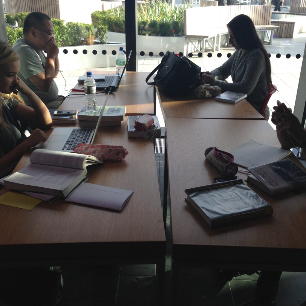
From a distance it looks like one large table, but as you can see, it’s not. These are four individual areas, and they’re being used that way. Individually.

I’ve written previously about the desire to have “flexible” spaces, and tables that break apart goes hand in hand with furniture on casters. But this is what happens; those breaks between the tables are indicators of how much space is yours and how much is mine. So these are private study spaces as well.

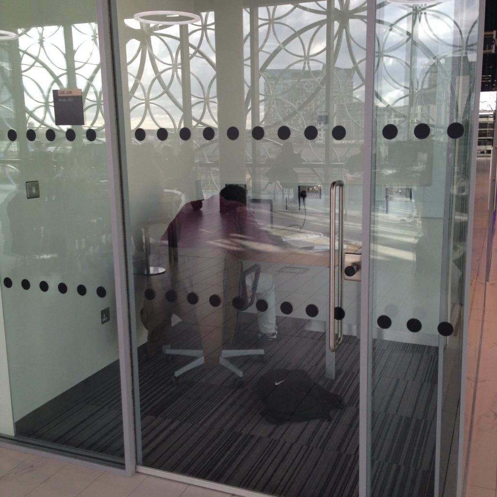
This is the first time i’ve ever seen individual study spaces hived off as study rooms. Each of these little rooms only fits one person. There’s only one chair in each. Given how noisy this library was on the day I visited, I could understand why they’d go out of their way to create silent spaces. And I suppose, if you have the room and the budget, why not? But I was beginning to seriously notice a trend here: almost all the spaces I saw were providing indicators that they were for individual use, even the spaces that were designed to be shareable.

Chairs walking off isn’t an unusual problem, but this library is suffering quite badly from it. You see where those gaps are? Chairs that walked, mostly in the pursuit of power. This is a brand new library, so I’m a bit surprised that there  aren’t outlets absolutely everywhere. But they’re aren’t. They’re few and far between, much like the chairs. You have to go on a hunt for it, and then hope there’s a chair there for you as well.

Perhaps a time will come when we won’t need so many outlets. Maybe computers and devices will have batteries that last days or weeks at a time rather than 2-6 hours, tops. We can hope for that, but in the meantime, power may be the single most important service a library can offer to support the use of technology. It’s not computers: remember that pod of computers above that’s unused and unusable because of the absence of chairs. Maybe it just comes down to this: chairs, power, and wifi. That might be enough to make magic happen.

The Library of Birmingham, as beautiful as it is, is showing signs of scarcity of two of those things: power, and chairs.

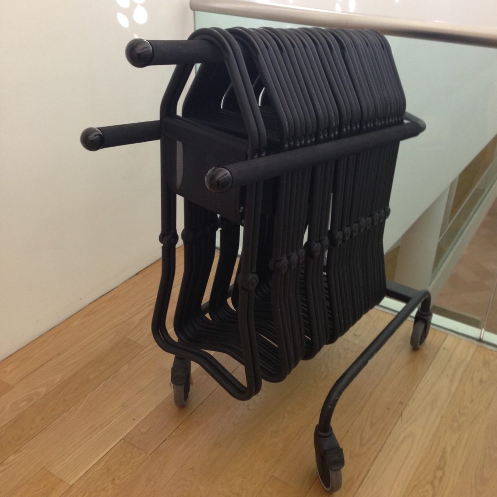
Over a year ago, I found a stack of study chairs in a hallway at work. I think they were there because they were off to get cleaned, but I needed some extra chairs, so I liberated them and wheeled them into the tech centre. I needed a couple of extra, and there were a few more than that, but I figured it wouldn’t hurt to have a few extra chairs on hand when instructors drop by with their TAs. As it turned out, having extra chairs in the room was outrageously useful. They call pulled out, rolled around, and used by everyone, staff, faculty, and students. Extra chairs are friendly and genuinely flexible. They added a bit more functionality to the space. While at the Library of Birmingham, I realized how valuable it was to see a stack of extra chairs in a space like this. People are essentially expected to fight each other for a place to put their bums. They have to make radical choices, too: computer, or no? Comfort, or no? Power, or no? It’s like Survivor but with chairs. When there’s a scarcity, people will retreat to the most conservative position, and I think that’s what’s happening here. There’s very little collaboration going on, and everyone’s just grateful they can sit down and plug in (if they’re lucky).

I’ve noticed something twice now in non-library settings: extra seating where patrons can grab it. I didn’t get a shot of the extra seating at the Wellcome Collection, but I’ll be back there in a couple of weeks. They’ve got heavy white stools patrons can pull down from their storage area and use wherever they like. The National Portrait Gallery has these:

Grab your own stool, walk around with it. Sit down wherever you like. Sit with others, or sit on your own. It’s up to you, because these chairs come with no conditions.

Of course, portable stools like these make sense in an art gallery. It’s quite a nice touch, I think. Galleries are intensely physical spaces that require to you to move through them to experience them. They aren’t tremendously flexible spaces because the art isn’t there to be shifted around by patrons. The flexible bit in an art gallery, primarily, is the patron. But galleries and museums have open and broad spaces for people to fit inside, big vistas of wide corridor, essentially, so why not give patrons slim seating to place where they see fit? The institution doesn’t decide where it’s needed. You do. It’s still the patron fitting herself around the gallery, but in a much more comfortable way.

If I had to give any advice to the Library of Birmingham right now, I would say: take a page from the National Portrait Gallery. Stick extra chairs all over the place. Far too many of them; make it feel like there’s an abundance of chairs. I suspect the space would get used differently if there weren’t a constant low-grade war going over the ability to sit down.

Tech I have Seen

Tech I have Seen

These don’t fit into any particular theme or category. It’s just some stuff I thought was cool.

This is the front reception/information desk and the box office at the British Library. I really dig the projected clock on the wall behind them. When I saw it, I wondered if they projected messaging up there as required as well. But thye were pretty busy, so I didn’t ask. Cool, though! Simple projection!

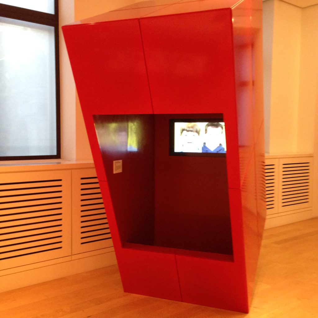
Video booth at the Wellcome Collection. You don’t exactly stick your head inside, but it’s tilted forward to keep the sound mostly limited to the area right around it. It also provides a bit of glare protection and dimmer lighting so the video is clearer.

Biometrics exhibit at the Wellcome Collection.  It checks your height, your heart rate (you stick your finger into one of the holes in the wall, a light flashes above it to show you which one), it scans your retina, and more to create a mandala of your biometric information. The touch screen wasn’t very sensitive, but I was impressed that it could collate so much information about me without human intervention.

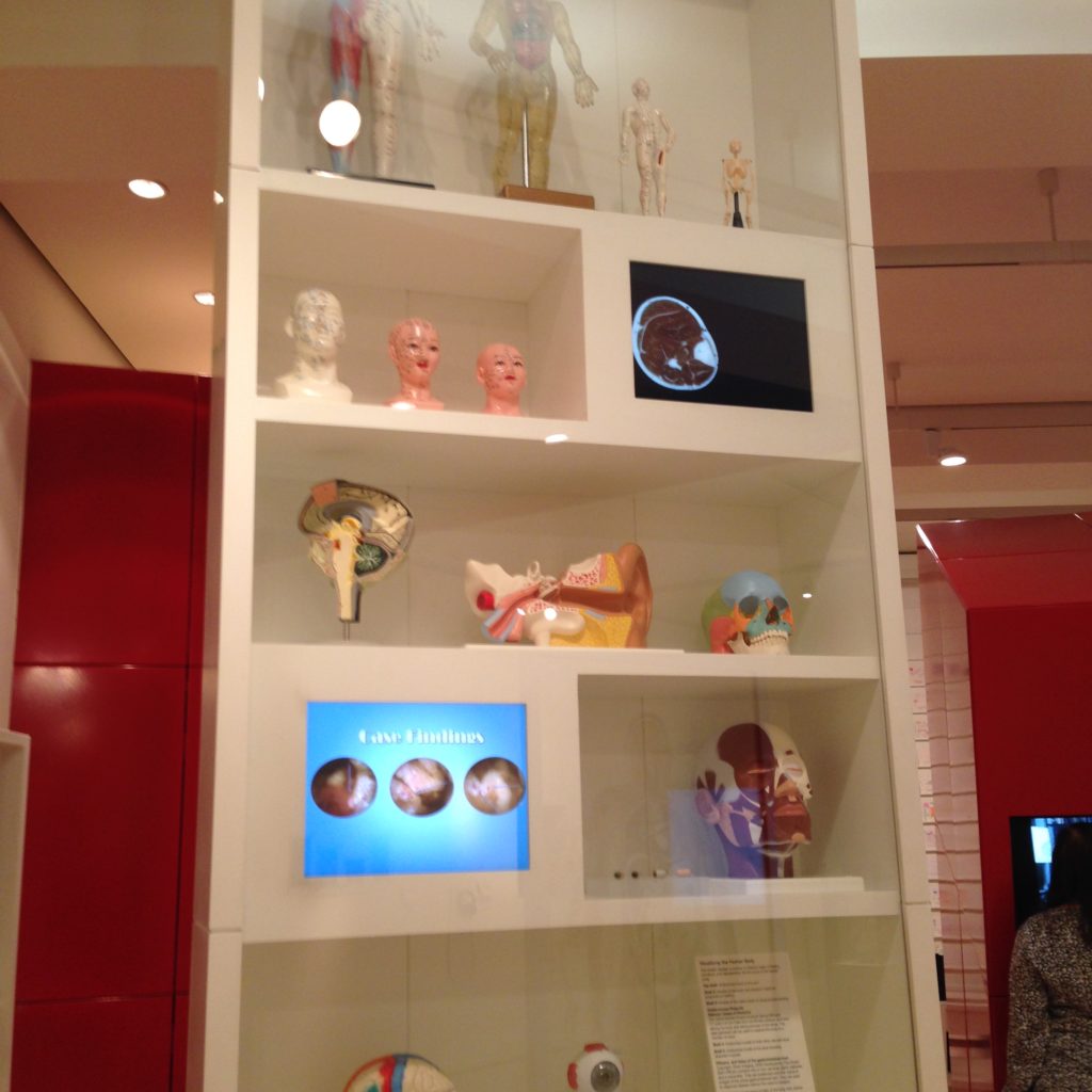
Display case at the Wellcome collection. It’s got digital information on display along with physical objects. I thought that was pretty cool, displaying digital information as objects, bits and pieces.

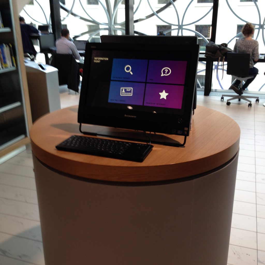
Person-free help point. These terminals are all over the Library of Birmingham. It’s a touchscreen, but there’s also a keyboard. Librarians are nothing if not thorough. Iti provides basic information about the building, what’s going on, and where to start on your project.

Video terminal in the National Portrait Gallery. It’s placed thematically with the physical collection, but lets you see things it’s hard for the gallery to display well or safely. In this case, it’s a display of miniatures. While we tend to think of computers as open-ended things that can be a portal for the patron into a world of any and all information, there’s something to be said for adding restrictions. This terminal doesn’t do everything. It only shows one particular collection.

I also really like that the signage information is painted directly onto the wall. That’s something galleries always do and libraries almost never do (but probably should consider doing).

The street is actually called Navigation Street, but this bus stop totem in Birmingham really impressed me. It’s awfully classy that it tells you how many minutes away the buses are from you, but it seems like a perfect opportunity to give people some actual navigation information as well. London has non-digital totems that show you a map with all the major landmarks in the vicinity, and a nice yellow YOU ARE HERE blob on them. It seems like these could do a good service being both a bus notification system, a map, and possibly provide some basic directions to things people are likely looking for.  Talk about way-finding!