Interactive Computing
There is a monumental shift going on in computing. It’s a technical change, a software change, and most importantly, a change in the way we think about and approach a computing device. This change has to do with what a computer is.
We’re familiar with the more radical end of this change as the smart phone revolution. It used to be we had two very distinct devices: a computer (which sat on a desk, had a screen and a keyboard, and required us to bring a chair up to it so we could rest our fingers against the keys) and a phone (which could be attached to the wall, sit on a table, or, eventually, fit into our pockets, has small keys, or, increasingly, software-only keys). The rapid merging of these two devices has left us with some very confused metaphors for computing. As librarians, we’re not entirely sure anymore how to signal to a patron that we have set aside a device for their use. We set up computing so that patrons can use them, but we struggle to break free from the workstation metaphor, even when it would behoove us to do so.
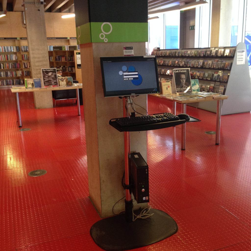
A catalogue-browsing station at the Idea Store Whitechapel. The attempt is clearly there to get rid of the workstation and move into a more flexible approach to bringing digital search and information into the physical world, but of course you still need a keyboard, a mouse, and a monitor, right? (Horseless carriage, anyone?)
Not to point fingers only at the Idea Store. This is tough, a lot of people are struggling with it. This is a tough one. But this terminal is just a stand up desk, really. You can’t put your stuff down on a table, and you can get stuck in for the afternoon of checking your email and writing an essay. It’s not comfortable enough to be a workstation. It says, “You, patron, may use this computer to do simple things, like looking something up.” Patron in that case is most definitely singular.
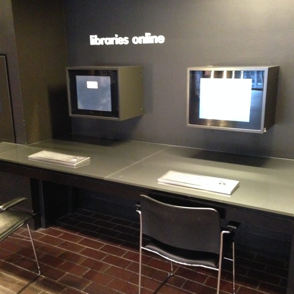
Here’s the not-especially-innovative interactive stations outside the Barbican library. Here we haven’t even moved away from the idea that you have to sit down to interact with digital media. At least they’ve got those steampunk keyboards with the included mouse to avoid all the extra wires. Rollerball for the win!
Once again, the layout is telling us how many people should be using these stations; one person per. If you were to bring the second chair over to look at something with a friend, you’d be depriving someone else of the use of a machine. Without intending to, we shout out our belief that computers are single-person items.
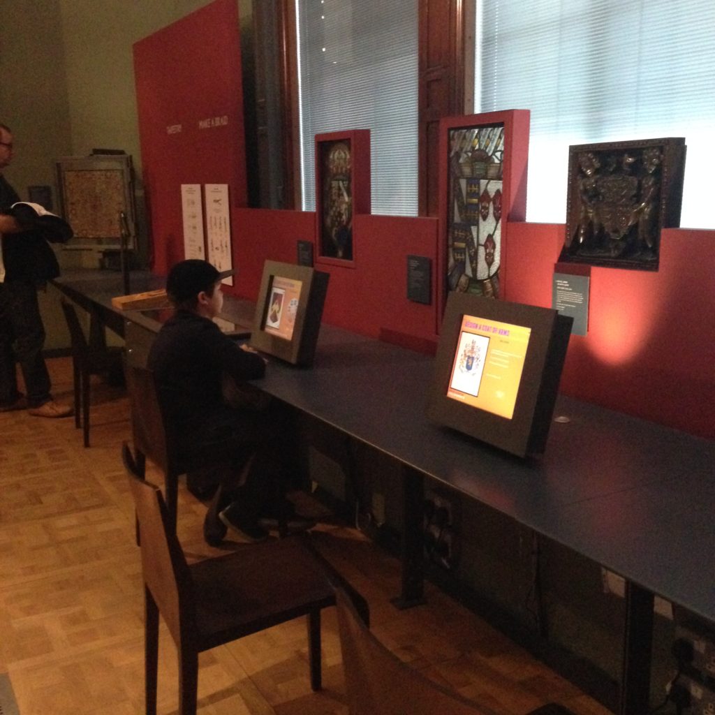
Everybody really likes the idea of bringing digital information into an experience; there’s just so much of it, and there’s no way any space, library, museum, or otherwise, can have any hope at all of bringing all or even most of it to its patrons without using screens. But very often you can see innovative spaces, like the Victoria & Albert Museum here, resorting to screens and chairs, in keeping with ye olde workstation metaphor. Is this the best way to bring digital information to patrons? It’s certainly the easiest. And the simplest for the patron to understand.
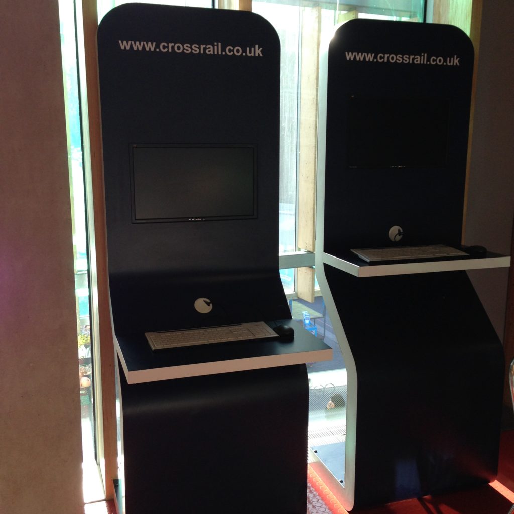
And not to say that these stations aren’t interesting and thoughtful; a lot of them are. These are the Crossrail information terminals at the Idea Store Whitechapel. As profiles go, these are pretty slim. For a workstation that’s been straightened out so you can approach them while standing as use them, yeah, they’re great. But this metaphor is wearing very, very thin. One person per screen, please. We started out that way in computing, and we keep reproducing it.
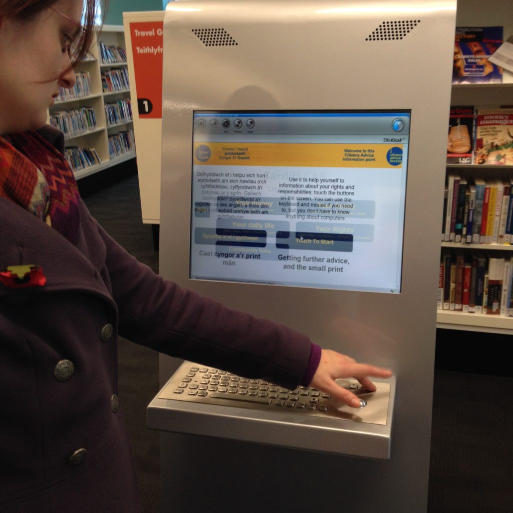
This is a really nice monitor/keyboard/rollerball mouse set up at the Central Library in Cardiff. That’s my friend Imogen; she went straight for the keyboard, because it was there, so she assumed it was required to use the machine. That’s a touch screen, though, as I showed her. (I can tell it is: of course it is! It’s high tech! This is a standing totem terminal, of course it’s a touch screen!) Because the affordances of the set up return the patron back to the workstation metaphor, all the interesting affordances of the touch screen go flying out the window.
The touchscreen, which replaces the keyboard and the mouse pretty effectively, is not a new technology anymore, and a lot of libraries (and museums, and all kinds of other spaces) have them. But libraries may be the last ones holding on so strongly to the keyboard. I understand why we do it; it’s true that you have a lot more scope with a keyboard. You can short-circuit whatever the designer thought you were going to do at this terminal with a keyboard and do what you need to do. It’s flexible. It makes that terminal ready for anything, and we really like to be ready for anything. We hate restricting what a patron can do. But unfortunately that flexibility puts the device, and by extention the patron, in a very tight metaphorical box. In trying to make sure a patron can do anything they want, we often don’t use contextual and layout clues help them do the thing they’re probably there to do.
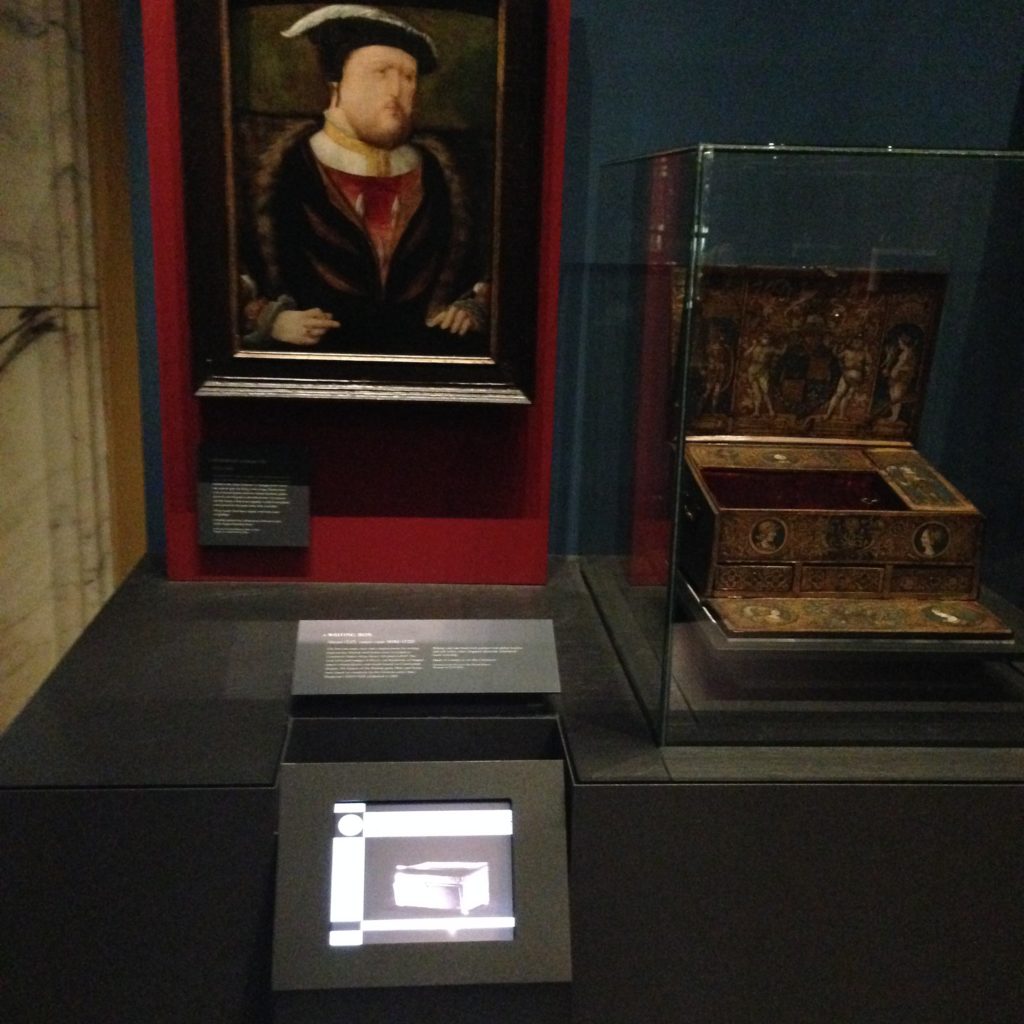
Here in the National Portrait Gallery they’ve got images, objects, and digital information all threaded together. The digital information is relevant and interactive, though interactive in a very limited way. But it’s not pulled out and stripped of its context, which is key. It’s the [read more] of the museum world, attached to the exhibit without overwhelming it. The patron has navigated to this piece of information not through clicking through a web page, but by physically moving through the building. Because of the physical location of the patron, we can make all kinds of assumptions about what information they want or need. It’s those few steps before search that they’re tying into here; anticipating information needs and incorporating them into the space itself. That device on the Henry VIII portrait isn’t as flexible as the terminals with keyboards above, which can do absolutely anything, but it’s more targeted, specific, and in that moment, useful. It’s not expecting the patron to do any work at all. There’s no keywords, because the patron has indicated the keywords by moving to this point of the museum.
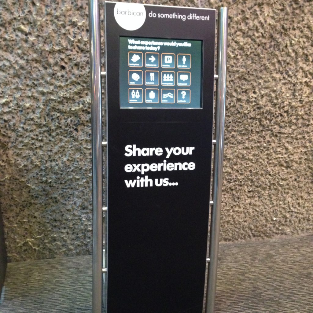
This is a fully interactive totem terminal at the Barbican, designed specifically to gather feedback from users. There’s no question that that screen is a touchscreen (obviously). No keyboard, you’ll notice. No mouse. (You don’t need a mouse with a touchscreen, because your finger is the cursor.) It’s not a computer you can hijack to check your email or jump into a search engine. It has one purpose, and it does that one purpose well. As computing has become cheaper and cheaper over the years, we’ve had more opportunities to include computing with limited purposes like this one. I think we often fail to notice that computing has become cheaper, and thus our relationship to it can now change. When a computer cost you five thousand dollars at minimum, it made sense that you wanted it to be as flexible as possible.
But that might not but the problem; lots of libraries have catalogue-only computers. We tend to make them stand up terminals to express this, and lock the software so that only that one activity is possible. We get the idea of the single use computer, we just haven’t made the jump to creating things like this:
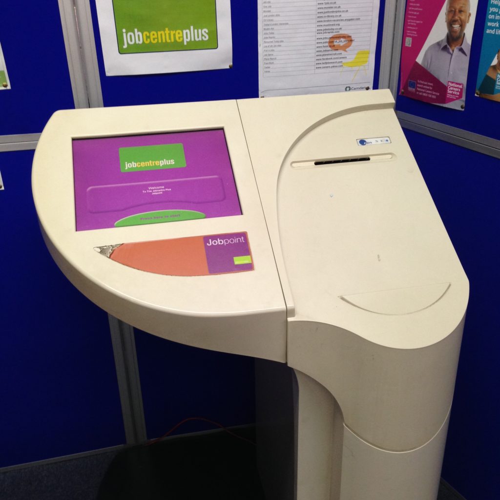
I found this Jobpoint terminal at the St. Pancras Library in Islington. It’s a small library attached to a branch of the borough council, which offers a range of services to residents, from issuing parking permits to housing benefits. The jobpoint is, as the name suggests, an interface to view job postings. Public libraries are frequently the centre of support for job seekers, but I haven’t seen such a sophisticated job searching terminal before. No keyboard, no mouse, but there is a small printer.
This is a terminal that’s sensitive to its context; job seekers can print out the details they need of a job that interests them. This terminal brings the riches of one particular database to its userbase, and one which, in this case in particular, isn’t well-known for being especially computer-savvy. Now that I’ve seen this one, I’m surprised that catalogue terminals in libraries don’t look more like this. The needs are strikingly similar. Minus the workstation metaphors, you can see how much easier it would be to provide support to someone using a terminal like this. It’s design doesn’t tell you how many people can use it at once the way a keyboard and a mouse do. It doesn’t invoke a private, personal computer. Anyone walking up to it knows it’s not somewhere they can sit down and read a book, or work on their essay, or send some email. It’s computing, but it’s not a computer the same way catalogue terminals often are.
I keep looking for the holy grails of collaborative-friendly computing spaces, and they are few and far between. I know they exist, I’ve only just started my explorations, but even seeing attempts has been helpful to framing what it is we’re doing, and how we might consider creating different kinds of spaces and interfaces.
I visited another high-tech place this week, which looked like this:
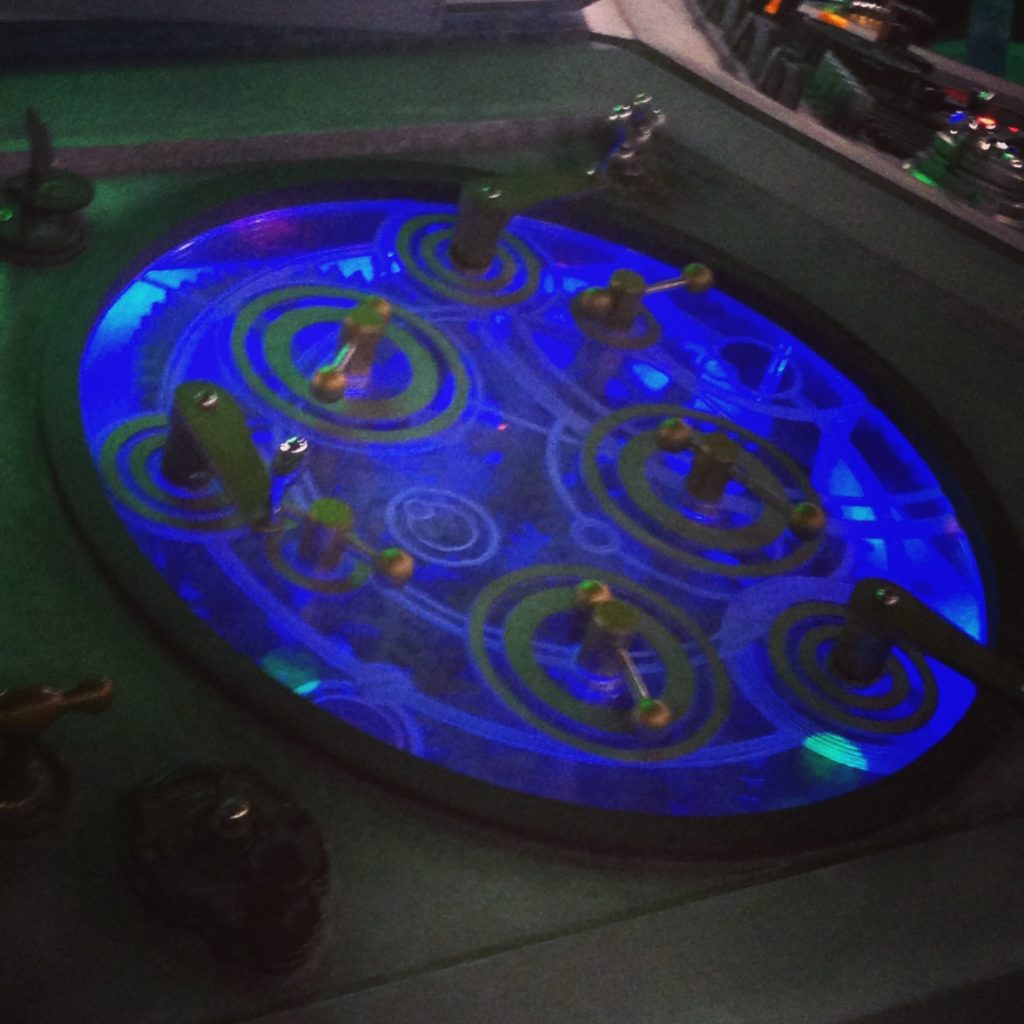
As we know, the TARDIS can be operated by a single person. It’s a Gallifreyan workstation, as it were. But we know it works better with a crowd.
0 thoughts on “Interactive Computing”
http://t.co/ONQqn6KCs8 with bonus TARDIS. I couldn’t resist.
RT @rmazar: http://t.co/ONQqn6KCs8 with bonus TARDIS. I couldn’t resist.