Dark Horse: Apex Networking Space

Dark Horse: Apex Networking Space

Dark Horse Espresso Bar, Toronto

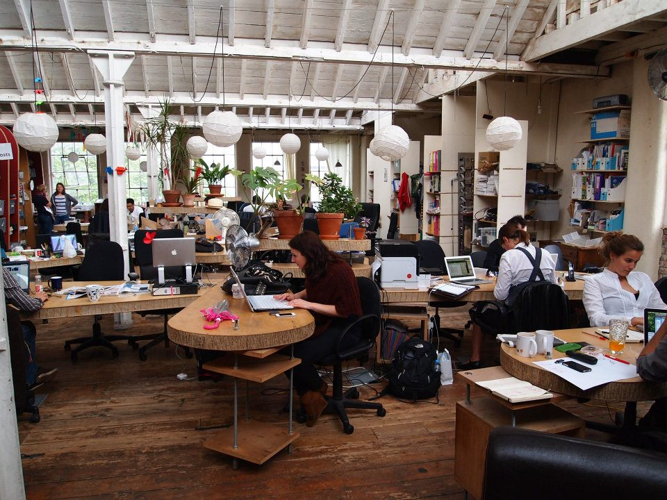
Dark Horse Espresso Bar on Spadina, in the heart of Toronto’s high tech hub, is, for me, the ultimate example of space as a networking tool. Sit here here for any amount of time, and you will hear conversations that sound like they’re probably interviews, descriptions of apps in progress, friends of friends recognizing each other across the table and showing off portfolios, and all kinds of casual discussions about trends, sales strategies, developments, and news. The person next to me is on skype. I’m sitting here as I write this, in fact, and I almost feel like I’ve dropped in on some hip new office. This is a space where work gets done. People don’t come here just to hang out; they come here to make the world a better place.

Possibly in part because the high tech sector is so flexible and full of tiny start ups that may not have offices of their own, or freelancers who want to feel part of the larger world from time to time. Or because so many businesses can benefit from connecting with each other, so a place like this acts as a living room for a busy, sprawling blended family. For all of these reasons, I think it’s an interesting space to look at with the eyes of a librarian. Because we don’t tend to build spaces like this.

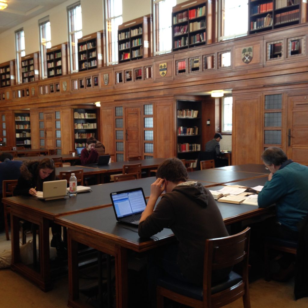
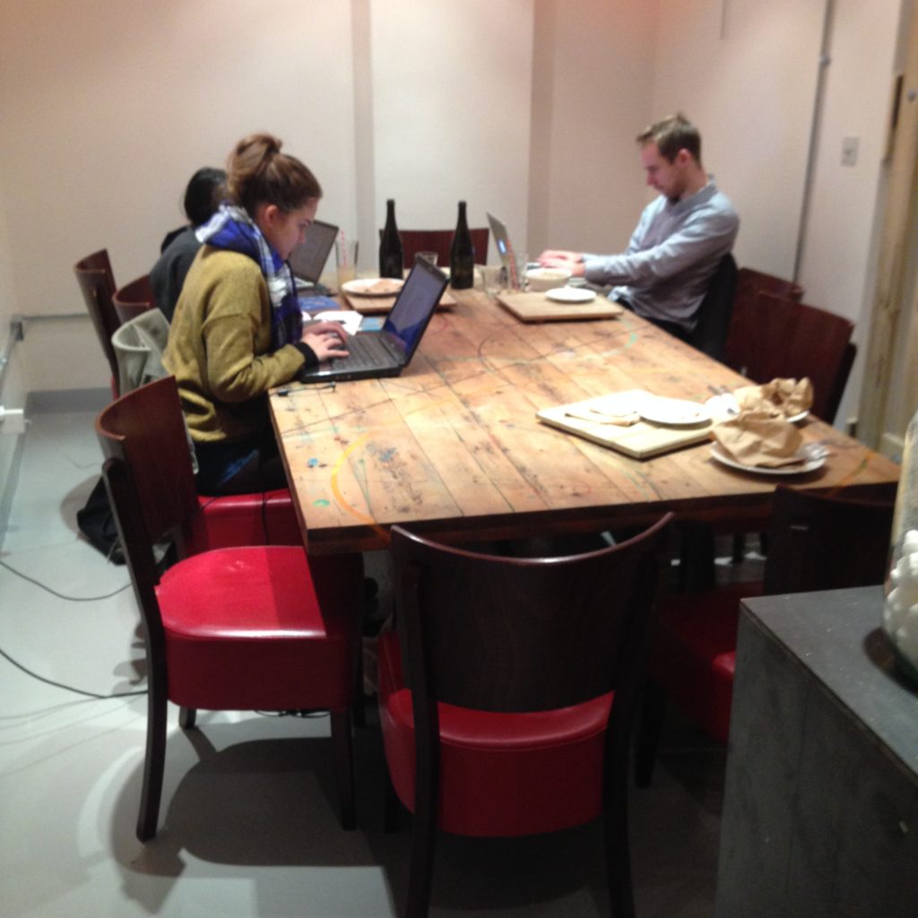
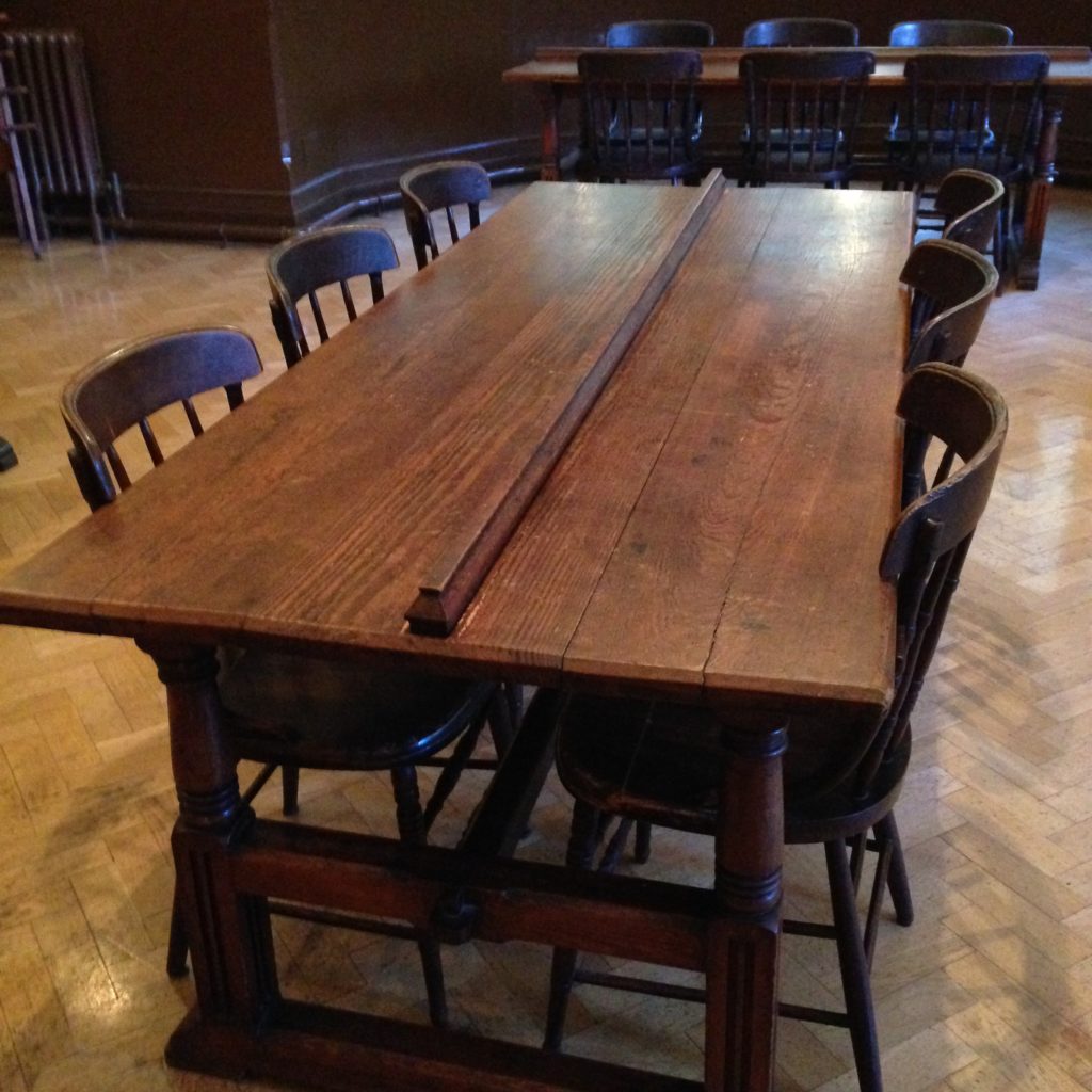
Dark Horse was my first experience of a communal table. (And the first time I sat down here, I discovered myself sitting across from someone I’d spoken to on twitter but never met in real life, in keeping with the theme.)

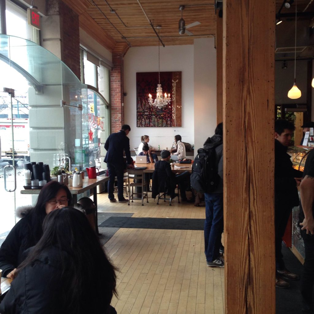
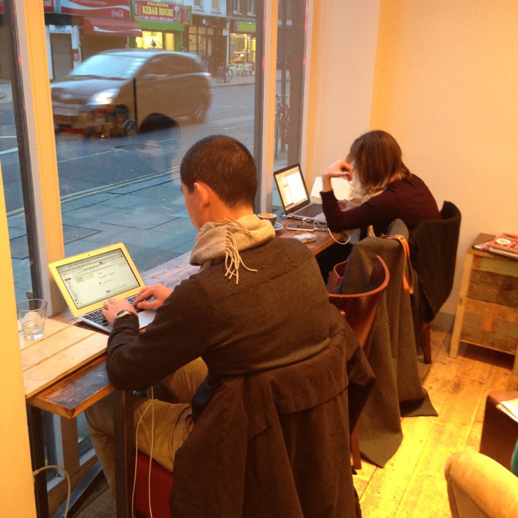
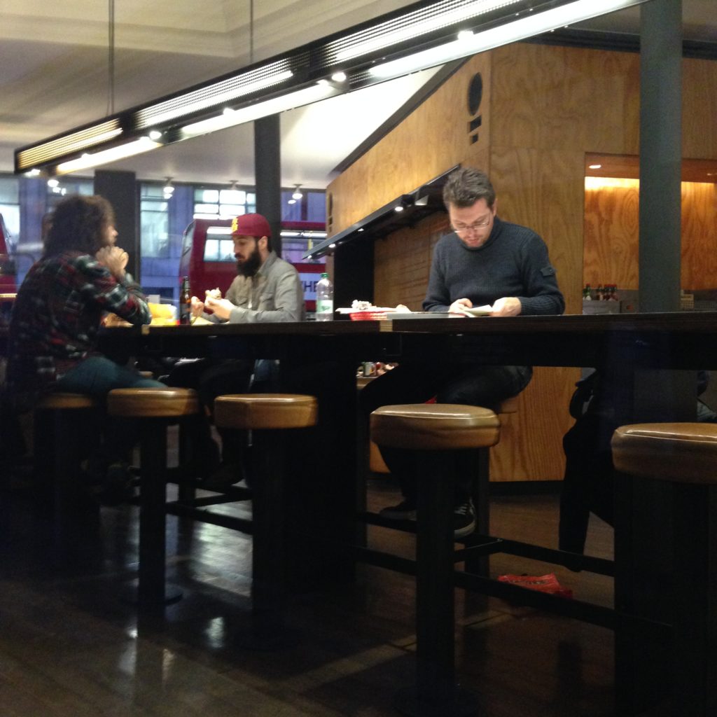
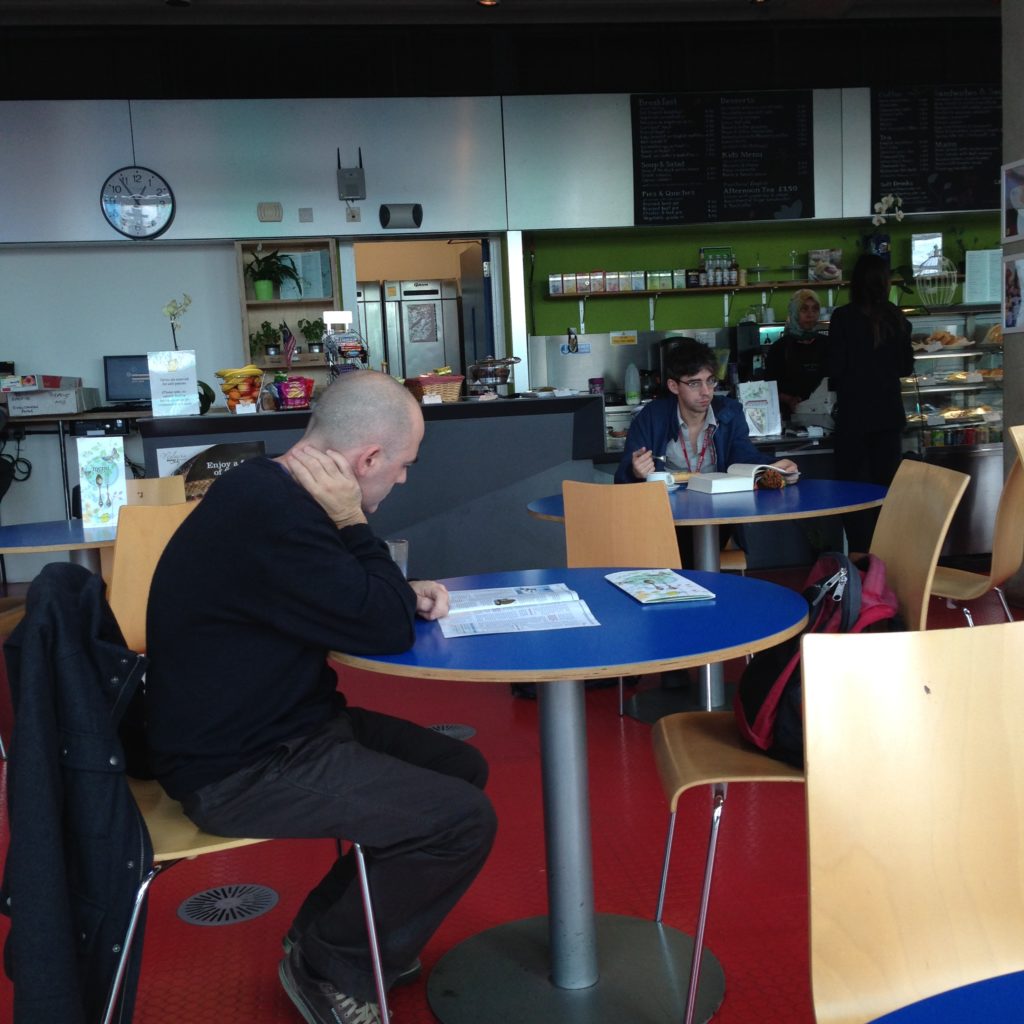
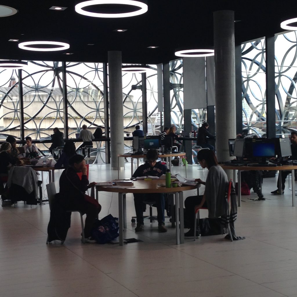
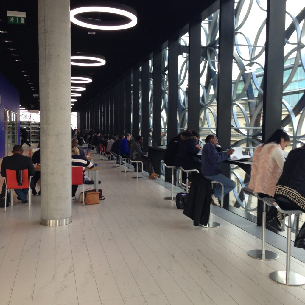
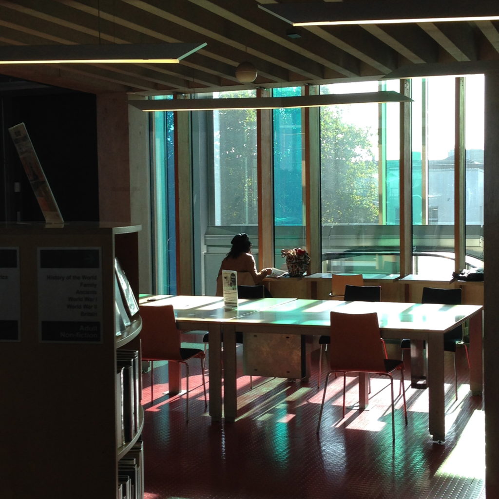
Right up at the front of the place, up by the front doors, are two large communal tables. They are so big that you can’t take over one of them yourself. So no one does. The culture of the place doesn’t allow that. You sit down next to people you don’t know, because that’s how it works.

I’ve spent a lot of time looking at communal tables and puzzling over them. I suppose that’s another post in itself, really; communal tables are very appealing, but very, very tricky. There is a direct and critical relationship between the social culture of a space and the physical dimensions of the furniture that can make a communal table succeed or fail, and the mathematics of predicting that are well beyond me. Where a culture allows a thinner table to be used communally, making it okay for strangers to sit close to each other in public, then a thin table can be shared by strangers and succeed. But strangers tend to be shy to varying degrees, and if that culture of space sharing and reduced personal space isn’t already there and understood, a communal table has to be much wider. I suspect you can graph the anxiety and shyness of your target population, the degree to which they understand the social culture of the space into which they’re stepping,  the amount of space around each chair, and the width of a communal table and get a formula out of this. I’m pretty sure there’s a science to this.

A very broad, wide table with my scarf on it

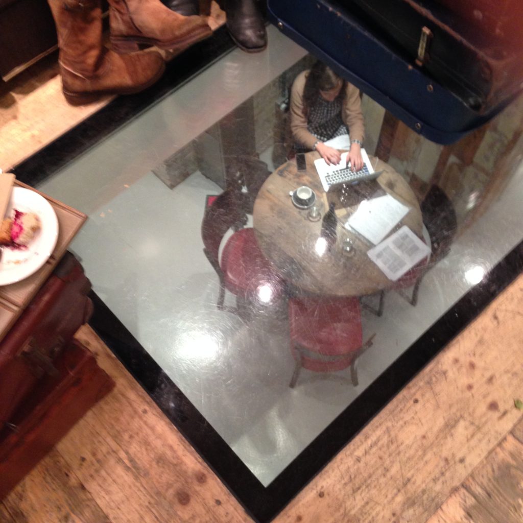
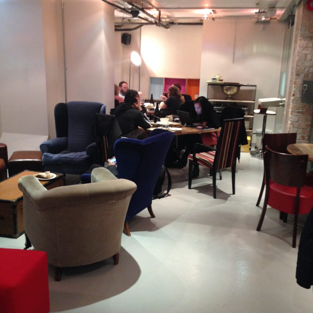
This communal table at Dark Horse is very wide. It’s a square, in fact. You’d think, if you’re a space planner trying to get as many bums in seats as possible, that it’s a bit of a waste of space. No one’s  using the middle of this table. But that space is what enforces the social culture of Dark Horse. You can’t carry on a conversation with the people on the other side of it. It’s too wide. This is, for me, the ultimate shared table. This is furniture that doesn’t negotiate. It’s not your table. It’s where we all sit, and we all do what we need to do. Sometimes that’s a conversation with the person next to us. Sometimes it’s a group of people sitting with computers open. Sometimes someone’s going to take out a phone and start a conversation. All these things are okay around the communal table, because while the purposes for being here are all different, the people around this table are opting in to sharing space this way. And feeling connected to strangers.

Smaller communal table, taking it’s direction from the larger one

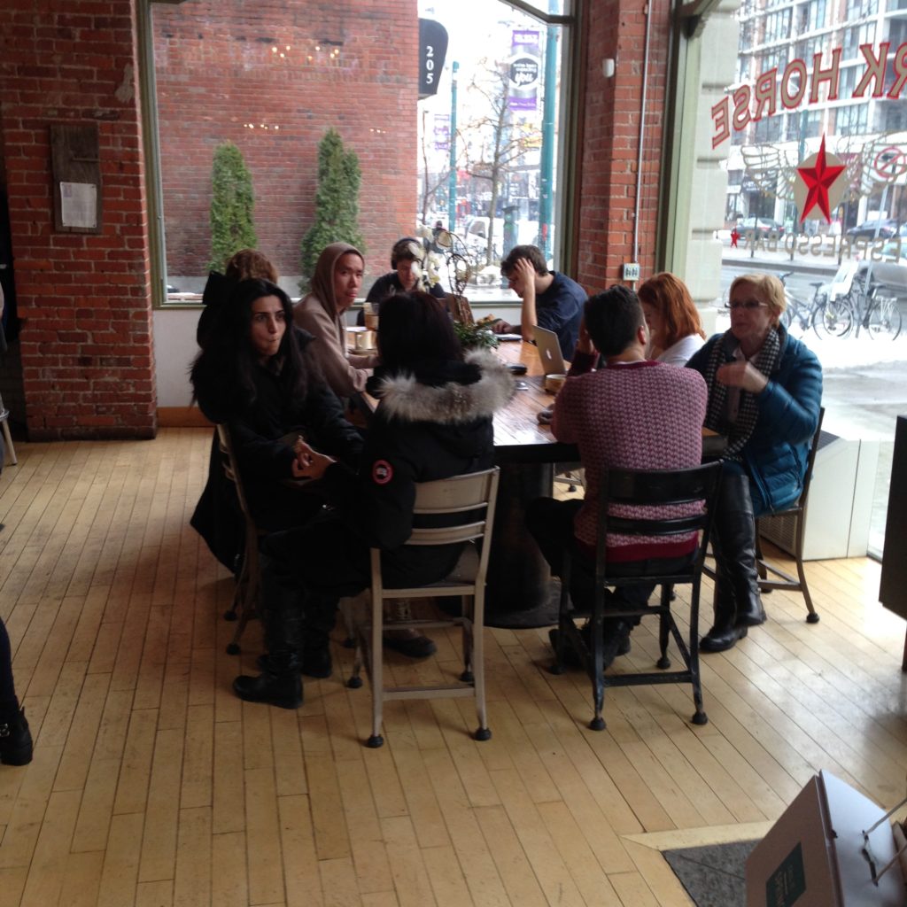
If you’re interested in communal tables, Dark Horse will be my first recommendation for a visit. It’s not the only one, but it’s the most relentlessly sharable one.

Dark Horse Espresso Bar, Toronto

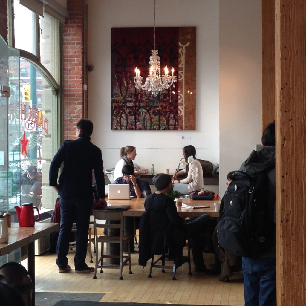
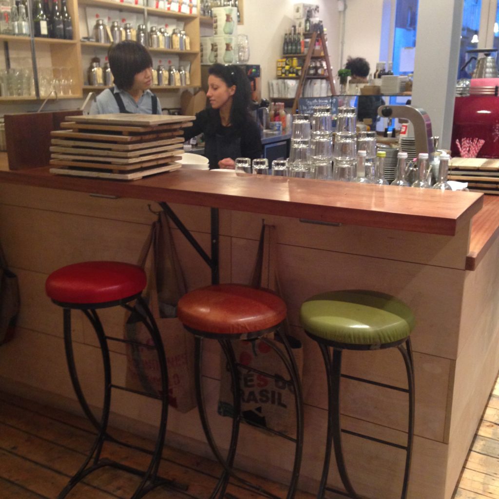
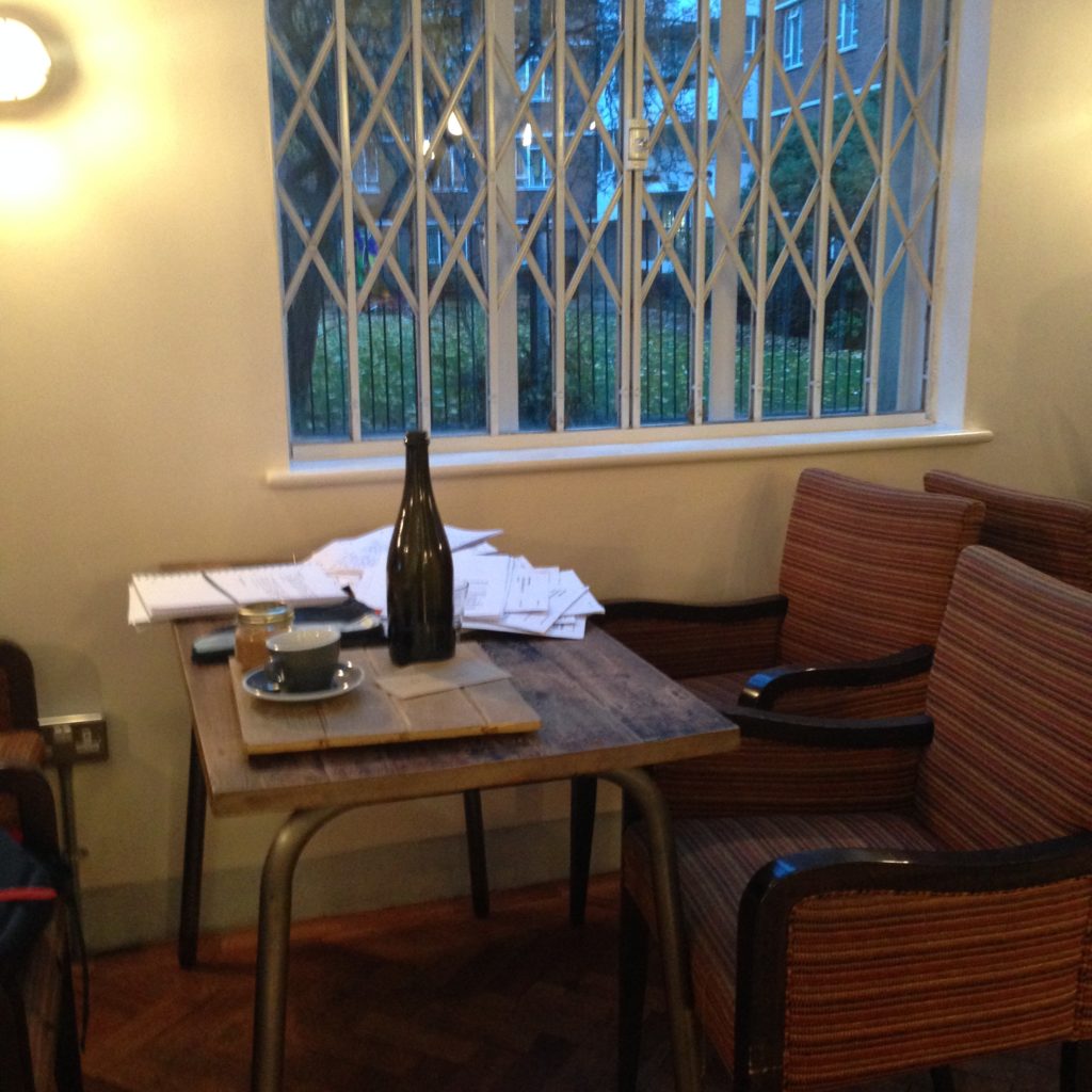
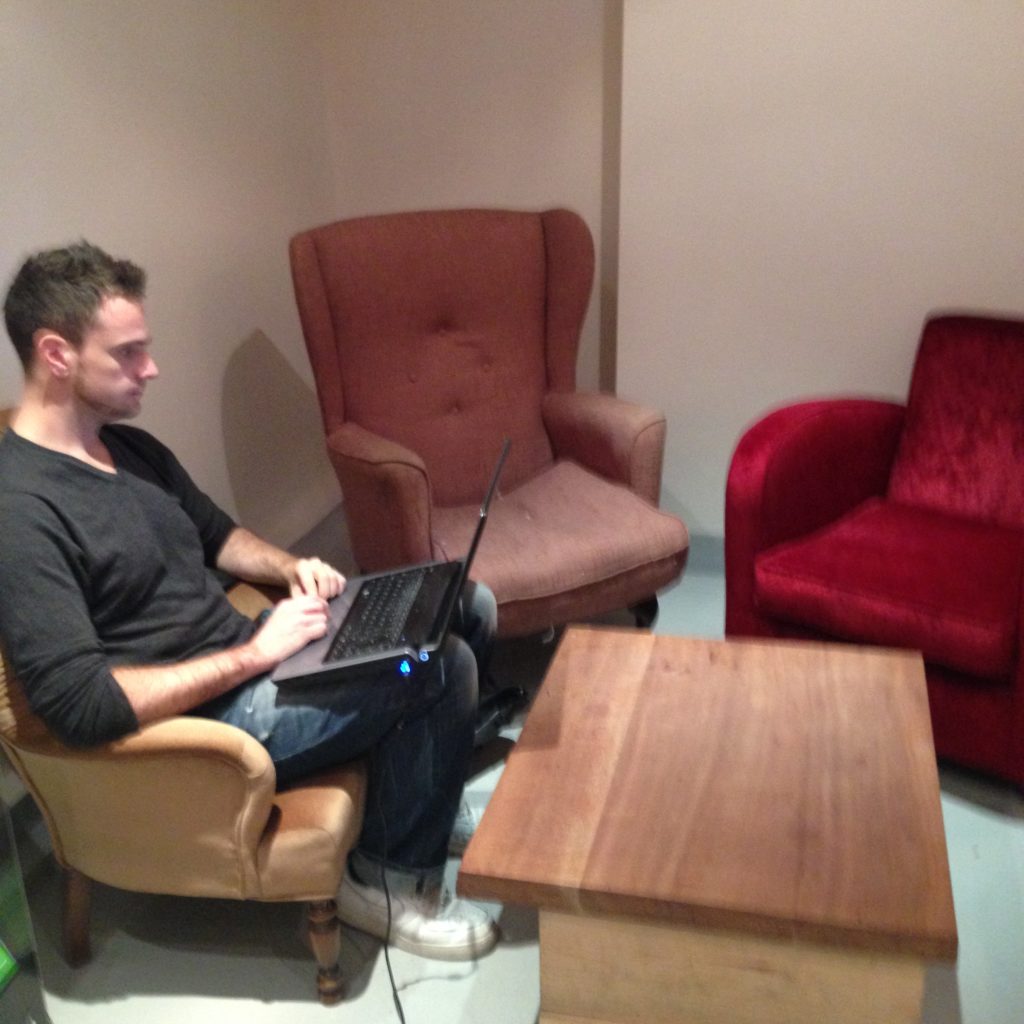
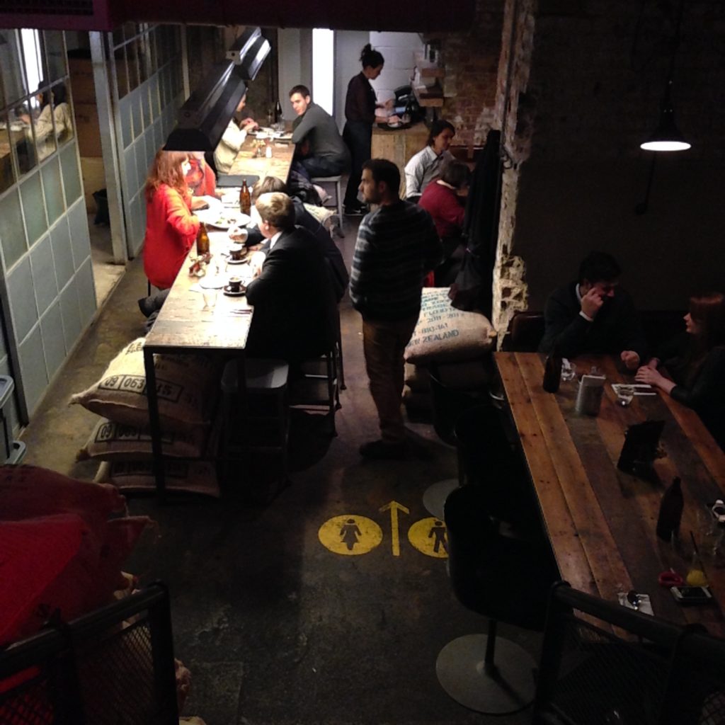
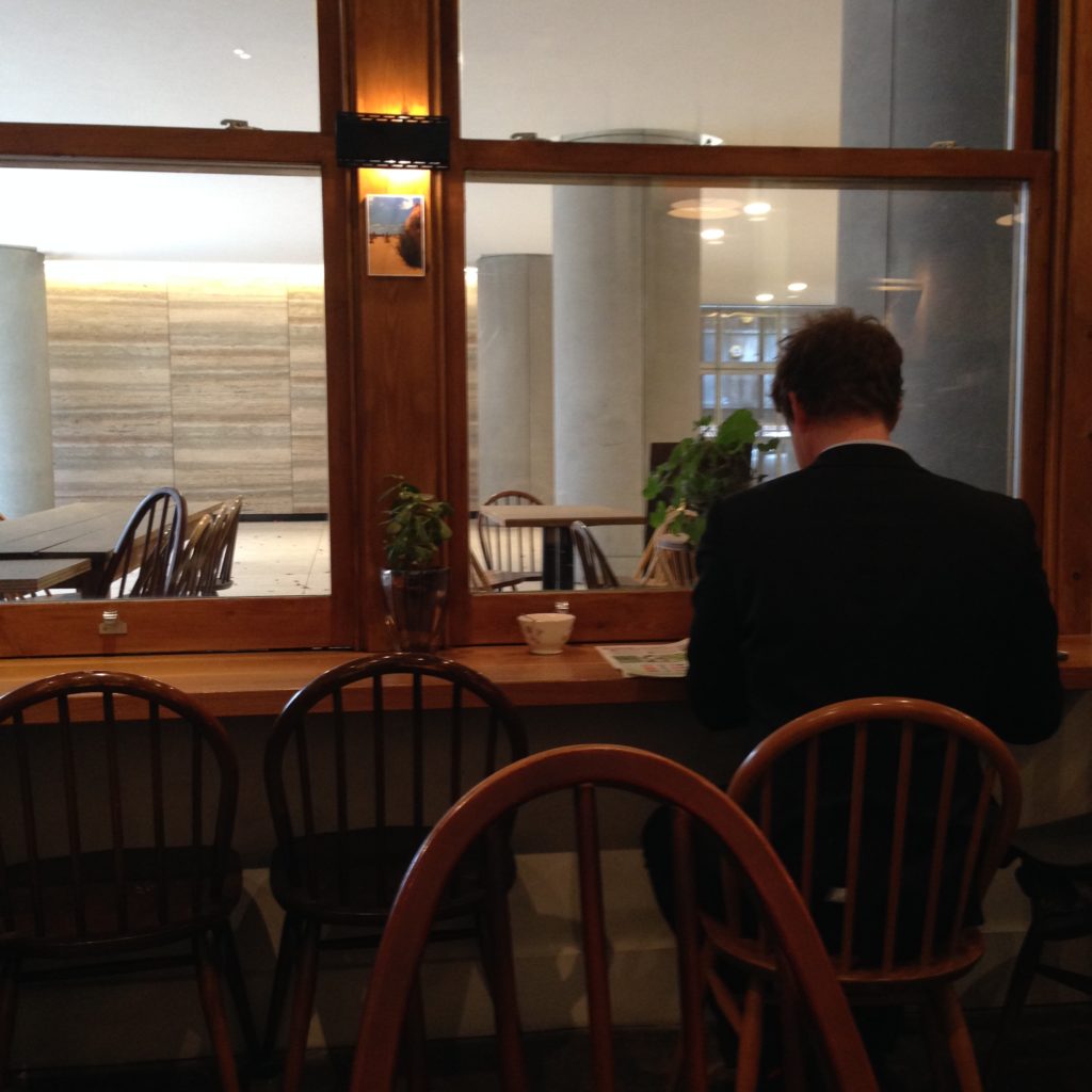
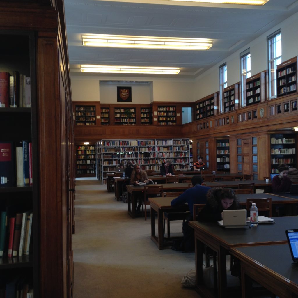
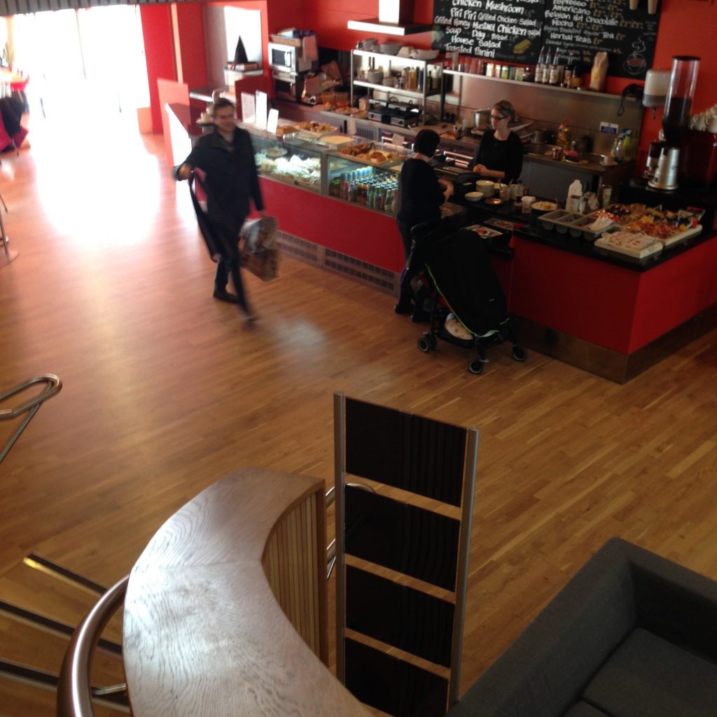
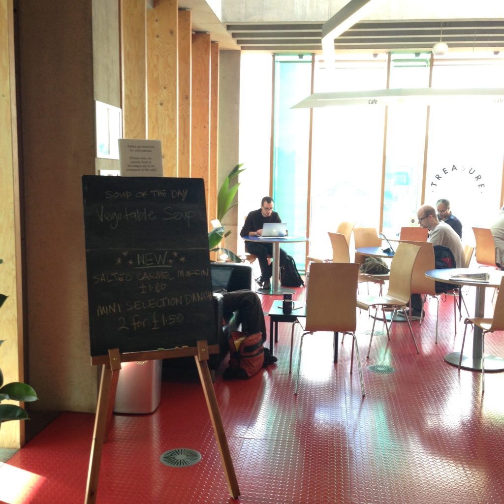
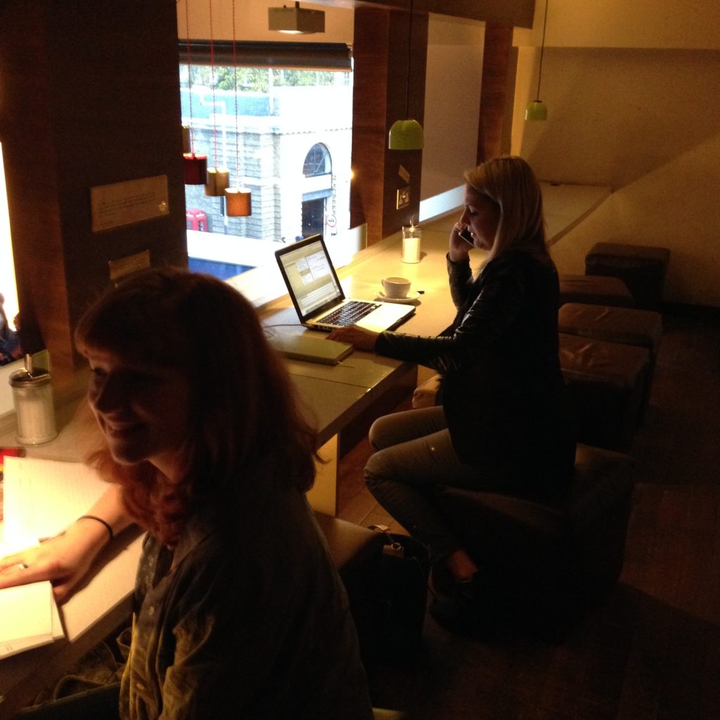
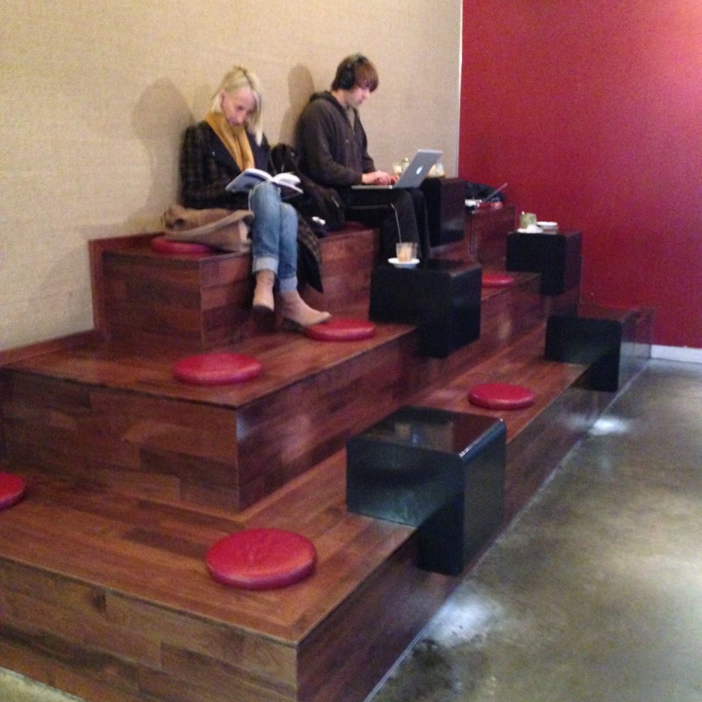
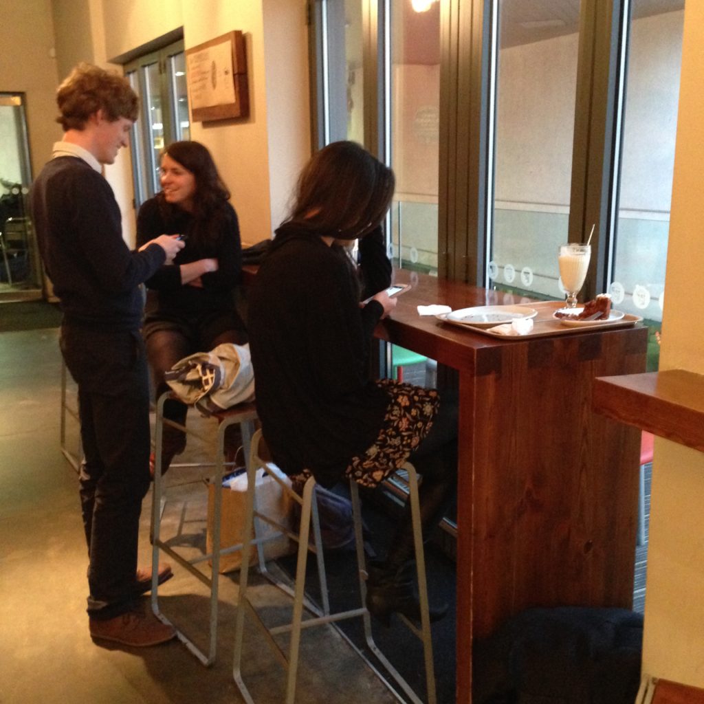
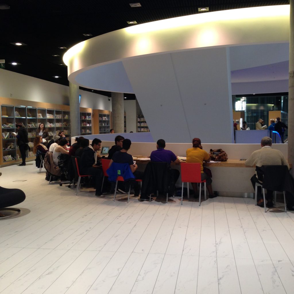
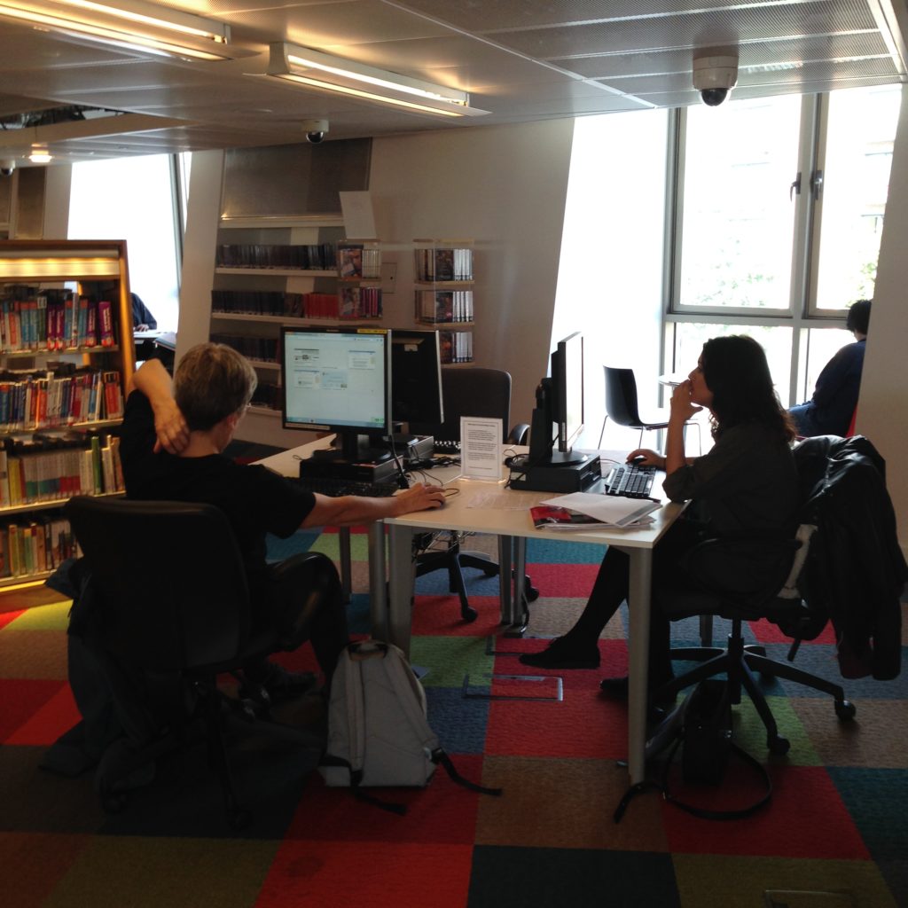
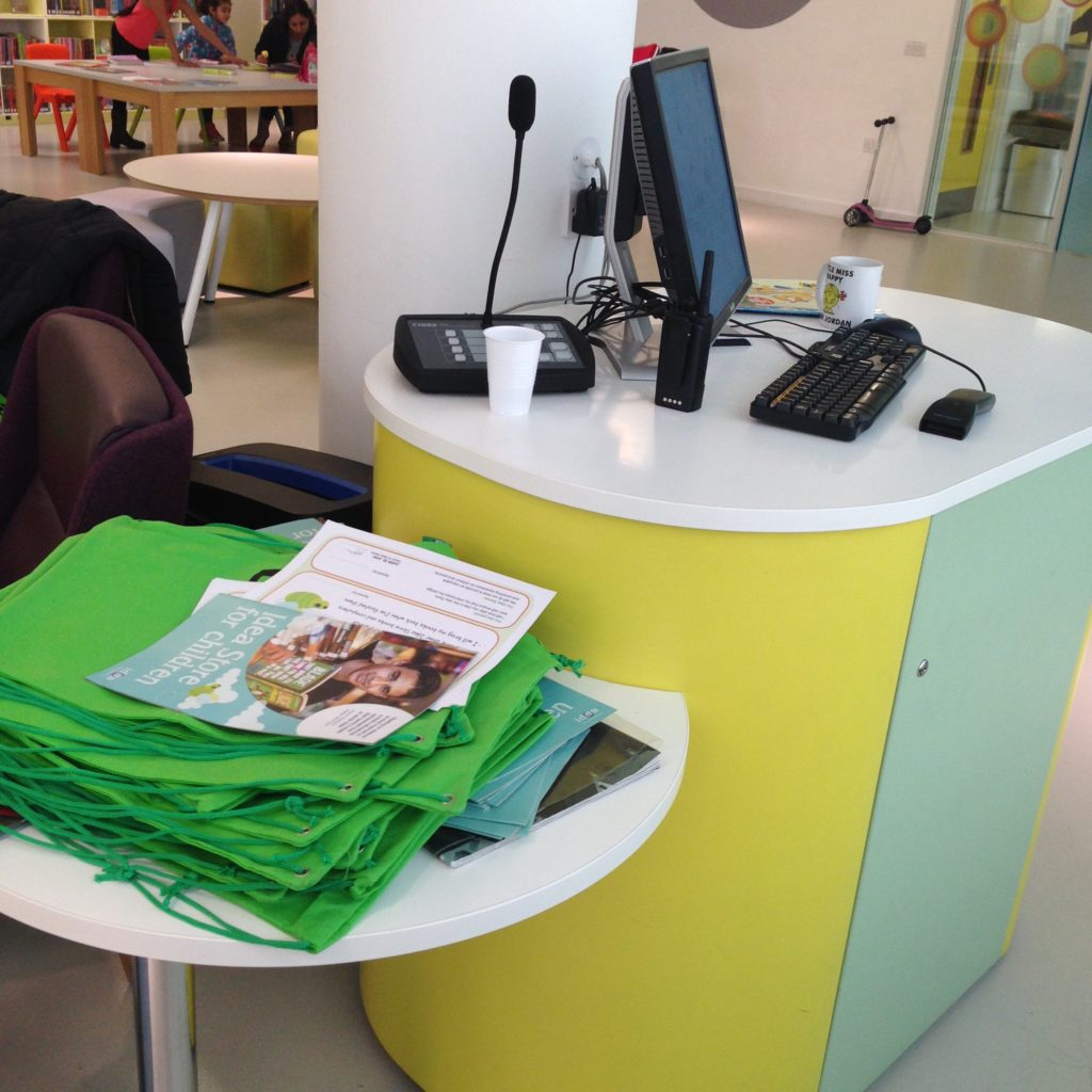
The image in my head of Dark Horse is so dominated by these communal tables that I actually failed to notice in my first two visits here that there is more space than this. A few steps up on the other side of the espresso bar, there’s an area for different kinds of interaction. Some small tables that can seat two, but are currently taken over but individuals within open laptops, a space for four or five, and a few spaces for groups of three, with lower tables. These are spaces that insist that you not sit there with a laptop. These are conversational areas. And they are in use as conversation areas: I think I walked through a business meeting when I went in to snap these pics. Sorry about the quality. I’m trying not to interrupt anyone.

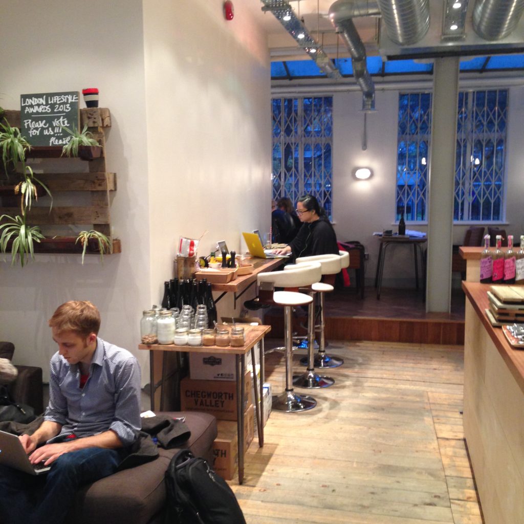
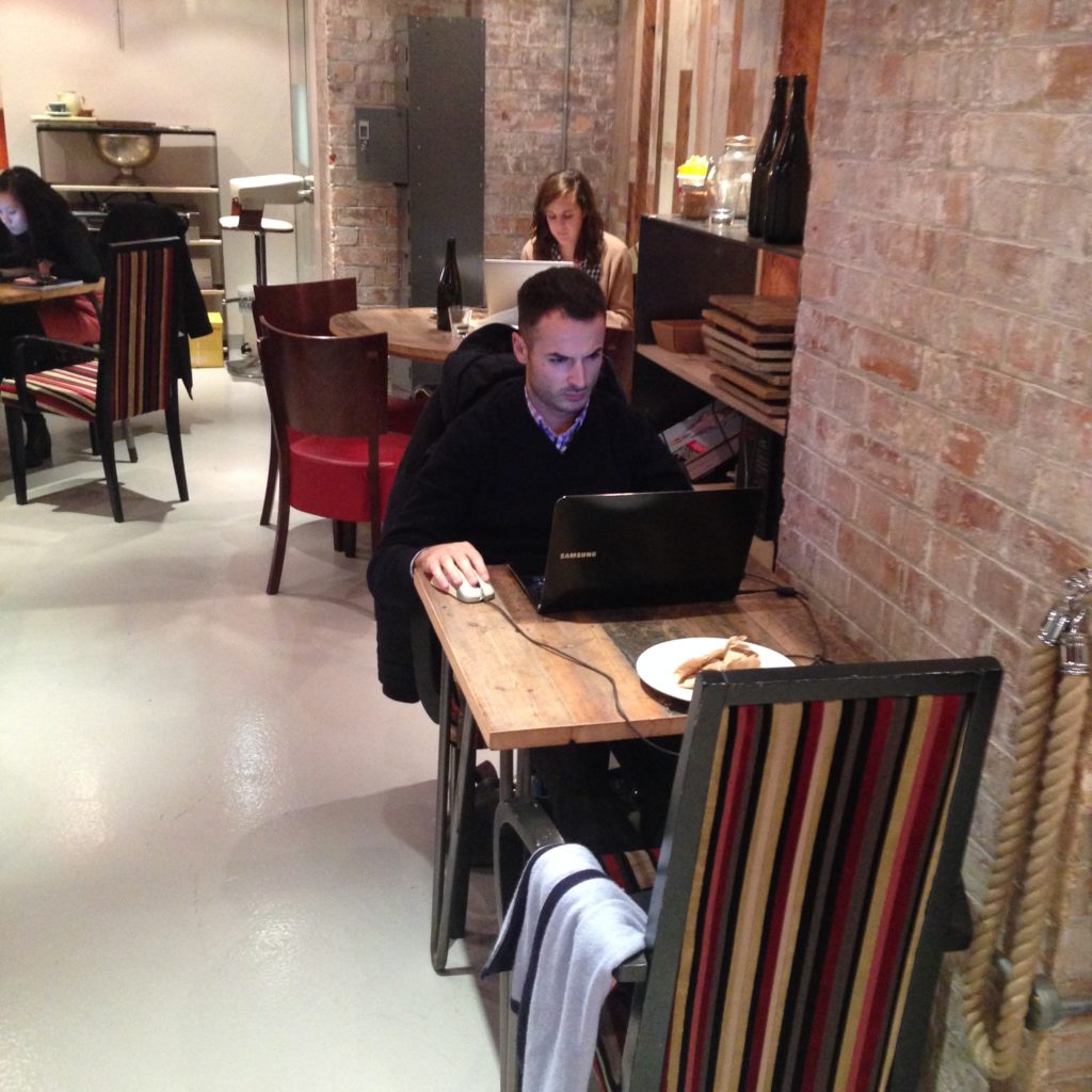
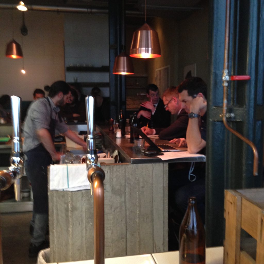
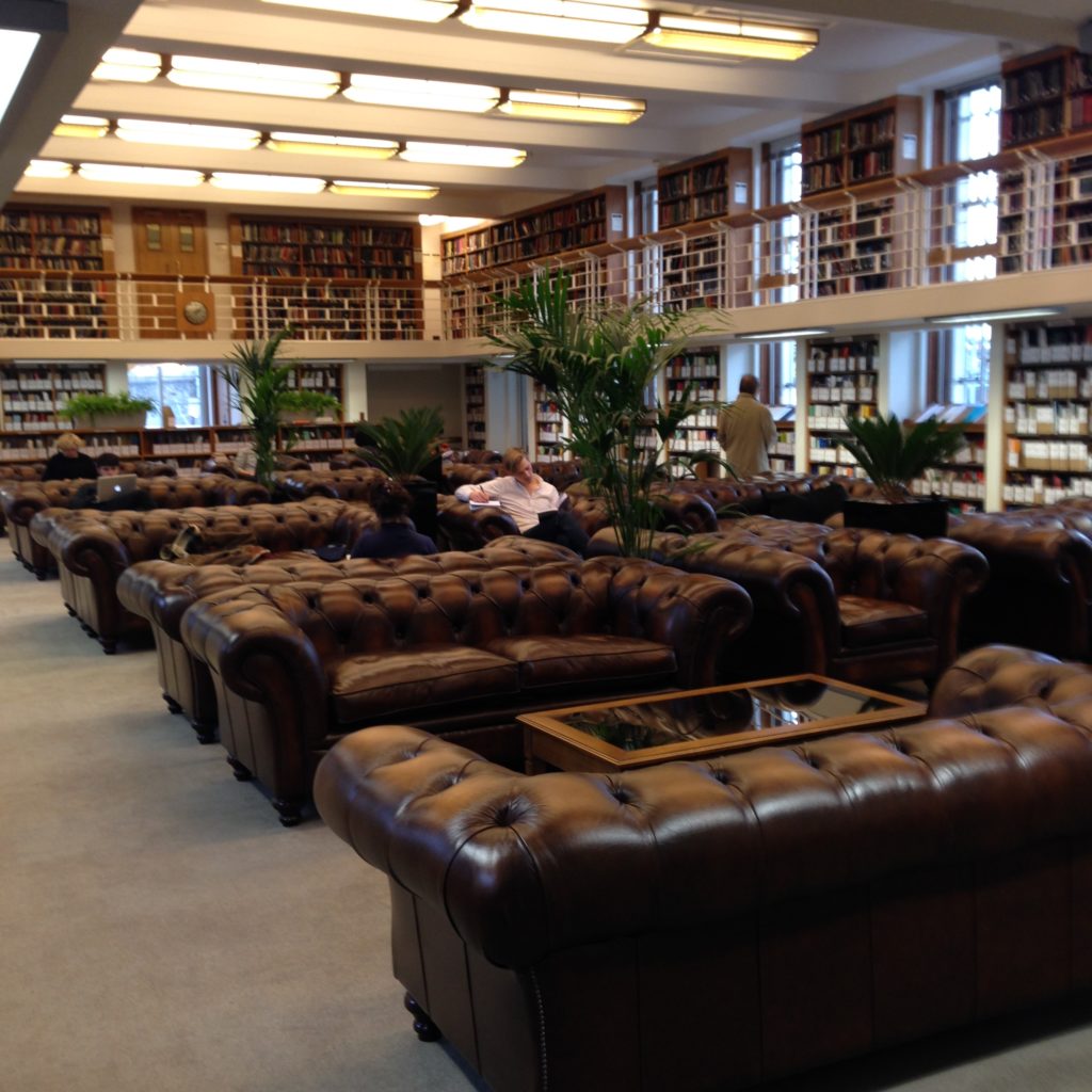
I’m always interested in spaces that are not quiet but get used as space for individual work. You could work at home. you could hole up in a library (that’s certainly cheaper). People are going to chat and laugh around you. On the way here today there were only three people on my car on the train, and one of them was on his phone making business calls for the entire trip. It drove me (trying to write over here) and the car’s only other passenger (trying to read my novel, thanks) absolutely nuts. But when you step into a place like this, you don’t expect silence. So it doesn’t bother you. Isn’t that strange? It’s less about sensitivity to noise and more about expectation. There’s something that appeals to people about working in a noisy, active, busy place like this. You’re in the heart of a hip neighbourhood, someone you want to connect with might drop in at any time, you’re around a lot of creative and passionate people. You make a statement when you work in an place like this. It’s a statement about availability, about what you think is important, and about who you think you are. Those conversations going on around you might change your life.

I’ve started to understand that most things we do are about self-identity, and the spaces we chose to frequent are very much a part of that process. Libraries are part of that equation as well, though we rarely frame them that way. It would be interesting to look at library spaces with an eye to what we’re helping patrons say about themselves to themselves and others. I think, in the end, it’s thinking that way that makes a space a social force.

Digital Materials in Physical Spaces

Digital Materials in Physical Spaces

Classic library workstation for interacting with digital materials. University of London, Senate House Library.

Very often, when we consider where in our libraries patrons will need to use digital materials, we add a station like this one. This is a terminal at the University of London Senate House Library. It’s placed helpfully in the stacks, near study areas. Like most such terminals, the point is probably to give students access to the catalogue while they’re browsing for physical materials and not very much more. It’s not a spot where you can sit down and spread out. There were other, better places to work on a paper or study. It’s exactly the kind of set up you see in most libraries of any description.

I understand why we do this. We’re coming from a good place. We want our patrons to feel comfortable. We want them to never be limited by the lack of a keyboard. Even if the catalogue can be browsed quite easily on a touch screen, what if you need to do something that requires sustained typing? I understand the impulse to account for every possible need within a rational budget. It’s logical, and thoughtful, and it’s technically open to changing needs and contexts. You can see how we think digital material is going to be used: alone. Not with a group of students, not with help from a librarian or a TA. Interacting with digital media, in this context, is very much an independent exercise.

Digital directory, Square One, Mississauga

This is the interactive mall directory at Square One, Mississauga. (And that handsome devil is my nephew, Max.) No keyboards, no mouse. Just a clearly designated directory. You can’t plonk down here and check your email, it’s true. You can’t write an essay on it. But you can work out where you’re going, and find out what this particular mall has in store for you. You can also walk up to it with your friend (or, as Max did, with your crazy aunt who takes photos and videos of odd things).

This is Max doing some fake navigation for me so I could film it. The downside of these things is that, at this point, you need to pay someone to create the digital materials for you to display like this. After years of static, keyboard-and-mouse based input, the easiest systems don’t respond as well to touch-based devices and interfaces. But that’s changing, and will continue to change with the rise of tablets and other larger-format touch-based interfaces. There is increasingly few technical reasons why libraries can’t provide catalogue and information access points that look less like the workstation above and more like what Square One is doing.

I ran into some interesting interactive screens in the Disney Store in Toronto. The focus is primarily on a projected film on the wall, but there’s associated information showing on two screens that flank it. Since this area is for children, the screens are smaller, slower, and primarily graphics-based. I think this is really interesting, mostly because Disney surely knows that the children in this store are bound to be incredibly distracted. There’s input coming at them everywhere. The store is full of toys. There’s a cartoon playing against the wall. But they integrated screens at the right level for their audience, and integrated it so that it’s not distracting from the purpose of being there, but adding to it. These children don’t need to turn away from what they’re doing to see the digital material. It’s part of the experience. And it’s a part of the experience that doesn’t dictate how many people can gather around it at once.

Staples control screen

This is a screen that controls the printers at Staples just off Dundas Square in Toronto. Again, no keyboard, no mouse. Like some of the stellar digital terminals at M&S in London, this machine takes a card for payment. It’s low profile, small footprint screen that doesn’t require a desk at all. This Staples doesn’t really have room for a desk. Sometimes necessity breeds some good ideas. I mean, it’s not pretty, but it’s computing in a tight space, without setting up a whole  independent workstation. It’s set up for people who are there to do a single thing and want to get it done quickly; that’s a goal a lot of library patrons can identify with.

Google co-working space noise-cancelling computing

This is a terminal at the Google co-working space in London. Because it’s a fairly noisy spot, there are a variety of noise-cancelling and relaxation-type areas. This pod digitally delivers information while the user is in this audio-limited environment.  Digital material, as you can see, is the least complicated part of it.

Looking around and seeing the variety of ways that digital material can delivered at point of need that doesn’t involve a chair, a keyboard, a mouse and a monitor is an important reminder to me. We shouldn’t assume that digital material can only be consumed in one physical way.

Silence as a Service

Silence as a Service

Bear with me for a moment here. This is mostly a thought experiment.

As I travel around looking at different kinds of spaces, I’ve started to question our relentless quest for total silence in libraries. Libraries have come to mean silence in our culture; why is that? Because silence is associated with reading? (Of course, only with modern reading: we know that medieval European readers considered reading a verbal activity, always done aloud, and if you’ve ever found yourself mouthing the words you’re reading on a page, you know we’re fighting our bodies to make reading silent. No need to be elitist about it: text is only a series of symbols representing speech. There’s no shame in it triggering our verbal centres. That’s perfectly natural.) When libraries are closed-stack, and the spaces inside it exist only as a reading room for material you can’t copy and can’t take out with you,  I can understand the focus on silence. To a degree, anyway. Silence is meant to go along with concentration. And libraries are meant to be places where you go to concentrate, right?

Everywhere I go, I find students and the self-employed deliberately seeking out spaces that are not silent. Some of them are downright raucous. A lot of them have jazz playing in the background, coffee grinders, conversations, laughter. Some of them are quieter than others, but none of them are silent. I’ve seen several co-working spaces, and a few high-tech businesses here and there. No private offices, only shared tables, conference rooms, kitchens and “libraries”.  Nooks for groups, couches, lots of earphones in the ears of those trying to buckle down and work alone. No spaces with a fixation on providing absolute silence, though.

I’ve been considering whether my comparisons with cafés and co-working spaces are entirely fair. I realize I’m looking at a particular sample of the population, the people who want to work this way. These are people who have a quiet space at home and find it difficult to work like that. These are people who want to be tangentially connected to other people while doing independent work, even if they’re strangers. I think there’s probably even a little bit of self-motivation going on; when I finish this paper, I can go home and relaxBeing somewhere other than at home helps you stick to a deadline and helps manage your time. That’s really healthy, I think. Co-workers in particular often need that separation between home and work to help give the work day a sense of closure, something students and academics both frequently fail to do well. The people I see working this way have quiet space elsewhere if they really need it.

But then I thought: don’t our student populations have this as well? Not all of them, maybe. But what percentage of the student populations don’t have a room of their own with a door that closes? I imagine it’s pretty small. So far my experience of residences on campus always includes some form of study room (and often study groups, as well.) For campuses where students can easily go back and forth from home where they can have silence and solitude, it seems to me that there’s more in common between libraries and other public and commercial spaces like cafés than we may have thought.

My own campus has it’s own rhythms and issues. Students can’t easily come and go from home, and many of them commute in quite a distance. They are effectively stuck on campus, and they may need that silence because they legitimately can’t get it anywhere else between the hours of 8am and 9pm. Again, I’m not entirely sure why the library is the place required to provide perfect silence, but I suppose that’s the tradition as we have it. We’re kind of stuck with it.

A lot of the students on my campus commute from their parents’ homes, so they share space with other family members. This is generally presented as a reason why no work can get done at home, but I’m not entirely convinced that that’s entirely true. Most homes with adult children in them are pretty quiet. Parents are usually supportive of students working hard on their school work. (Not always, I know. There are always stories and circumstances.) I would suspect that, most of the time, residence is far louder than anyone’s household, and even residences have silent spaces in them.

Why are we promising to provide absolute silence,  something so difficult to maintain it is practically impossible, if the vast majority of our patrons already have access to it when they need it?

Too harsh? Bear with me a moment longer.

Here’s a statistic I don’t know: what percentage of our student populations would sit in a comfy chair in a Starbucks and write an essay if they knew no one was going to harass them to buy anything or glare at them to give up their table. As far as I can see, we expect that about 70-80% of our students want to work in complete silence. If that’s true, 70-80% of students should abhor working in a public place like a Starbucks. I find that exceedingly unlikely, but I don’t know what those stats actually look like.

Maybe the music is too loud: okay. how about a little indie café in the distillery district, or buried in the annex behind a bookstore? Somewhere with ambient music, soft conversations, coffee. Not too busy, not too quiet. Alive. I don’t know the statistic; I don’t know how many students would be happy to work there. Walking around London, seeing the 3/4ths empty and quiet Senate House library, and the jammed and happily buzzing public libraries, the full cafés of Islington, Hampstead and Shoreditch, the students lining the tables at the Barbican and Southbank Centre, I struggle to imagine that it’s a small percentage. But I don’t know. This is critical information to me at this point. I’m going to have to find a way to get it.

I haven’t said it yet, but I’m sure you can feel it coming. What if most students don’t actually require absolute silence to do really good work?

I can already hear the objections. I’ve seen them; students in my library complain about the noise all the time. I can’t keep saying “bear with me” whenever I say something outrageous, can I? But what if this is in part based on expectations that we’ve set, both through our policies, our space design, and through our powerful public image? What if they demand silence between they just imagine they can expect it, and should expect it, because we’ve promised it, not because they actually require it? We are allowing students to have unrealistic expectations of our entire buildings, top to bottom. Libraries are meant to be silent, so every sound they hear is annoying.

What if we designed spaces based on the presumption that most students don’t need absolute silence, but want a comfortable level of ambient sound that isn’t too annoying, much like a half-empty café? What if we designed lots of different kinds of spaces, the kinds of spaces cafés and other public spaces increasingly have, with coffee/tea available, but no pressure to get out of your seat and give your table to someone else? What if we created that for 70-80% of our spaces?

There’s still the question of silence.

I seem anti-silence at the moment, but I’m not, really. I’m only asking questions. I’m only suggesting that the desire for absolute silence might not be felt by the majority, as long as if there is other, really functional, comfortable, not overwhelmingly-noisy spaces on offer that clearly doesn’t promise something it can’t deliver. There will certainly be people who want absolute silence.

What if silence becomes a specialized service? Perhaps the way to break the association of a library with perfect silence in all places is to create a space that is specifically designed and pitched as entirely silent? Enclosed, with a clear demarcation between the normal zone and the dead quiet zone. If you’re in here, you’re here to be totally, completely, utterly quiet. No phones. Maybe no wifi. Maybe no 3G at all (if that’s even legal.) No ipods, no music, because sometimes you can hear them and that’s annoying. Nothing: just silence. Quiet keyboards only? How extreme can you reasonably get?

I don’t know the statistics, so I don’t know for a fact what size a space like that would need to be to accommodate the people who would want it, but from what I see so far, I imagine it probably doesn’t need to be monstrous. Maybe it’s nestled in among the stacks, using the books to muffle even the sounds of keyboards and pencils scratching. But it’s strict, exclusive, and maybe you even need to apply to be allowed in. It would have a zero tolerance policy. It would, I imagine, build it’s own culture and empower students to tell each other to shut up should they need to. The eye conversations would be epic.

We are currently encumbered by the idea that the silence rule currently applies to anything called a library. Most libraries tell you to shhh with their staff and their signage. We tell you what your behaviour has to be from one area to the next. But what if, instead of telling people how to behave, we offer the spaces where the behaviour restrictions are a service?

In some ways it’s just a matter of rebranding, isn’t it.  but I know for a fact that just rebranding the quiet areas in my library as a service rather than a set of rules wouldn’t create this kind of atmosphere. There’s a bit more to it, I think. Some of it is building in the right context, making the space look markedly different, having students pass over a threshold between one commitment and another. They need to actively choose to be there. You can’t stumble in accidentally. You go there with a purpose, armed with the knowledge of what it’s going to be like. You go in there to get work done, and then you get out.

Meanwhile, you give students other really good options for non-silence. We already know there are a lot of students who cannot work in complete silence and are pretty forthright about that. They want music playing. They want to be around people. Surely this is why we remain as busy as we are, even as the use of the collection and reference services declines. On my campus, the computer labs are empty but the library is packed. Most people, it seems, want to be around other people, even if they’re doing their own work. If we build great spaces for working near others, different levels of noise, different kinds of seating, all that other good stuff, and then have the vault for the times when you want absolute silence, offered as a service from us to them…

I think that might be interesting. I think it might work.

Just a thought experiment.

Bringing the Digital Into Analogue Spaces

Bringing the Digital Into Analogue Spaces

Bravissimo check out point

This is the staffed help point in the bra-fitting department of Bravissimo, Covent Garden. No keyboard, just a floating ipad fixed to the wall with an arm. They didn’t add it to replace a full computer terminal, though: it’s there to replace pen and paper. It’s interesting to see the digital world sliding into what have been purely analogue spaces. Without having to commit space to a keyboard and monitor, and not being required to install an ethernet port into the wall, businesses with an internet need but limited space can now add terminals like this one to help staff provide support to their patrons.

No pun intended.

This, versus the digital presence within the stacks at Senate House Library, University of London:

Senate House Library stacks, University of London

Feels a little…shoehorned in, doesn’t it. It’s the same terminal in front of the service desk a few floors down. A computer’s a computer’s a computer, right?

Selfridge’s staffed help point

This is a staff station at Selfridge’s. Fairly classic: I think the thin drawer under the monitor is probably a keyboard tray. I think it’s interesting when you can see management has acknowledged that staff need access to a computer, but they don’t want patrons to be confronted with the back of a monitor. This isn’t meant to be shared or used to show a patron anything; it’s a reference point for staff.

This is a customer-facing terminal at John Lewis. It’s tucked away in a spot where staff help customers with returns or special orders, and I presume it’s an attempt to highlight their online services to these people. Like a library tends to do, they put a keyboard in front of a touchscreen. Nothing particularly innovative here, unlike:

“All the stuff you need to know!” a touchscreen-only information point on Oxford Street, London. It’s designed totem-style, outdoor street furniture to provide access to a screen and to the internet for random passersby. But this is Britain, a culture that has been mobile for a very long time. Most people passing this help point have phones. Which goes some way toward explaining this:

A phone booth that doubles as a wifi hotspot on the Hampstead high street. I find this one fascinating; it’s a morphing metaphor. This is in a city that still has a popular store called Carphone Warehouse, so it’s hardly a surprise that they’re using the telephone booth metaphor for a hotspot. It’s for connecting a mobile phone, so it really is a telephone booth.  It’s very similar to the other access points, except that it’s relying on the pedestrian to have a device of their own. They’re providing half the experience, not all of it. There’s a sensitivity to context in this idea that I find especially inspiring.

How best to bring digital materials into the wide-open physical world is clearly still an open question.

Timberyard: The Value of Variety

Timberyard: The Value of Variety

bar seating at Timberyard, Shoreditch, London

This is Timberyard, a very successfully-designed café that’s a big hit with students and other independent workers in Shoreditch. What strikes me about the places that have hit the right note with students is that incredibly wide variety of different kinds of seating, different kinds of spaces, and a thoughtful variety of configurations that acknowledges that not only do different people have different preferences, but one person generally has a variety of different needs from a space depending on their current task, mood, or circumstances.

The front of the house at Timberyard contains a modular shared couch, old suitcases that act as coffee tables, and plenty of outlets. Enough outlets for everyone.

Bar seating facing out a window

A sight I’ve become accustomed to: bar seating by the window. This kind of space is almost universally understood as individual, private space within a public space. I’ve started to notice that in libraries that don’t build spaces like this, patrons will drag a chair over to a window, face it against the window, and create it. I think this kind of seating might be the most accessible and least threatening to people entering a social space like this alone. Facing outward is a kind of message that indicates that a patron is not only not looking for a conversation, but is here on their own for a reason. Again: notice the easy access to power.

Bar seating facing a wall, which is less popular

A second band of bar seating, facing the wall. It’s more space that’s comfortable and available for individuals coming in alone and intimidated by the big, shared couch. But there’s another interesting thing about this bar seating:

An branded ipad on a bar table, ready for use

The café provides not only wifi, but ipads for the purpose or browsing the internet while drinking your coffee or having your lunch. I’ve never seen anything like this outside of a library. When I wander through our library and see how students are using our computers, a good percentage of the time I see keyboards shoved up under the monitor and a laptop or book sitting in its place. A fixed ipad like this probably isn’t a bad replacement for a catalogue terminal, when you think of it. It makes that table far more multifunctional. It’s very generous of them to provide them, really. I found three of them around the café, admittedly none of them in use.

A small table for four

We’ve got individual space, very much shared, common space with the couch, and also more traditional shared space for groups: three tables for four. These are small enough that they aren’t shared by strangers; these are for people who know each other, are working together, or have decided to come here together to share the space as a group.

From above, a hint of what lies below:

A small table for four occupied by one person on a laptop, viewed from above through a window in the floor

Downstairs, more kinds of space, all of which seems to be designed with students in mind:

Assorted armchairs and a man working on a laptop perched on his knees
Assorted armchairs, and tables where two students sit together working quietly, and a group of four are collaborating.

Quirky, mismatched, soft seating, in a variety of different configurations! Here they’ve got armchairs you can use as an individual, or with a group. Full-sized tables that, as you can see at the back, encourages group work. This furniture can move, but it doesn’t appear to, especially. If you don’t like one configuration, this café has many more to choose from. That’s another form of flexibility, one that doesn’t require reconfigurable tables or casters.

A table for two with one person working on a laptop, and a small table for four with one person working on a laptop.

These group spaces, filled with the noise of people talking, also includes spaces that patrons use for individual work. As we know, there are many people who don’t like to work in complete silence or solitude. Being alone in a group is more productive for them, and you can see the evidence of that in places like this.

A communal table fowhere three people are working independently.

As in most places I’ve seen, there’s also a communal table. Interestingly, in spite of all the other available spaces at Timberyard, these folks prefer to work independently together here, with ready access to power. Communal tables are tricky, and interesting: there are signals that tell patrons they can share the table, but I don’t think they’re as simple as the size of the table or the number of chairs. That factors in, certainly, but I think the affordances of the rest of the space contributes as well. If everything else is sharable in a space, a communal table will be more shareable, even if it’s thin or smaller. I wish there were a ready and easy science to this, but I’m not sure there is. I’m really fascinated by the communal table; it’s potential is so tantalizing. For me it is the definition of flexible. It can support group work, become an instant conference room, and be a place for individual work as well, all without shifting the layout at all. It can support high tech work and digital collaboration as well as work with paper and post-it notes. It’s simple, familiar, and comforting. But I think it’s also the layout most sensitive to the context of the room and the hardest to get right. I’ve seen communal tables on my travels that I suspect don’t work that well. This isn’t one of them.

Cafés in the UK are especially interesting because they don’t have much of a culture of throwing people out if they stick around too long. In that sense, they are closer to libraries than almost anything else. We also create spaces and encourage students to stick around. Because of that, I feel like we have an incredible opportunity to create really terrific spaces without worrying about turnover. I knew I wanted to look at cafés as part of this project, but I really didn’t expect the parallels to be so strong.

Popular Study Haunts

Popular Study Haunts

Finding out where students like to study, and visiting those places, is really fascinating. That’s been my project for the last few days.

This is a place called Ozone Coffee Roasters. It’s a combination coffee roasting place and café. This is a view of the lower level: as you can see, it’s pretty much all communal tables. There’s the long thin one on the left, and the wider tables against the walls. 

Here’s some of the window seating upstairs. As you can see, pretty much every flat surface in this place is unstructured and communal. How this space gets used depends entirely on the people who sit down at it. It might be two people sitting together, or an individual sitting down with a computer. Unlike most bar seating up against windows, this table is really wide. It’s about as wide as the communal tables downstairs. Once I took one look at this space, I could understand why it was rated so highly as a study space. Students like to be able to spread out.

Bar seating at an actual bar

The bar. As you can see, this place has a culture of sitting down and digging into work. No one’s the slightest bit bothered that they’re looking into a busy working area rather than against a window.

I have to say, this place is loud. I imagine the students who come to work here really like that, because you’d have to. It’s a very trendy kind of industrial vibe, with lots of word. Very hip, loud, busy, and designed with serious coffee drinkers in mind.

Around the corner from Ozone is Salvation Jane, which is a way quieter, more chill kind of place. Much less polished, much less deliberately hip, but still funky and cool.

Long communal table and group tables

Here I think I saw some actual studying in action. Tables beyond, and the communal table in the foreground. This is a very slim communal table, and based on that I’m surprised it works. But it does.

Solitary bar seating

More bar seating. This ledge table is quite slim, and sitting there definitely seems like a more solitary experience.

Salvation Jane has an extended outdoor area as well. It’s covered, so students could sit out there if it were warm enough, in spite of any potential rain.

What I can’t help but notice in spaces like this is the old-timey kitchen table feel they have. It’s almost ubiquitous, the big farmhouse tables and classic chairs. It’s furniture picked for vibe rather than comfort, which is interesting. (Though: to be fair, they’re not uncomfortable.)

Walking between one place an another, I spotted another, modern take on this layout:

Fast food communal table

This is sort of fast food chipotle place. Nothing fancy, but walking past, I couldn’t help but notice the same themes, just less quirky-traditional style and materials.  Here, like in Ozone, is a long, thin communal table.

Fast food communal table

Bar seating by the window, as is practically standard in nearly all libraries and cafés alike. And belowo that, something interesting: it’s a curved table. I didn’t get a good shot, but you can see the woman with the dark here and the light coat, with her back to us, in both pictures. The tables has a long straight end and a curved bit that goes into the restaurant. 

Another interesting play on a communal table theme.

Communal table

This is a popular communal table in Penarth, Wales (just outside of Cardiff). I thought the single bench along with the more moble chairs was an interesting touch.

What’s interesting in all this is that I bet they got the communal table meme from us:

Historical wooden communal table

This is a shared study table in a library on display in a museum. Antique shared tables: not that much has changed, really:

Senate house reading room

This is one of many reading rooms at the Senate House library, University of London. We were on this communal table thing from the beginning, weren’t we? And check out this periodical reading room:

Big, tufted leather couches

Is it just me, or is this room going for “high brow living room”?

I’ve got more popular study joints to check out. The trends are already poking through, though: quirky, cosy, flexible (not necessarily on casters) space, free wifi, no pressure to finish your drink and get out, and, there’s no getting around this, food. Food is the unifying theme of all the places I’ve visited that students like. Though many of them buy one coffee and sit for hours. the proximity to food, the ability to get food and coffee easily should it become required, is a key factor here. Many libraries have a very firm distinction between a café and the library proper. I’m starting to seriously question the wisdom of that. And I’m not the only one:

Library cafe

The café at the Canada Water library is in pride of place: right as you walk in, at the base of the stairs, in the atrium with its ceiling all the way at the very top of the building. Either because of this design, or, as the librarian at the desk told me, a problem with the ventilation system, the entire library smells like coffee and baked goods. Which may or may not be a good thing, really. But still: the café is an integral part of the library experience here.

“Eat in or take away,” inside the library. How about that?

I’ve written about the Whitechapel Idea Store café before, because it’s spectacular. They put it at the top of the building, alongside a news-watching area and current popular periodicals.

Library cafe
Library cafe with round tables and people reading

Food and thinking go together, which might be why cafés are such popular and comfortable places for students to dig in and study. We’re taken a lot of ideas from them, and they’ve taken a lot of ideas from us.

The Spaces People Choose

The Spaces People Choose

The spaces people have the choice to inhabit are, I’m discovering, often the most interesting when it comes to innovative design. But there’s so much to choose from! It’s relatively easy to find popular libraries and see how they’re laid out. What I’ve been investigating lately are the places where people choose to work. Fortunately, because locations are rated, tagged, and reviewed on Google Maps (via Google Plus), I’m able to see which locations are considered the best places for studying and working.

Which brought me to two places: the first is Tinderbox.

Tinderbox is a coffee shop in Angel, Islington. Based on the reviews and the photos online, I really thought this place would be bigger than it is. But I think that’s part of its charm. From this view, mostly what you see is the typical split between the common table and smaller tables for two. But there are a few more really unique and interesting spaces in this place.

These two spaces tucked away along the side of the main room are, I think, what make Tinderbox a winner with students. Below, there are three roomy booths with a very low head height. It’s a seated head height, and not much more, though no one’s hunching in there and no one seemed uncomfortable. On the contrary, all these booths are taken (I thought I could sneak into that last booth, but no, it’s taken too.)

There’s something about a cozy space. I met a student here who told me they call Tinderbox the Nook Café, because of all the interesting little spaces in it. Given that it’s a warehouse conversion, that’s quite a feat. All the nooks in it are entirely retrofitted from an open space.

I’ve seen several takes on the low-head-height approach, mostly with furniture. Psychology isn’t my area, but the idea that we tend to find smaller spaces comforting and comfortable resonates with me. A friend of mine (Lucas Barber, Project Manager at UTM Library and all-round good guy) once told me that his father, who builds houses for a living, always builds small bedrooms with attached sitting/dressing rooms rather than gigantic master suites. He says we don’t tend to sleep well in big, open rooms. That idea has always stuck with me; small, cozy rooms feel safe and comforable, even when we think bigger is better. I’ve noted this as a bit of a trend in the most popular studying spaces, too. Ensconced up in the rafters, facing outwards, looking down, with a lower head height; spaces like that seems private, safe, comfortable, and quiet. Does it help students to concentrate? To feel comfortable? At home?

The people inside these booths definitely seemed to be in rooms of their own without being entirely cut off from the larger group. Maybe that’s part of the appeal; alone in a crowd, off to one side, sheltered. Alone together.

The second (of several) interesting spaces at Tinderbox is the mezzanine level above the booths.

The low buzz of the café crowd below, a view and streetscape, low ambient lighting but good direct light on the table in front of you, power for your computer, and coffee. This space genuinely couldn’t be better designed for the student crowd. Tinderbox also has free wifi, so it doesn’t take much to see why this place is so well-loved and well lived-in.

The view from the mezzanine, and the third interesting space: a set of old, worn, ratty airplane seats. I found this area really interesting, because it breaks the rules for creating seating for two. Generally you arrange to have people face each other. But the two new mothers sitting in these seats were quite comfortably and happily having a chat the entire time I was here. For all the self-conscious “conversation areas” I’ve seen in libraries and elsewhere, this might be one of the most successful. It’s quirky, interesting, and completely conductive to long conversations, particularly placed as it is by the window. It’s interesting that they didn’t try to put seating right up against that terrific windnow, but I guess this way the whole space shares it uninterrupted.

And on the other side of Tinderbox’s front till:

I genuinely don’t know what they thought was going to happen here, but I’m fascinated. I’m not sure why you would put a cushion down on a place where, if you tried to lean back, you’d end up with a wooden corner digging into your spine. But I like the built-in table and the sheer uniqueness of this thing. It’s the opposite of the booths; wide open and tiered, visible to everyone walking in, perched above the crowd. I’ve seen steps in use as seating areas all over the place, so I can see the appeal of adding them as deliberate seating.

And in front of the cash and the pastry case, traditional bar seating, facing a small patio area.  No power that I saw, just a simple wooden ledge-table and stools. Interestingly, as with many spaces like this, patrons feel free to strike up conversations, often with one person standing and another sitting. Personally, I really like seating like this in areas where patrons frequently need help and input from staff, because of the ease with which a standing person can interact with a seated patron. It looks and feels natural.

I think, as far as cafés go, the variety of spaces contained within Tinderbox is closer to a library than any I’ve ever seen. But its touches are more homey and quirky than libraries tend to be. It’s small, cozy, warm (lots of wood filling up what is essentially an industrial space), with low ambient lighting but good task lighting. Librarians tend to design things in orderly lines, with bright spaces we can easily peer into to ensure that the right kinds of activity are going on. We design spaces that are less quirky and more efficient. I understand why students choose to work at Tinderbox; it covers all the bases. It’s homey and comfortable without being a junky living room. It’s an interesting mix of shared spaces, any of which can turn into collaborative ones.

Another place I got a look at today is a co-working space down the street from Tinderbox called The Hub Islington.

HUB-Islington

I didn’t take this picture. I was there, but I didn’t want to bother the full house working there at the time, so I’ve borrowed this one. The Hub is a co-working space on the top floor of an old warehouse in Angel. It’s designed by and for freelancers who want an office to go to rather than sitting at home all the time. They apply and pay a fee to work here. If we want to learn anything about deliberate choices of the best working spaces, co-working collectives might be the best place to turn. Not only because the people who use them tend to be innovative and design-oriented, but also because these are road-tested, and people vote not only with their feet, but with their membership fees.

The Hub Islington co-workers hotdesk. Hotdesking means that no one has a permanent desk; you choose the kind of spot you need when you need it and set up there. Therefore the Hub includes a variety of different kinds of spaces for the co-workers to shift between. The petal-like desks and chairs on casters allow each person to set up laptops as they like and need. Without monitors on the desks, they can pick how much open desk space they want at any give time. It also means they can deliberately work with someone else close by, or more independently. I like the way they have connected pieces as well as independent pieces; it makes “zones” out of thin air, and stops the place from being a hive of cubicles.

The Hub Islington includes a “library” (a nook in the left corner, by the windows, with two walls covered in books and cushioned benches. Because the library is a bit obscured, I think this space might fill the gap for those who want to work in a public place with a bit more privacy. Maybe for intensive thinking, or other kinds of private, quiet time. The Hub also includes a kitchen, and a dining booth area, presumably for having lunch as well as for impromptu brainstorming.

There’s a running thread in these chosen spaces of “home” metaphors. But it’s not like taking someone’s house and making it a public space; it’s not like an Ikea show room. It’s home with a significant professional twist. In fact, I’m starting to think that “home” isn’t the right metaphor, given how far afield these spaces get. People generally don’t have spaces like this in their home. The idea of a couch, a kitchen table, the ability to shift from one kind of space to another, that’s some of the home-ness of it. But the layout and structure itself is far from “living room” or “dining room”. The idea of “home” imparts the idea of different kinds of comfortable space, but it’s more formal than home. It’s just a more thoughtful office space, really.

Co-working spaces traditionally contain a conference room as well, like any other worksplace, as this one is no different:

french-course-london-hub-islington

It’s a dining room metaphor. This is a space you use when you’re deliberately in meeting mode. This space has a door on it that can be closed, unlike any other part of the space.

These are two spaces that have been deliberately chosen by those doing individual work. The first was designed by business owners developing a commercial enterprise; the second, by co-workers themselves, originally drawn on the floorboards in chalk. Both are an interesting mix of comfort, connection to other people, ability to share with close collaborators or friends, and a strong thread of individual space.

So these are the kinds of spaces that people chose for themselves: no individual offices, and no permanent stations, no complete privacy. There’s a connection to other people there, always, even if you’re not speaking to those people, or know them at all. They aren’t silent spaces, but they’re not excessively loud, either. They both have a buzz of work going on, in and around the casual talk. They are both flexible spaces, not because the furniture necessarily shifts around a lot, but because it supports a wide range of different kinds of activities, individual and collective, and the ethos of the space embraces the idea that different moods, tasks, or projects need different kinds of configurations, different furniture, and different affordances. In both, you’re not stuck in one kind of chair looking at one kind of view for all the work you do. You get to choose.

Interactive Computing

Interactive Computing

There is a monumental shift going on in computing. It’s a technical change, a software change, and most importantly, a change in the way we think about and approach a computing device. This change has to do with what a computer is.

We’re familiar with the more radical end of this change as the smart phone revolution. It used to be we had two very distinct devices: a computer (which sat on a desk, had a screen and a keyboard, and required us to bring a chair up to it so we could rest our fingers against the keys) and a phone (which could be attached to the wall, sit on a table, or, eventually, fit into our pockets, has small keys, or, increasingly, software-only keys). The rapid merging of these two devices has left us with some very confused metaphors for computing. As librarians, we’re not entirely sure anymore how to signal to a patron that we have set aside a device for their use. We set up computing so that patrons can use them, but we struggle to break free from the workstation metaphor, even when it would behoove us to do so.

A catalogue-browsing station at the Idea Store Whitechapel. The attempt is clearly there to get rid of the workstation and move into a more flexible approach to bringing digital search and information into the physical world, but of course you still need a keyboard, a mouse, and a monitor, right? (Horseless carriage, anyone?)

Not to point fingers only at the Idea Store. This is tough, a lot of people are struggling with it. This is a tough one. But this terminal is just a stand up desk, really. You can’t put your stuff down on a table, and you can get stuck in for the afternoon of checking your email and writing an essay. It’s not comfortable enough to be a workstation. It says, “You, patron, may use this computer to do simple things, like looking something up.” Patron in that case is most definitely singular.

Here’s the not-especially-innovative interactive stations outside the Barbican library. Here we haven’t even moved away from the idea that you have to sit down to interact with digital media. At least they’ve got those steampunk keyboards with the included mouse to avoid all the extra wires. Rollerball for the win!

Once again, the layout is telling us how many people should be using these stations; one person per. If you were to bring the second chair over to look at something with a friend, you’d be depriving someone else of the use of a machine. Without intending to, we shout out our belief that computers are single-person items.

Everybody really likes the idea of bringing digital information into an experience; there’s just so much of it, and there’s no way any space, library, museum, or otherwise, can have any hope at all of bringing all or even most of it to its patrons without using screens. But very often you can see innovative spaces, like the Victoria & Albert Museum here, resorting to screens and chairs, in keeping with ye olde workstation metaphor. Is this the best way to bring digital information to patrons? It’s certainly the easiest. And the simplest for the patron to understand.

And not to say that these stations aren’t interesting and thoughtful; a lot of them are. These are the Crossrail information terminals at the Idea Store Whitechapel. As profiles go, these are pretty slim. For a workstation that’s been straightened out so you can approach them while standing as use them, yeah, they’re great. But this metaphor is wearing very, very thin. One person per screen, please. We started out that way in computing, and we keep reproducing it.

This is a really nice monitor/keyboard/rollerball mouse set up at the Central Library in Cardiff. That’s my friend Imogen; she went straight for the keyboard, because it was there, so she assumed it was required to use the machine. That’s a touch screen, though, as I showed her. (I can tell it is: of course it is! It’s high tech! This is a standing totem terminal, of course it’s a touch screen!) Because the affordances of the set up return the patron back to the workstation metaphor, all the interesting affordances of the touch screen go flying out the window.

The touchscreen, which replaces the keyboard and the mouse pretty effectively, is not a new technology anymore, and a lot of libraries (and museums, and all kinds of other spaces) have them. But libraries may be the last ones holding on so strongly to the keyboard. I understand why we do it; it’s true that you have a lot more scope with a keyboard. You can short-circuit whatever the designer thought you were going to do at this terminal with a keyboard and do what you need to do. It’s flexible. It makes that terminal ready for anything, and we really like to be ready for anything. We hate restricting what a patron can do. But unfortunately that flexibility  puts the device, and by extention the patron, in a very tight metaphorical box. In trying to make sure a patron can do anything they want, we often don’t use contextual and layout clues help them do the thing they’re probably there to do.

Here in the National Portrait Gallery they’ve got images, objects, and digital information all threaded together. The digital information is relevant and interactive, though interactive in a very limited way. But it’s not pulled out and stripped of its context, which is key. It’s the [read more] of the museum world, attached to the exhibit without overwhelming it. The patron has navigated to this piece of information not through clicking through a web page, but by physically moving through the building. Because of the physical location of the patron, we can make all kinds of assumptions about what information they want or need. It’s those few steps before search that they’re tying into here; anticipating information needs and incorporating them into the space itself. That device on the Henry VIII portrait isn’t as flexible  as the terminals with keyboards above, which can do absolutely anything, but it’s more targeted, specific, and in that moment, useful. It’s not expecting the patron to do any work at all. There’s no keywords, because the patron has indicated the keywords by moving to this point of the museum.

This is a fully interactive totem terminal at the Barbican, designed specifically to gather feedback from users. There’s no question that that screen is a touchscreen (obviously). No keyboard, you’ll notice. No mouse. (You don’t need a mouse with a touchscreen, because your finger is the cursor.) It’s not a computer you can hijack to check your email or jump into a search engine. It has one purpose, and it does that one purpose well. As computing has become cheaper and cheaper over the years, we’ve had more opportunities to include computing with limited purposes like this one. I think we often fail to notice that computing has become cheaper, and thus our relationship to it can now change. When a computer cost you five thousand dollars at minimum, it made sense that you wanted it to be as flexible as possible.

But that might not but the problem; lots of libraries have catalogue-only computers. We tend to make them stand up terminals to express this, and lock the software so that only that one activity is possible. We get the idea of the single use computer, we just haven’t made the jump to creating things like this:

I found this Jobpoint terminal at the St. Pancras Library in Islington. It’s a small library attached to a branch of the borough council, which offers a range of services to residents, from issuing parking permits to housing benefits. The jobpoint is, as the name suggests, an interface to view job postings. Public libraries are frequently the centre of support for job seekers, but I haven’t seen such a sophisticated job searching terminal before. No keyboard, no mouse, but there is a small printer.

This is a terminal that’s sensitive to its context; job seekers can print out the details they need of a job that interests them. This terminal brings the riches of one particular database to its userbase, and one which, in this case in particular, isn’t well-known for being especially computer-savvy. Now that I’ve seen this one, I’m surprised that catalogue terminals in libraries don’t look more like this. The needs are strikingly similar. Minus the workstation metaphors, you can see how much easier it would be to provide support to someone using a terminal like this. It’s design doesn’t tell you how many people can use it at once the way a keyboard and a mouse do. It doesn’t invoke a private, personal computer. Anyone walking up to it knows it’s not somewhere they can sit down and read a book, or work on their essay, or send some email. It’s computing, but it’s not a computer the same way catalogue terminals often are.

I keep looking for the holy grails of collaborative-friendly computing spaces, and they are few and far between. I know they exist, I’ve only just started my explorations, but even seeing attempts has been helpful to framing what it is we’re doing, and how we might consider creating different kinds of spaces and interfaces.

I visited another high-tech place this week, which looked like this:

As we know, the TARDIS can be operated by a single person. It’s a Gallifreyan workstation, as it were. But we know it works better with a crowd.

Lecture Benches: Audio in Museums

Lecture Benches: Audio in Museums

I’ve decided to call this a lecture bench. Sit down, select your content, listen while you look upon the objects described. Two birds with one stone: learn something, and have a rest. (Hey: those floors are really, really hard. Everyone’s feet need a rest in big museums!)

It’s an audio brochure controlled by a touch screen and delivered through a set of headphones.

This is the high-tech version, I discovered later, because of the touch screens and the fancy headphones. (Is it only me, or does sharing headphones seem a little…intimate? Headphones seem like a personal item to me, for the most part. I’d rather plug in my beats, but maybe that’s just me.)

This is, I think, the older version of the lecture bench. You hold the big plastic handset to your ear to listen whilst sitting on this lovely leather bankette. No touchscreen control, you’ll notice. Just some knobs.

Museums are unique in that people come to see their stuff, and if their stuff were converted entirely to digital stuff, no one would visit anymore. Because the point really is to come see the stuff. Okay: maybe museums aren’t that unique, because a lot of people think the very same thing is true of libraries. But libraries don’t curate in the same way that museums do. Frankly I think that’s a bit of a tragedy. What these audio benches attempt to do is bring different media into the space to sit alongside the more physical objects. People don’t go to museums to listen to things, they think, but of course if someone’s there telling you all the interesting stories behind the objects you see, you absolutely are there to listen.

Here’s a very stripped down (and far less comfortable) version at the Wellcome Collection, with a telephone handset rather than headphones. What’s most interesting about this one to me is that the surface they’ve left for you to sit on sort of makes it look like you’re part of the exhibit when you sit down on it. As if you’re there to be looked at, with a label on the wall over your head. Not quite as inviting, obviously. But interesting.

At the Natural History Museum, they’re trying a similar thing through QR codes. You can look at the skulls and minerals and models of ancient animals while you’re there, but they want to knit more context and more information into them. There is so much information, and it seems like everyone is trying to find ways to knit it into a physical experience. You can’t write entire monographs on the walls. People won’t read that much text. It’s very interesting to see the variety of ways curated spaces are trying to bring digital media into their midst.

Interactive Media without Keyboards or Screens

Interactive Media without Keyboards or Screens

This is my very favourite bit of fully collaborative digital space: it’s the interactive exhibits at the Museum of London.

Simple, eh? Not much to it, really. It’s only a white table. Just a white table, with all the digital content projected from the ceiling. It’s really fascinating to watch people interact with it. Because they don’t behave towards it they way people tend to when they’re working with a computer. Here’s a woman with her young daughter experimenting with it.

Good collaborative design just works. It doesn’t require anyone to think too hard about the fact that there are two people giving input to a computer. It’s open, inviting, and no one feels odd about someone else joining them in the experience, very much unlike a workstation situation. There’s no over-the-shoulder issues here. It’s comfortable to work with as a group.

If you listen, you’ll notice that every time the system recognizes someone’s touched the controls, it makes a sound. They all do this, very subtly, but it really gives the systems a sense that they are physical rather than only digital. They are only digital. It just doesn’t feel like it.

The Museum of London constructed their interactive exhibits very, very carefully. They are extremely thoughtful and fit fluidly into the displays.

The tables displaying materials are clearly designed to also incorporate a space for digital material to be projected from above. Interestingly, the staff are under the impression that the table is touch sensitive, but it’s actually not. (I tested it!) It’s all being controlled by the projector; it can tell where your fingers are. It’s no ipad, but it’s pretty close in terms of responsiveness.

Projected digital media

This bit of projection is on a much smaller table, and it’s a bit of a wedge shape. The projection and the design of the content is made to fit. There are physical objects on one side, and digital material right next to it. No screen, no keyboard, just simple, digital content I can flip through without reading instructions. This is genuinely doesn’t feel like working with digital content.

Digital content projected onto a table as part of an exhibit.

I really love these. The pieces of it are really fairly simple; it’s the design of the tables, installing the projector and the computer in the ceiling, and, of course the coding of the material. I keep thinking, we have content management systems like Drupal that will let us manage website content; it’s a short step to having a content management system for spaces like this. Imagine a space like this for a reference desk, rather than another bloody workstation. You could plug in a keyboard if you really had to.

Projection isn’t the future of touch screens. LCD screens are tons better for clarify and crispness, and even for responsiveness, in the end. But projection lets you do the interesting shapes and massive sizes on the cheap.

Several square feet of projected digital content

This is a video playing on a huge patch on a table. That’s simple and cheap to do with projection. It would be crazy expensive to do with an LCD screen right now. This way, they can easily adjust the size and location of the projection within the museum for practically nothing. An LCD screen, while a better piece of technology, simply isn’t that flexible. It’s also harder on the eyes, truth be told. A projection is a fairly gentle kind of light. As long as the video doesn’t require HD or too many fine details, a basic projection will work just fine.

And an LCD screen is just not going to let you make a round interactive space. This is a simulated fountain, where, from all points of the table, you can touch the various fish to get more information. It works from every side, which means you can have multiple people interacting with it at once. And no one here considers the fact that they’re interacting with a computer. No one even looks up to see it up there.

I really love the work the Museum of London has put into these really innovative computing spaces. They’re demonstrating something really valuable and important here. If you want people to feel comfortable walking up to a display of digital information with no preconceptions about how they’re meant to use the space, you have to break the rules and create something that doesn’t look like a workstation. Workstations don’t fire the imagination, and they aren’t especially approachable. They dictate the kind of work that can be done at them.

Digital media everywhere you look

I know it’s not comfortable to do any lengthy computing while staring down at a table. This is why I’m not convinced the tables formerly known as Surface (now called PixelSense) are as functional as they should be. But I think, if we want people to be able to, say, search through digital materials with the aid of someone else, or with a group of classmates, we need to break down some barriers to make it easier and more natural. The examples at the Museum of London are spectacular.

Help Points

Help Points

These are interesting, so I can’t help but keep snapping pictures of them and writing about them. Help points, or reference desks, or information desks: they are common in a variety of different locations, and they wear so many guises. At the Apple store, they did away with the furniture and turned a massive staff into uniformed, technologicaly-equipped help points themselves. To be honest I’m undecided on how well that works. It works when the staff come to you exactly when you need them, switching the tables on “just in case” information points. (In the Apple store, the information points come up to you!) What’s required to make that work is a) uniforms, and b) a tremendous number of staff. Have you ever counted how many staff there are in an Apple store? It’s twice as many as you think. And then there’s the people behind the scenes we don’t even see.

For locations who can’t hire that many staff, or who can’t dictate a uniform for the staff they, furniture and lighting often steps in to create an obvious, approachable point for people to find and move toward when they have a problem or a question.

Here’s the main desk at the Victoria and Albert Museum:

I know a lot of forward-thinking librarians are anti-desk. Especially anti-big-desk, and anti-“just in case” staffing. I can’t stay I’m anti-desk or pro-desk. I don’t think these things can exist without a solid, proactive service model behind it, and I think whether a space requires a designated desk, and what kind of designated desk in that case, is entirely dependent on the context of the institution. If it’s purpose is to act as that gravitation point, almost like a meeting place, an architectural feature so obvious you can’t miss it if you tried, ideally tied to a well-considered service model, a giant yellow desk might be just what you need. If your space requires a staffed visibly beating heart, then you might as well take to 11. That’s obviously the direction the V&A took.

You cannot miss this information desk at the V&A. For one, it’s glowing yellow. If you had to direct someone to it from another part of the building, it would be pretty easy to know you’ve found the glowing yellow desk. The second key element of this desk, for visibility, is the outrageous light fixture above it. I’ve seen this trick on a much smaller scale in a variety of other libraries over the last few years; when you want a space to be designated as unique by your patrons, one way you can do it is with big, bulky furniture. Another is with dramatic lighting.You really can’t miss this blown-glass bit of drama:

Nobody’s missing that. These are all visual cues to highlight a point in the building where patrons should direct their attention. Given the size and scope of the building, the drama of their help points has to step it up and make a scene.

But as I said, context is everything. There are many other interesting forms of help point. This one is in the gift shop of the National History Museum:

These are tills. They’re small, unlike the glowing yellow desk at the V&A. They’re slick and low-profile in a tight space, but right smack in the middle of the merchandise. It’s impossible to miss them, in spite of the fact that they’re not flashy, glowing, or under a halo of tremendous lighting. The Natural History Museum is a building dominated by stone. It’s got a very obvious look about it, and hasn’t especially modernized all that much.

The interior of the Natural History Museum

So those ultramodern, slick, white pods in this space really stick out.

It’s all fine and good to have easy-to-find tills in a gift shop, or a glowing yellow front desk in a large, well-regarded museum. But what about places where there isn’t one obvious front door, or one big foyer? What about big, sprawling spaces where different kinds of help are required all over the place?

Transport for London Underground Help Point

This is a help point inside the tunnels of the tube. You find them all over once you get down into the many tunnels that lead from one line to another. It’s the physical version of the online help chat widget we place on pages of the library’s website; press the blue button if you get lost and want some help working out where you should be heading. Unlike the Apple store, Transport for London doesn’t have enough staff to litter help through the miles of tunnels, stairs, escalators and elevators that make up the London Underground system. But you can access someone by pressing a button.

These are obviously not as friendly or approachable as dramatic, staffed desks. There’s no one smiling at you, encouraging you to come over. But it’s all about context; most people walking very quickly through these tunnels knowing exactly where they’re going and don’t need the extra obstacle of a desk, a smiling face, or fancy lighting. Context really is everything.

A Place to Sit

A Place to Sit

I went north last week to see the brand new Library of Birmingham. It’s only been open a few months, and it’s stunning. It’s nice to see something beautiful in this country that isn’t over a hundred years old or a nod to its illustrious past. This is a defiantly modern structure, and I absolutely love it. I made the perhaps ill-advised decision to visit during a school break, but I certainly got to see this library full, busy, and full of noise. So perhaps not a completely terrible decision.

There are many wonderful things in the Library of Birmingham, including a well-designed children’s library and event space, a lovely front lobby where they sell crafts made by local artists,  thoughtful (and gender-segretated) prayer rooms, to say nothing of the two beautifully functional roof gardens (the main one, and the secret one). Stunning.

But you can already see where the seams are going to burst for this library. Not enough power, and not enough collaborative spaces. This problem is most obvious in their study spaces.

I have to admit, I hadn’t expected study space to play such an important role in public libraries, but it clearly does. Every public library I’ve visited so far has been packed full of studying students, which certainly makes me feel at home. It’s obviously not a new phenomenon, because each of these libraries has been designed to accommodate them. Canada Water library has it’s charming ring of study space perched along it’s upper floor, Idea Store Whitechapel has it’s little tables up against windows, and the Library of Birmingham has an impressive variety of study spaces.

You can see three different kinds of study space here, all of it in use in spite of the unholy racket emanating up from the ground floor. Tables with supplied computers, similar tables minus computers, and the bar seating along the length of those solid glass walls. (I really love bar seating, and apparently I’m not alone in that. I haven’t seen a library without bar seating yet.) All those spaces are well used, but what you can see in this photo is that the fixed computers are perhaps the least well-used part of the space.

Those of us watching computing have been waiting for the moment when the other shoe drops and patrons visibly begin to prefer to use their own computers in public spaces rather than use public terminals. This is a natural development, and frankly I’m surprised it’s not more in evidence back home at UTM. But here, it seems pretty apparent to me that personal computing is just that, and the people of Birmingham have no issue bringing in their own devices and computers. Because there are no chairs around that pod in the middle of the picture, the one with the fixed computers on it. The computers have been left to sit on their own, but the chairs have gone off to places patrons would rather use.

This might be where some of those chairs have got to. I think this is where we start to see some of the gaps in the space emerging. This is a private study area ringing a stairwell. (If you can call it a stairwell when it’s full of blue-glowing escalators.) I’ve seen this in other libraries, and I think it’s really good use of space. Having private study space in a public traffic area but looking outwards (either to the view outside through glass, or into a vast internal space like a central stairway) makes for a really nice happy medium, I think. Lots of people want to work on their own but feel connected to the activity going on around them rather than in total silence. This kind of space provides that, and also provides a kind of dampening effect over all. When people come up the escalator, they see the patrons with their noses down working, and that’s a cue to lower your voice.

But you’ll see those red chairs, the ones I’m pretty sure don’t belong there. They’ve been dragged over from other areas, and the boys are sitting together. They’re sort of working together, but the space isn’t really allowing for it. You can see they’ve shoved their chairs back a bit in an attempt to create a space for more than one. They’d probably rather be at a place like this to work:

But it’s full up. And to be honest, quiet as a tomb. This space, in spite of the “collaborative” look to the tables, is being used as a reading room. Each of these people are working independently rather than collaboratively. And, if you note the stool pulled up to the first table, it’s got a chair problem as well.

Why would that young lady bring a stool that belongs to the bar seating area, and thus is completely the wrong height for the table, to a table where she’d have to crouch over to use her computer? She’s not doing it because there’s a failing in this space. She’s doing it because of a failing in the other areas. She’s there for the power. These are all powered tables. If you’re sitting at one of these tables, you can be sure you’ll be able to plug in. Strangely, in the areas designed for more individual study, the power outlets are only every third or fourth slot.

Maybe this space would be better for collaborating:

From a distance it looks like one large table, but as you can see, it’s not. These are four individual areas, and they’re being used that way. Individually.

I’ve written previously about the desire to have “flexible” spaces, and tables that break apart goes hand in hand with furniture on casters. But this is what happens; those breaks between the tables are indicators of how much space is yours and how much is mine. So these are private study spaces as well.

This is the first time i’ve ever seen individual study spaces hived off as study rooms. Each of these little rooms only fits one person. There’s only one chair in each. Given how noisy this library was on the day I visited, I could understand why they’d go out of their way to create silent spaces. And I suppose, if you have the room and the budget, why not? But I was beginning to seriously notice a trend here: almost all the spaces I saw were providing indicators that they were for individual use, even the spaces that were designed to be shareable.

Chairs walking off isn’t an unusual problem, but this library is suffering quite badly from it. You see where those gaps are? Chairs that walked, mostly in the pursuit of power. This is a brand new library, so I’m a bit surprised that there  aren’t outlets absolutely everywhere. But they’re aren’t. They’re few and far between, much like the chairs. You have to go on a hunt for it, and then hope there’s a chair there for you as well.

Perhaps a time will come when we won’t need so many outlets. Maybe computers and devices will have batteries that last days or weeks at a time rather than 2-6 hours, tops. We can hope for that, but in the meantime, power may be the single most important service a library can offer to support the use of technology. It’s not computers: remember that pod of computers above that’s unused and unusable because of the absence of chairs. Maybe it just comes down to this: chairs, power, and wifi. That might be enough to make magic happen.

The Library of Birmingham, as beautiful as it is, is showing signs of scarcity of two of those things: power, and chairs.

Over a year ago, I found a stack of study chairs in a hallway at work. I think they were there because they were off to get cleaned, but I needed some extra chairs, so I liberated them and wheeled them into the tech centre. I needed a couple of extra, and there were a few more than that, but I figured it wouldn’t hurt to have a few extra chairs on hand when instructors drop by with their TAs. As it turned out, having extra chairs in the room was outrageously useful. They call pulled out, rolled around, and used by everyone, staff, faculty, and students. Extra chairs are friendly and genuinely flexible. They added a bit more functionality to the space. While at the Library of Birmingham, I realized how valuable it was to see a stack of extra chairs in a space like this. People are essentially expected to fight each other for a place to put their bums. They have to make radical choices, too: computer, or no? Comfort, or no? Power, or no? It’s like Survivor but with chairs. When there’s a scarcity, people will retreat to the most conservative position, and I think that’s what’s happening here. There’s very little collaboration going on, and everyone’s just grateful they can sit down and plug in (if they’re lucky).

I’ve noticed something twice now in non-library settings: extra seating where patrons can grab it. I didn’t get a shot of the extra seating at the Wellcome Collection, but I’ll be back there in a couple of weeks. They’ve got heavy white stools patrons can pull down from their storage area and use wherever they like. The National Portrait Gallery has these:

Grab your own stool, walk around with it. Sit down wherever you like. Sit with others, or sit on your own. It’s up to you, because these chairs come with no conditions.

Of course, portable stools like these make sense in an art gallery. It’s quite a nice touch, I think. Galleries are intensely physical spaces that require to you to move through them to experience them. They aren’t tremendously flexible spaces because the art isn’t there to be shifted around by patrons. The flexible bit in an art gallery, primarily, is the patron. But galleries and museums have open and broad spaces for people to fit inside, big vistas of wide corridor, essentially, so why not give patrons slim seating to place where they see fit? The institution doesn’t decide where it’s needed. You do. It’s still the patron fitting herself around the gallery, but in a much more comfortable way.

If I had to give any advice to the Library of Birmingham right now, I would say: take a page from the National Portrait Gallery. Stick extra chairs all over the place. Far too many of them; make it feel like there’s an abundance of chairs. I suspect the space would get used differently if there weren’t a constant low-grade war going over the ability to sit down.

Tech I have Seen

Tech I have Seen

These don’t fit into any particular theme or category. It’s just some stuff I thought was cool.

This is the front reception/information desk and the box office at the British Library. I really dig the projected clock on the wall behind them. When I saw it, I wondered if they projected messaging up there as required as well. But thye were pretty busy, so I didn’t ask. Cool, though! Simple projection!

Video booth at the Wellcome Collection. You don’t exactly stick your head inside, but it’s tilted forward to keep the sound mostly limited to the area right around it. It also provides a bit of glare protection and dimmer lighting so the video is clearer.

Biometrics exhibit at the Wellcome Collection.  It checks your height, your heart rate (you stick your finger into one of the holes in the wall, a light flashes above it to show you which one), it scans your retina, and more to create a mandala of your biometric information. The touch screen wasn’t very sensitive, but I was impressed that it could collate so much information about me without human intervention.

Display case at the Wellcome collection. It’s got digital information on display along with physical objects. I thought that was pretty cool, displaying digital information as objects, bits and pieces.

Person-free help point. These terminals are all over the Library of Birmingham. It’s a touchscreen, but there’s also a keyboard. Librarians are nothing if not thorough. Iti provides basic information about the building, what’s going on, and where to start on your project.

Video terminal in the National Portrait Gallery. It’s placed thematically with the physical collection, but lets you see things it’s hard for the gallery to display well or safely. In this case, it’s a display of miniatures. While we tend to think of computers as open-ended things that can be a portal for the patron into a world of any and all information, there’s something to be said for adding restrictions. This terminal doesn’t do everything. It only shows one particular collection.

I also really like that the signage information is painted directly onto the wall. That’s something galleries always do and libraries almost never do (but probably should consider doing).

The street is actually called Navigation Street, but this bus stop totem in Birmingham really impressed me. It’s awfully classy that it tells you how many minutes away the buses are from you, but it seems like a perfect opportunity to give people some actual navigation information as well. London has non-digital totems that show you a map with all the major landmarks in the vicinity, and a nice yellow YOU ARE HERE blob on them. It seems like these could do a good service being both a bus notification system, a map, and possibly provide some basic directions to things people are likely looking for.  Talk about way-finding!

Tiny Stations and Communal Tables: Individual Space in Public

Tiny Stations and Communal Tables: Individual Space in Public

photo(7)

We are creatures who like privacy and autonomy. We like to have bounded space when we sit down to do individual work, demonstrating the clear line between what’s mine to use and what’s yours to use. We appreciate not having to fight someone’s elbows or stage our things elaborately to maintain a respectful distance. Successful space planning accounts for this, and carves out spaces that are at least hinting that, while seated at them, you can pretend that you’re alone and not sharing space.

Do we hate sharing space?

Maybe it’s just that the rules are clearer with spaces like the one pictured above. It’s small, yes, and it’s not the most comfortable, but it has everything you need: a place to put your backside down, a flat surface to rest your elbows, computer, or book, power, and, nicely, a view. It’s facing away from other people, from the traffic directly behind you. Once seated, you assume the don’t bother me stance.

This space is in the Library Store Whitechapel (which is, let me underscore once again, amazing). It’s one of many like it, and this was the only one I could find that wasn’t occupied. The rules of this seat are fairly obvious: it’s empty, take it. You don’t need to answer to anyone. Do as you will. I must say, coming from Canada, I was really surprised to see such a tiny space. It really goes to show how lucky we are when it comes to space; the US study space standard seems much bigger to me, but this is what patrons in London are happy to find.

While it seems obvious to anyone that human beings tend to prefer individual spaces to shared ones, I think the story is quite a bit more complicated than that; as a culture, I think we actually love shared space, as long as it’s well-designed and accounts for our needs. How else to explain why some spaces (like libraries) are often packed, but computer labs nearby are empty? If no one’s in them already, no one wants to be in them. at the UTM library, we have students sitting on the floor in the library, together, while computer labs in the building next door sit open and entirely empty. People tend to like to be where other people are, but like to maintain their own sense of space and autonomy while there. That’s the fine line we need to walk when considering spaces for people.

This is a study area in the Canada Water library. There are, I think, some fatal flaws in the design of this library, but you can see all the attempts to make it more user-centered and thoughtful. These study spaces are one of those thoughtful pieces, even though there are some critical problems with it.

The study spaces are simply a long ledge built into the wall along the very top level of the building, looking over the collection. Again, the posture you assume seated at this study area is don’t bother me. You’re facing out, not inward toward your neighbours or toward anyone coming up the stairs. You are looking outward, there is a sort of visa in front of you, and you are winged on each side by spaces doing the same thing. I really like this approach. I think it tells you that it’s a silent study area without you having to articulate it in words.

What’s also interesting about this study space is the absolute lack of barriers between one study area and another. I’m not sure what to think of that, but I could see, walking through this area (it was very hard to find a place to get a shot of it, because it was packed) that everyone respects that tiny strip of wood that marks the line between your space and my space. Barriers would make the space uglier, and I’m not sure whether or not patrons would appreciate them or not. Those might be one of those things we feel like people want, but maybe they don’t. The patrons who use this space will use it for shorter spans of time than, say, a staff member seated at her desk day in and day out. The privacy needs here might be lessened because of that. It might be that all you need is to designate the line so that no one fights for space. As I said, this area was very popular.

It’s fatally flawed, though, because the area below, quite bizarrely, contains the children’s library. So they have children’s programs going on underneath the noses of a bunch of students doing their homework. Not ideal. But I think study areas like this overlooking collection spaces could work really, really well in areas where that collection space is not a noisy location.

This is a really difficult library to photograph, but as you can see here, the band of wall above hides the study space that ring the whole floor, all facing outward, and there’s low collection and tables below. I suspect if it weren’t for the children’s area, this set up would work well. I love how tucked away they are. It seems like the perfect teen homework zone; it’s a cozy nook at the top of the library, it’s got a view peering down at the rest of the world going about their business, keeping it from being lonely and depressing. There’s power outlets, and at the first floor, at the centre of this library, a full cafe, the smell of which drifts up to the top floor. (That seems like a mistake and possibly a problem with the A/C, but when it’s cookies and coffee, it’s kind of an interesting design choice, really.) Teens and cats; both apparently fans of hidden, high places with a view.

Another, less successful teen study area. I say less successful mostly because I was able to take a photo of it. (I try not to get patrons into photos as much as I can, though I am always taking these pictures with the permission and full awareness of the library staff.) This  space is in the new Idea Store Watney Market in Shadwell, which is a short walk from the Whitechapel branch. This branch is nowhere near as busy as the Whitechapel Idea Store, but there were a few teens here when I visited. But they were seated in computer area to the right of this area, which looks down into the beautiful glassed-in stairwell, using individual work spaces as communal ones. This area is lovely, with really nice chairs, but the table is too narrow, the space you can take up too undefined, and you’re face is practically pushing up against nothing but wall. You still get the sense that this is individual space rather than collaborative space, but I’d imagine this is the last space that will get claimed. It’s just too difficult to use. Small can work, but it has to be the right kind of small.

Individual computing, Canada Water library. I’m genuinely conflicted about this. It’s a good use of space, and clearly in use. I like the barrier-free look, but is it comfortable when someone is sitting directly across from you, and you run the constant risk of staring meaningfully into a stranger’s eyes?

photo(8)

Individual computing, Idea Store Whitechapel. No chance of an accidental staring contest here. Sorry it’s so dark; it was a beautiful, bright day. As you can see, once again, it’s a small space you get to claim, by North American standards. There isn’t a lot of room to spread out. But, thoughtfully, these are spaces for spreading out. These are spaces for sitting in front of a computer, not for laying out an outline or working with books. I appreciate the varied approaches to respecting that difference in that activity. Not all spaces need to conform to all needs. Also, thoughtfully, this is a space that looks outward, underscoring the individual nature of the work they expect will go on here. I’d worry about glare, but to be fair, this isn’t the sunniest country in the world. I say that with affection.

What I remain deeply interested in is the other ways to create individual spaces, the more challenging ways. I genuinely don’t know if this will work, but history says it has worked in the past, and there seems to be a kind of pendulum-swing in attempts to bring it back. The communal table.

Most shared tables look like this one at the Idea Store Whitechapel. Notice there’s suddenly a lot more room per person; when you’re sitting at a table, you need to designate more room to make people feel more comfortable sitting there on their own doing their own work. This still isn’t a collaborative table; the chairs are too far apart. Notice the only patron in this area chose the narrower table that’s looking out, more easily self-defined.

We used to get a look of mileage out of reading rooms. In my own experience at UTM, reading rooms can quickly turn into cafeterias, shouting, pizzas and all. Is there still a place for these kinds of shared tables?

This is an advertised Communal Table in a bakery/café in Hampstead, just down the road from my flat. It’s never for one party, it’s always for individuals or pairs who end up sharing a table like a family. The staff facilitate this by seating you there, which takes away some of the awkwardness. It’s not designed for small groups, though; it’s designed to get strangers to interact with each other, if they’re willing to. Or not; sit and have your coffee, read a book. But you’re part of a greater whole when you sit here with others. You’re part of a community.

Because of the wide variety of activities that take place in a library, libraries need to contain a wide variety of kinds of space. Individual work space that shows in its design that it’s for individuals studying is critical; but keeping it somehow connected with the life of the space going on around it seems key. Large shared space seems to be coming back, perhaps in part because it’s more flexible. These shared tables can work for individual study, or for collaborative groups of all kinds, depending on need. I’m looking forward to seeing more spaces that fit into this spectrum.

Online Interaction In Situ

Online Interaction In Situ

I’d heard that Marks and Spencer had some interesting computing set ups in some stores, so I was keeping my eyes open for them I finally stumbled across one yesterday.

photo 1

It’s quite something. It’s three stations; one, a proper workstation, very slightly reconstructed to function as a pubic terminal (in the middle, with the attached keyboard), and two computers set up to look like giant iphones. Giant iphones on which you can a) scan through everything you can buy from M&S, which is a lot, b) scan the barcode of a product you have in hand at the store, and b) order products and pay for them on the device using your credit card.

What M&S is doing here is pretty analogous to what we do with computing in libraries; there is a collection all around you, but you can access it digitally as well. And, with the barcode reader, the two can interact.These are custom computing devices to help branch the physical and the digital world, and nicely-thought out ones at that. When I first saw it, I wondered if they were trying to highlight the fact that you don’t actually need to come into the store, you can order everything you want online and have it delivered, but I think it’s more than that. It’s offering a new dimension of service to people who are physically in the building.

I haven’t yet seen libraries branch into shifting the metaphor from sitting down at a workstation to an app-like experience like you see here. It might be too early for the general population, but I can’t see why you wouldn’t try, and why it wouldn’t work. Look at the difference between the set ups; the keyboard and mouse seem so clunky next to the slick faux-iphone. I flipped through the options a bit on the touch screen while I was there, and it was very much like scanning through a paper catalogue. It’s a jump ahead in that it’s bringing the digital version of the shop into the physical shop, but it’s also a return to the paper catalogue, just in digital form, with the ability to order without looking away from it. That seems really accessible to me.

I’m always interested in how well-considered technology like this works on the ground, and unfortunately I didn’t manage to witness anyone trying to use these. (I might have to go back and watch.) What’s really nice about them is how really approachable they are; it would certainly be easier to use the touch device with a friend or a staff member than the keyboard and mouse set up. It’s lower, it’s pointing up at you, it’s got smooth, broad edges so that people can gather around it. The screen is bigger. The software is clear, simple, and beautiful. It’s not the same thing as a regular computer. It barely feels like a computer at all, in the same way that a phone is a phone in our minds, not a computer. Would something like this have a place in a library?

We’d have to consider what it’s for. Because it’s not a generic computer that a patron could use for whatever they like, the purpose and use has to be crystal clear. Is it for browsing the collection? Is that a short-term activity, or a longer-term one? These computers are set up primarily for people who know what they’re looking for and want to find/order it. They even appear to be for people who have an item in hand and want to order a variation of it. It’s a very specific need that’s filled here. (You could browse the whole collection here as well, conceivably, but isn’t that better done at home sitting on the couch?) Libraries definitely have their specific-need patrons as well; reserve materials, textbooks, looking for a specific book or article. Is something like this helpful? We certainly have a lot of computers in libraries. The way these ones are set up, they don’t let people convert them into email-checking machines. They’re single-purpose; browsing and ordering from the collection. That’s all.

Though, when you think about it: it would be interesting if a device in a library could be a springboard off of I want something like this. Scan a LC call number or a barcode and see everything in that narrow band for browsing. That might be a way to help incorporate our digital materials into a physical space.  Physical books would then act as placeholders, the beginning of a journey into the physical and the digital at once. A reference collection could even double as the show collection, really (since it’s a miniature version). Patrons could bring their own books in, too. Or you could type in a title, I suppose, as you can do at these M&S terminals. It’s like a variation on a search term, like searching via photograph. Search via book metadata, without ever really knowing what that metadata is. I want more like this. That’s sort of interesting.

It’s a cross-over between what can physically sit in a building and what’s available. I found this set up in M&S next to the underpants section. If you found a pair of underpants or a bra you liked but wasn’t in your size, you could order what you wanted directly from the computers here. It’s hard to say where that’s heading, really. Will people go for that? Will they eventually discover that they can do without the physical analogue as a starting point? (It seems, largely, that that’s what’s happening: online shopping statistics seem to go up and up and up every year.) What’s the future of shops like this? At the moment, this department store is still pretty crowded, and these digital ports were untouched while I was there. I’m not entirely sure it’s found it’s niche in this case. But I didn’t get to see it in use with a member of the staff. It might be that they walk customers through this when they have their heart set on something that isn’t in stock.

photo 2

These two kinds of computing stations is, it seems to me, a physical manifestation of where we are at the moment when it comes to computing; the keyboard and mouse are slowly being replaced by something slicker, but not everyone’s entirely ready for it. In fact, most people aren’t; look at the signage over the standard monitor.  It looks as if they put the fancy iphone-like devices in, but people kept drifting toward the keyboard and mouse instead. So they had to highlight that you can get the same content from the computers on either side as well! When the first laptop came out without a floppy drive, it hurt, because floppy drives were still in use. But eventually no computer had one anymore. This feels like one of those moments. The keyboard-and-mouse metaphor, which is frankly quite difficult to understand since both are proxies (press a button to create a letter that builds words, move an object to move a arrow that stands in your finger), is so comfortable and familiar to us that we often prefer it even though it’s far more primitive. But I suspect that will ease off as we fall more and more in love with our smartphones. I think dressing that touchscreen up as a smartphone was a good idea, as it helps replace that keyboard metaphor with something equally ground into our consciousness.

I think commercial experiments like this have a lot of teach us in libraries. I’m going to keep my eyes open for more of these.

#libraryleader: Respect

#libraryleader: Respect

This one is so obvious I almost didn’t think I should include it. But no: I’ll be obvious.

A library leader needs to respect the people who work for her. She needs to respect their knowledge, their efforts, their ideas, and their contributions. She needs to respect their ability to do their own work.

I think there’s a thread of thought about leadership in our profession that suggests that the core of it is about telling people what to do. You set the goal, you tell people how to get there. The background of most people who end up in leadership positions is, after all, getting from point A to point B successfully. People seem to think that their sterling ability to track that route is what got them to where they are, and therefore should be enough to make them a good leader. That’s where they see their own value and  skills. But we know that being good at getting from point A to point B isn’t what’s going to make you a good leader. You can’t just tell people what it is they need to do in order to do their job. The organization, with all its creativity and enthusiasm, isn’t an extension of you. Ideally, it’s far more than that. An organization is everyone’s passion and effort.

Taking away decision-making and autonomous action is demoralizing. The role of a leader isn’t to demoralize people. It’s to energize them and engage them toward a common goal. It’s to show them why we want to get to point B, and making sure they have the resources they need to get there. You have to let the how slide. Everyone’s going to do it differently.

Not that you abandon them. Respect them. Respect their perspective, their means of reaching a goal. It doesn’t mean you don’t hold them to the goal. Just don’t tell them how they have to get there.

A successful library doesn’t include a pack of obedient drones doing exactly what they’re told. A successful library has a staff packed with engaged, inspired people who feel empowered to look for problems to solve, find new ways to solve them, and constantly strive to make things better within their purview. Creating an environment like this doesn’t involve just hiring the right kinds of personalities. A library leader needs to leave room for staff to self-actualize. A leader needs to respect her staff enough to let them try things, take risks, learn, grow, and demonstrate the effectiveness of their ideas.

People need to have control over their own work; that’s a key psychological need, to exert some level of control over the things you need to do. We need to know that if we see a problem, we can go ahead and fix it. We can make a suggestion and it will be heard. We need to feel valued, we need to feel that we can have an impact on the things that matter to us. If you don’t respect people enough to listen to their advice, let them take action and make decisions about their work, you’re going to lose their energy and enthusiasm. Ownership is one of the most motivating elements of any kind of work. A leader needs to respect the autonomy of the people in the organization. I think granting people ownership over their work is one of the most important things a leader can do in order to achieve their goals.

I realize that can feel counter-intuitive to some people.  We’ve bound up the idea of leadership with the idea of power and control. But this isn’t actually a power and control game, I don’t think. We talk a good game in librarianship about collaboration, but too many seem to believe that leaders get to tell the people they lead to do things their way. That’s a mistake. You have to respect your staff enough to take their well-considered advice on board. You’ve got to respect their knowledge and experience. An organization isn’t just shaped by its leader; it should be a harmonious chorus, not just one voice.

Perhaps it’s rooted in pessimism. Possibly it’s perfectionism (another form of control). But a leader needs to put that aside and respect the ability of the people in the organization to know the specifics of their work better than she does, and to have valid and considered opinions about it. This doesn’t mean there aren’t disagreements or compromises. But a leader shouldn’t imagine herself a dictator who gets to insist things be done the way she wants them done. A leader creates the circumstances where everyone can be successful in their own arena. Taking away autonomy in order to seize control over every decision is letting those people down.

A comment I used to hear all the time in my library, from staff at the front desk: “Do you still work here?” It’s a joke, sort of. I don’t work at the front of the house, and sometimes I work extremely long hours up on the third floor. I am faculty-facing, not student-facing, so the front desk staff, who mostly work with students, have very little grasp of what I do or how it fits into the work of the library. One of the front desk staff once told me, with intense conviction, that the only meaningful work of the library was what happened in the learning commons. Everything else could go.

At first I was annoyed by these kinds of comments. His perspective is so limited!  I understand that student support is important, but some of us, like me, do work to improve the student experience by making sure their instructors can do what they need to do in the classrooms. That’s important too, isn’t it? But I got over it. Because I realized that we all have a unique perspective on the importance of their own work and are committed to it. A leader needs to respect my work as well as my colleagues, and not short-change one of us. A leader needs to have the wider perspective, and needs to respond to the concerns of all the rest of us with a very narrow focus. That narrow focus is going to make sure services run smoothly, after all. My library needs me to focus exclusively and completely on my own work, and it requires the same of everyone else. A library needs to have priorities, but everyone in the library should feel that their commitment to their own area of work is respected. Likewise, I understand that sometimes library leaders have to do outward-facing work, like fund-raising or liaising with Presidents or Deans or what-have-you. But while they’re doing all that, they need to respect my part of the library’s work, respect that I’m an expert on my own corner of our services, and let me assist in the making of critical decisions about that work in order to reach our collective goals. All the pieces are important, all deserving of respect.

Help Desks

Help Desks

I was going to call this “reference desks,” but enough of the libraries I’ve visited have disposed of the phrase, and I don’t want to re-apply it. This is a key element of any library space, in my mind, and is something widely and diversely interpreted. There is the back and forth between being big and obvious (in terms of furniture) and being as unobtrusive as possible.

photo 2Look at this one! This is a “branch” help desk on an upper floor of the five-storey Idea Store Whitechapel. It closes up when not staffed. The Idea Stores can afford to have smaller furniture for staffed points for one big reason: the staff wear a uniform. As you can see, this staff member (who was so friendly and helpful, as well as very well-informed about the history of mission of Idea Stores generally, and articulate about it, which indicates lots of good strategic communication with staff from the leadership) is wearing a branded sweatshirt and a name tag. I didn’t question whether he was an employee on sight, regardless of the temporary look of this help point.

The Idea Stores really have it in for anything that smacks of a reference desk. In the children’s library in the Whitechapel branch, which has the collection on casters, this is what staff have as computing infrastructure:

In case it’s not clear, this is a computer in a lockable closet. I’ve seen this kind of thing as the “instant office” plugged by places like Ikea for better uses of limited space, but I’ve never seen one in a library before. As it turns out, these closet staff computing stations exist on all floors of the library. I saw another, closed, up on the top floor near the cafe as well. I presume the idea is that you pull it open when the need arises, but leave it shut otherwise.

Here’s the desk in the children’s library in the Idea Store at Watney Market:

It’s more of a desk than they have a Whitechapel, but not by much. The staff at this branch (also extremely helpful) might have thought I was visiting specifically to check out this particular desk, had lots of feedback for me about it. It didn’t have enough storage, for one.

“Storage for what?” I asked her.

“Paper. Membership forms. Just stuff!”

All of this is very telling to me about what we think a desk like this is for. 

This is a recently-qualified librarian perched on the stool at her help point in the “Surfing Space” at Watney Market Idea Store. They are, as you can see, small workstations that don’t encourage the staff to sit and scroll through the internet when bored. They aren’t designed for comfort. They are, in essence, quick look-up stations, for 5-10 minutes of computing at a time, not office areas with lots of desk space to spread out. Nor are they collaborative in any way. They are tools to help staff interact with the things staff have access to, in order to help patrons. The presumption of these spaces is that the real value in the interaction is going to happen between two people, with no real support from computing.

Okay, this isn’t a great picture to illustrate my point. This is from the Canada Water library, which I will talk about in more depth later. You may not actually see their reference desk in this picture, but it’s down the first set of stairs, and on the other side of the second set. See it? Same wood as everything else. It’s a big, round, traditional reference desk. However, in a epic attempt to have your cow patty and eat it too, the policy at this library is for staff not to stand behind the desk. I understand the impulse: the furniture is there, it can be useful visually, but you don’t really want staff to stand behind it picking their noses and waiting for someone to need them. It’s a waste of resources and doesn’t look very good to the patrons. But if the staff aren’t behind it, the signal that this is the place where you can get help is kind of muted by it being unstaffed. Or staffed by someone who is hidden somewhere in the stacks or by the windows.

As a profession, we have not solved the issue of computing, help, and desks. We have lots of ideas, and we know what’s wrong, but we’re not sure yet how to fix it. We’re at this very interesting juncture between recognizing the problem and finding the best solution, so there are an unlimited number of solutions in action, for better or for worse.

All of the help points that I saw presume that technology is something the staff can use to help them answer questions, but is not critical to the enterprise. These are public libraries; that might have something to do with it (but I doubt it). There is no sense in these spaces that help involves working together with computing. The furniture doesn’t allow it.

Perhaps that’s not what they want. It’s easy for me to stand back and say, “I couldn’t do good work with this space.” Though that’s true: I would struggle to do good work in these spaces, because the kinds of questions I need to answer don’t involve a standing person coming up to me to ask a question I can answer without them sitting down with me, opening up their own computer or taking control of one of mine, and walking through a process together. We’re at odds with how to integrate computing comfortably, without alienating patrons, setting up de facto workstations where staff ignore patrons (or seem to be), or play solitaire all day. It’s a challenge, and our metaphors have largely failed us.

Home Away from Home: Idea Store Whitechapel

Home Away from Home: Idea Store Whitechapel

The first step with any kind of space, any kind of application, service, or idea, has to be its core metaphor. We often don’t consider this, but everything has a metaphor, and that metaphor is what tells the user or patrons what that space, application, or service can do for them. A good metaphor helps people see the affordances of a thing so they can use it more naturally without having to dig for an instruction manual. My classic example of a watertight metaphor is email. If we called it server messages, that wouldn’t help anyone understand what they could do with it, but once you call it email, the metaphor does a lot of the explanatory work for us. You receive it email, send it, store it, throw it away. You get packages, you unwrap them. A tight metaphor can make the difference between an idea that soars and an idea that absolutely fails to catch on.

Libraries come with their own ready-made metaphor; libraries are a metaphor. Other systems and services use the concept of a library to explain the idea that key resources are stored in a place they can access. An image library stores imagines in a browsable format, a seed library stores a wide variety of seeds and makes them available, that sort of thing. That metaphor is useful in many ways, but it also limits what we can do as libraries. People come into a library with many, many preconceived notions. But if you want to reinvent yourself, you have to either stretch the existing metaphor (tricky and often limiting) or create/borrow a new one.

One of the metaphors that higher ed designers have been reaching for of late is “home.” What if the library is your home away from home? What if we designed spaces that looked more like your living room or your dining room? I’ve heard lots of arguments countering this direction, all of them perfectly fair. (Do we really want undergraduate students treating our library the way they treat their own living rooms? Probably not. Does it benefit the library to have a certain level or formality, even if it’s only a little bit of formality? Probably so.) That said, I still find this idea intriguing. My colleague Lauren Di Monte and I have discussed this many times; what if we could have a space to work in that was designed more like a home than like an office? It’s all the rage with high tech companies like Google and Airbnb. The advantages of it for us, as employees, seem obvious: a comfortable chat around a dining room table is more pleasant and relaxed than a conference room. Who doesn’t love working in a sunny kitchen? There’s no single desk in places like that, you pick up and move based on your needs. What if you hunker down and get work done in a place that looks like a living room instead of in a cubicle? Those kinds of spaces, it seems to me, lend themselves better to facilitating real collaboration. It doesn’t let you dig into your space and never come out. It forces you to tailor your location to your need.

photo(5)

The Idea Stores of Tower Hamlets, London, have taken this concept more to heart than any library I’ve ever seen. And to be clear: Idea Stores aren’t just libraries. They are libraries, they are definitely libraries, but they also offer courses and provide space for civic information needs and rentable interview rooms for local businesses, among other things. Idea Stores are what happen when you take a library, shake it out, and reconstruct it based on patron needs rather than tradition.

The metaphor you’d expect (as a North American) is retail, given the name. It’s an Idea Store, do you buy ideas there? Seems logical to my Canadian brain. But this is the UK, and they call their stores shops here. So it’s not an Idea Shop, it’s a Store of Ideas. A variation on the idea of “Library”, without all the connotations people bring to that word. Names and metaphors are cultural and specific, obviously. Idea Store Whitechapel went with a home metaphor. They want their patrons to feel at home there.

I really like this approach, for one giant reason: the longer I’ve been in librarianship, the more I’ve become aware of the fact that the #1 enemy of learning is fear. Everyone’s afraid. They’re afraid of failure, of looking stupid, their afraid of technology. This is the way we live our lives, it seems: battling fear. If you decide that your key goal in relation to your patrons is to first address fear, you can, in my experience, watch them go much further if you ignore their fear and consider them information-needy instead. Entirely different approach! I think the “home” metaphor, with all it’s dangers, is another way to address that core fear. If a place feels homey, that’s one step closer to opening patrons up to new ideas.

photo(6)

Idea Store Whitechapel is at once a little industrial in feel and also very approachably homey. The lighting is lower and dimmer, and the furniture is the same sort of thing you’d buy for your house. But it’s got an industrial-style flooring and exposed wooden beams. It’s not a perfect “home” replica, but the hints are there that it’s not your average library.

They stopped using library lingo. They actually stopped! They have no “Reference Desk,” but they have staffed spaces on every floor. The spaces vary, though: sometimes they look a bit like a traditional desk, but sometimes they’re just an opened out cabinet (more on that in another post). They don’t have “computer labs”, they have very well-used Surfing Spaces. (Bit dated, but I can appreciate their attempt to avoid ye olde library terminology.)  There are call numbers, but you can easily browse using the labels on the low shelves, like you would in a bookstore. I didn’t see the word “Circulation desk” anywhere. Lots of self-check machines, though. There are lots of book displays throughout the library, all based on relevant or quirky themes. (There was one of books with cult followings.) You can see and feel that this is a place designed around a patron’s experience rather than the comfort level of the staff. (Again: more on that later.)

Up on the top floor, with a really lovely view of Whitechapel and the Gherkin in the distance, they have a cafe. Not just a Starbucks like we have at home, but a actual cafe, where, until 11:30, you can get a full English Breakfast. I asked about their food policy, in case you were curious: no hot food in the rest of the library, but snacks are okay. And in the cafe, along with the cafe tables where people are eating? The most recent issues of magazines and newspapers, of course. So we have a kitchen and a dining room, and what’s next to that? A living room, with a big television. It’s got a viewing schedule as well, so you know what you’re in for when you sit down (they take requests). But it’s up on the top floor, where you need to at least acknowledge, at some point or other, that there are four floors of resources and services beneath you you might want to think about. We always put the cafe area up front, but I can see the upside of moving it to the top floor. You can’t smell the kitchen anywhere else in the library (unlike at the Canada Water library, which is a story for another post), you lure people up, just like they do in commercial settings, and you get a terrific view.

(Is there any way I can make afternoon tea, with scones, preserves, and clotted cream, happen in Toronto?)

I think the volume of traffic through the Whitechapel branch is telling of the success of its choices. I visited two more libraries today, and neither was as packed as Idea Store Whitechapel. Nor were the activities going on inside as diverse; I saw groups of men chatting at tables, groups of women chatting at tables, young adults studying, lots of women with babies. It really is their second home, and I think, in this context, that’s a good thing.

Casters, revisited

Casters, revisited

Just as I finished writing about the downsides of casters, I see an addendum about casters.

photo 2(2)

photo 1(2)

A collection on casters! This is in the children’s library in the Idea Store Whitechapel. (More on Idea Store, and the Whitechapel one in particular, shortly.) While I’m not that fond of casters generally, I have to say, this puts a new spin on the idea of mobile shelving. Mary Ann Mavrinac always said the goal of good library design is people space over collection space, and this is another example of that ethos. When people need it to, the collection slides out of the way.

On Flexibility and Casters

On Flexibility and Casters

For some time now I’ve been pondering the need to make a distinction between a space that’s flexible and one that’s furnished with chairs and tables on casters. Those two things are very often connected in our minds. We figure, if we fill a space with movable furniture, the space is thus flexible. Job done. The ease of casters has, to some extent, replaced the process of thinking creatively about the needs of our patrons and how our spaces can fit those needs.

I think we need to reconsider what the word flexible actually means to us when it comes to library space.

This perspective is mostly rooted in my disappointment in spaces furnished with chairs and tables on casters. We spend the money on the furniture in the hopes that it means we can reconfigure the space to our shifting requirements on the fly, and thus be truly flexible, but what seems to happen nine times out of ten is that the space gets colonized by students who need a place to sit down and work (no argument there), but they do so in a way that maximizes their personal space at the cost of having fewer bums in viable seats (again, no real argument there, I don’t blame them for doing it). The question in my mind is this: is the occasional legit need to reconfigure a space for an event or activity enough of a driver to accept the poor use of resources that kind of space tends to exemplify 98% of the time?

I suppose I’m being unfair to furniture on casters and the really functional spaces that contain it. It just seems to me that, wherever I go, I see the same story. In places where a library can afford to have two students take over a room that seats 20 without depriving anyone else, then I’m sure that’s fine. It’s wonderful if you can leave that much room for your students to construct the kind of space in which they want to work. It’s just that I’ve always worked in libraries where space is at too much of a premium to allow for that level of space-claiming. We have to get a bit more creative and a lot of more thoughtful.

What does flexible really mean? A flexible space is one where a patron can perform a number of tasks without the layout getting in her way.  A flexible  space can accommodate a wide array of activities. Maybe this is where we go wrong: we try to design spaces that can literally accommodate any kind of activity, from presentations and lectures to group work to silent study. From computer lab to video editing suite to gaming room. We try to ensure that our spaces can turn into absolutely anything in the blink of an eye. But what starts to happen is that a space becomes not terribly good at any of those things.

I’ve been looking really hard at some spaces that are far less movable but, to my mind, better at a series of related tasks. Less flexible than capable of absolutely any kind of activity, perhaps, but much better at the smaller range of options. It’s a matter of specializing; create a space that does really well at the smaller range of planned activities, and create other kinds of spaces to handle the rest.

This kind of planning requires a certain level of confidence. Patrons know their own work best, but we have to be confident about delivering spaces that will satisfy them. Perhaps that’s the crux of it; our hearts are in the right place when we make spaces that our patrons can turn into whatever they need, but it’s a position that lets us stay a bit farther removed from them. It doesn’t require us to dig in deep and find out what would help the patrons most, and design for it.

To my mind, the worst, least flexible, and least movable spaces are workstations. Desk with plywood privacy walls around it, Monitor, computer, keyboard, desk chair. The activity is designed for is obvious. (It reminds me of the perennial “Send us your PowerPoint slides” email for conferences or job interviews, making it almost mandatory that you use PowerPoint.) Desks with monitors on them are difficult to modify if you aren’t sitting down to do the exact kind of work the planner expected. It means keyboards shoved up under monitors, or textbooks lying on keyboards and practically DDoSing your library’s website by accident (true story!). It means groups of students huddled inside the privacy enclosure as best they can, trying to finish a project. Immovable, inflexible: the opposite of what I’m currently being inspired by and what currently works really well. But I don’t think the answer is to do the exact opposite.

Some of the best spaces I’ve seen so far are very much fixed. Coffee shops everywhere set up shared spaces for strangers to sit down, drink their coffee, eat their scone, and tap away at their computers. Those spaces are often small, individual tables for two, but are sometimes large tables shared by many. Two or three (or more) can sit down and share that space, but so can individuals. There is a science around how big a table has to be so that one group can’t dominate the space, and that’s got to be, to my mind, the most important science in library space planning, outside of accessibility concerns. One big solid table, well-powered, with comfortable chairs, is possibly the most flexible kind of space there is. Groups, workshops, individual study; it all works. You can’t fold it away and play charades in the space instead, though. You can’t do that. But because you can’t. you can lean in on that table, you can power it (it’s hard to have a table that is both on casters and powered), you can push against it. You can sit on it. There’s something very comforting and very functional about a big, solid table.

We are quickly reaching the point where everyone has their own computer or computing device. We’ve suspected for some time now that we may be the roadblock to students bringing their own computers to school with them; we provide so many, it’s hardly required. We keep (inflexibly) building in the computing instead of building spaces that are flexibly computing-friendly. As the needs of our technologies become increasingly ambient, we’re able to go back to spaces that actually look retro; like old school libraries used to look. Tables and chairs, reading rooms. Good, strong wifi in the space means computers will connect throughout; powered tables (all of them powered, with, ideally, USB power ports as well for phones and tablets as well) means the patron feels like they just hit the jackpot. A comfortable chair. (It’s almost impossible to have a chair that isn’t movable unless you bolt them down, which no one recommends anymore.) It’s one kind of space. It’s technology-friendly space, with no built-in technology. It lets the patron decide how and when to use technology, but relies on them to bring it.

I think the challenge to building truly functional, flexible spaces is in accepting that no space can accommodate every single imaginable activity. We have to be creative, thoughtful, and aware of the needs of our patrons in order to create not just “do whatever you want” space, but “you have the freedom to do what you need to do, and the existing infrastructure will support you” space. Sometimes solidity allows for more flexibility than casters can.

Space and Audio

Space and Audio

I feel like this is a bit of a tangent, but I keep noticing these things, and I keep thinking they’re interesting. It’s my research leave, right? So I should investigate the things that strike me as worthy of observation, shouldn’t I?

The thing I keep noticing, and keep being intrigued by, is how various services and spaces make use of audio to provide  critical information.

As I’ve expressed before, I’m very impressed by the signage on the London Underground. I will have to delve into this again more thoroughly, because I still find it very inspiring. The thing I immediately liked best about it was that it delivers small pieces of information to patrons exactly when they need it, and not a second before. It also works to provide “confirmation” signage, the sole purpose of which is to reassure the patron that they’re in the right place. I’m generally excited to see any acknowledgment of the emotions associated with an experience built right into the placement and content of signage; fear is always a key factor, in public transit as in library services. With the pressure to keep people moving along platforms, through long tunnels and up stairs in crowded and busy tube stations, it makes sense that the London Underground would place so much emphasis on answering patron questions exactly in the places where those questions get asked so that no one has to stop, block traffic, and figure out whether to turn right or left.

That’s not the end of the information-giving. Once on the train itself, there are maps on the walls of the entire line, so you can watch your  progress. There are digital signs telling you where you are and where you’re going. This is surely enough, but on top of all this, there’s a voice that tells you where you are, which stop is next, where the train terminates, and, famously, to mind the gap.

It’s overkill, surely. I can see the map, I can see the station names on the walls of the stations as they appear, I can see it on the digital sign. Is it there purely for those with visual impairments? Possibly. But it also infuses the space with very reassuring information that’s frankly easy to ignore if you don’t need it, and easy to cling on to otherwise. Even if I know where I’m going, it marks my progress and punctuates a relatively dark journey with no real views (most of the time). It supports the written information and pins it not in space, but in time.

photo(1)

I’m a fan of Westminster chimes. I grew up with them; my parents had (and still have) a mantel clock that chimes every fifteen minutes, day and night. Lots of people find that horrifying, but I don’t. It’s reassuring to me. I don’t especially trust my internal clock; sometimes three minutes feels like ten, and an hour feels like five minutes. When you wake up in the night you feel like you’ve been lying there awake for hours. But the Westminster chime grounds you in reality: I’ve only heard it go off once since I’ve been awake, so I’ve only been awake for fifteen minutes, tops. I like how the chime infuses space with the knowledge of how time is passing. The sound changes from chime to chime; you can tell from the chime which part of the hour you’re in. It’s an audio version of a physical object. It’s an ancient means of providing ambient information.

I think the voice on the tube is similar. It’s providing me with ambient knowledge that I can half ignore.

There was a documentary, or news piece some time ago, about the unlock sound on an iPhone. The sound is gone from OS7, but until recently, there was a very specific, very metallic sound always accompanied the action. You can’t feel it unlocking, since an iPhone uses only software keys. But there had to be a sound so we could understand what was happening, and to be assured the action was successful. In place of a sensation, a sound for reassurance. A sound to make a digital action feel real.

Libraries are generally aiming to be silent spaces. Having things announced is a nuisance to most people. I think it’s possible that audio cues have a place in the good functioning of a library; it’s just a matter of being supremely thoughtful about it and determining what kinds of ambient information is valuable to patrons, and what kinds of audio cues would be comforting rather than annoying. There’s also the question of placement; there are no voices telling me things when I’m walking through tunnels and following signs, but there are when I’m heading up an escalator, or sitting inside a train waiting for the right moment to head for the door.

My parents have been visiting me for the last few days, so we went on a few city tours on open-topped double-decker buses. I seem to recall seeing these kinds of buses drive past me, with a tour guide shouting into a microphone. Those days are gone. Now they give you cheap earphones, and you plug into the bus to hear a pre-recorded tour in the language of your choice.

photo 1

This struck me as kind of genius. The pre-recorded tour told me stories and history about the places I was looking at; it wasn’t ambient information, it was a packaged lecture based on my choice of language and volume, and the location of the vehicle I was sitting in. Initially I assumed it was hooked up with GPS so that it would play based very specifically on location, but I discovered when we got cold and came inside the bus that the driver was pressing a button to advance the script. I found that oddly disappointing. I liked the idea of a system tracking traffic and our location and giving me stories based on it. It’s a shared experience, but it’s personal. It’s utterly silent to the people around you, but immensely informative for the people listening. It’s carefully planned and thought out, and no piece of the story is forgotten. The recorded tour goes on all day, and you can jump on and off the bus where you like. That means you can listen to the tour over and over again and pick up the things you missed without asking a human tour guide to be at your disposal. That got me thinking too. How can we help pace information to keep it in line with the place a patron finds herself?

I’ve seen similar things on a different and more self-driven scale. The Murmur project in Toronto placed ear-shaped signs all over to Toronto with phone numbers on them which played stories about that spot to the caller. We can do better than that now with QR codes or just URLs, since smart phones have become so ubiquitous.

One of the very best examples of audio in libraries I’ve seen is the pre-recorded audio push-cubes in the Rama public library. You know those teddy bears with audio buttons in their hands? Or cards with audio that plays when you open them? You can buy those devices empty now, with 20 to 200 seconds of space for audio. They’re cheap, and they’re even reusable. In an effort to expose children to the Ojibwe language in order to preserve it, the brilliant Sherry Lawson of the Rama Nation uses the cubes to record words and phrases, and places them in relevant areas in her library. A patron can approach an object, see it’s written Ojibwe name, then press the cube to hear it spoken. She is providing ambient exposure to the children of the reservation by inserting her voice and her language in places where they can easily interact with it.

Perhaps it’s Mike Ridley’s fault for introducing me to the concept of a post-literate world, but there’s something about getting audio information in situ that really appeals to me.  Where it provides new information, I think it’s fascinating, letting people lift up the dog ear on a place and see a whole new world underneath. Where it focuses on reassurance, I think it provides a critical service in allowing people to feel found and safe. This is technology that isn’t infrastructure; it’s a bolt on, an ambient addition, and a simple and cheap one at that. Letting audio form a feeling: that’s the kicker, for me.

Devices, the Tube, and the Heath

Devices, the Tube, and the Heath

The purpose of this research leave is to look at the relationship between computing technology and space, and how those two things together either support or discourage people’s goals, creativity, and collaboration.  I could do this pretty narrowly, and given that I only have six months, I probably should, but I can’t help but notice the use of technology is all kinds of spaces, planned or otherwise.

There is an advantage to being away from home in this respect; you look at everything as a visitor, and being foreign opens your eyes to things you might not have thought remarkable otherwise.

It will come as no surprise to anyone that computing technology is everywhere. We have always been careful when we use words like “everywhere” and “everyone”, because not everyone had a laptop/tablet/phone, and there is that danger of marginalizing people and not taking account of the so called digital divide. Of course there are always outliers, but we’re very quickly approaching the point where we can say, without real apology, that everyone has some kind of computing device with them in all kinds of unlikely places. UTM Library’s wireless connection information cross-referenced with its headcounts and traffic data indicates that there are twice as many internet-connected wireless devices in the building than there are human beings. Computing devices are reaching a significant level of ubiquity, and it seems to me it would be foolish to start a project talking about computing and space without acknowledging that. Patrons come into libraries with devices, and I think we’ve reached the point where it’s safe to design spaces and services on the assumption that they will.

Screen Shot 2013-09-26 at 8.00.38 PM

Devices are everywhere, and there are more and more kinds, shapes, sizes, and price points. And people love them. Is love the right word? Depend on them, at least. They serve as entertainment, communication media, navigation devices, and aids in preventing unwanted conversation or eye contact. They are calendars, email devices, music players, GPS units, books, and our entry into conversations with everyone we know.

It’s neither a surprise nor a revelation that there are always many devices on the tube.The fellow in the background reading the paper has a lot in common with the fellow sitting next to me reading a script. There’s a continuity there that makes brand new technologies slip very easily into this space; it’s a space where you need something to do to pass the time.

The tube is transportation, obviously, but more specifically it’s a waiting room. It’s a thin room where people wait until the doors open onto a place they need to be. It’s a space where people have to be, and congregate in large numbers. Complete strangers sit next to each other. The tube is often cramped, hot, and sometimes stalled. It’s a requirement of every day life, a habit that quickly loses any sense of wonder, novelty, or interest. London’s underground is a Victorian creation, certainly not designed for computing technology. And yet: if you want to take a photo of someone using a tablet or a phone, you’d be hard-pressed to find a better place.

As much as I’m interested in how we can design spaces that allow patrons to use technologies better, more freely, and more creatively, I have to start out by acknowledging that they will do so regardless of the design of the spaces.

Sometimes they’re barely designed at all.

Screen Shot 2013-09-26 at 8.41.42 PM

This is Hampstead Heath. It’s a thousand-year-old, 790 acre park in North London, perched on its highest hills, looking down over the sprawling expanse of the city. Since the weather has been exceptionally mild since I arrived (I credit my sunny disposition for this, you’re welcome, London), it was hard to resist a traipse through it in the late afternoon. I quickly discovered that the Heath is well-supplied with 3G, because quite a number of people had their phones out. Chatting, checking email, or, if you’re me, snapping photos and sending them to your dad while carrying on a text conversation with him.

Even here, in this ancient green space, technology intrudes. Or accompanies, if we want to avoid the value judgement. Places like this can be a respite from the relentless speed of communication technology, the constant pressure to be paying attention, communicating, answering every call and question. It’s a breath of air in the middle of a busy, noisy, cramped city. But as I said, the Heath is 790 acres. It’s hilly and twisty. It joins Hampstead and Highgate, Golders Hill in the north to Gospel Oak in the south. It’s quite easy to get lost in there. It’s not a bad thing, really, to be able to reach into space and ping a satellite to help you find your way through it.

The paths inside the Heath are helpfully marked on Google Maps, and with the help of that 3G coverage, GPS will pinpoint precisely where on the Heath you are. You can use the device in your pocket not to distract you from the beauty of the Heath, but capture it, share it, discuss it, and help you navigate your way through it.

The model of the computer workstation has been at the forefront of our planning for technology use in libraries. It’s our core metaphor: everywhere you look, anywhere we think someone might need information, we insert a workstation. But our technology culture is changing fast. Spaces that were never designed for technology are becoming the perfect, most natural places for it. As computing devices get smaller, faster, and easier to integrate with the real world outside of a desk chair and a monitor, all spaces have the potential to become technology-rich, collaborative spaces.

#libraryleader: Honesty

#libraryleader: Honesty

It’s beyond trite to say that honesty is an important characteristic, both for leaders of organizations or human beings in general, but when I thought about what it was I wanted to convey as the first and most basic quality of a library leader, everything seemed to boil down to it. Active, committed honesty is, I think, at the root of good leadership.

Everyone thinks of themselves as honest, for the most part; people don’t (as a general rule) go out of their way to lie to people just for the fun of it. Almost everyone, I imagine, considers themselves to be honest at heart. But I mean something beyond a warm feeling and a good intention.

Extremely early in my career I got what is perhaps the most shaping piece of advice I’ve ever received. It was from Mary Ann Mavrinac, and what she told me was this: “do what you say you’re going to do.” So simple, so basic, but critical. If you tell someone you’re going to do something, be known as the person who follows through. Don’t be known as the person who fails to. I thought it was a lesson in introductory professionalism.

But it’s more than that. Consistently following through, being competent, putting a priority on being organized enough to keep track of all the commitments you make has farther-reaching implications. It builds your reputation as a reliable, trustworthy person. Because when you say something’s going to happen, it happens. People can rely on you doing your part, and thus can build their own plans on the foundation of your promise.

When I first started working with faculty I vowed to take on a policy of what I called radical honesty. When something went wrong and I knew it would have an impact on faculty, I was committed to being honest and telling the truth about it, even if it wasn’t flattering. Even if it was my fault. I did that as a means of squaring my own work for myself; I just don’t like hiding things and sticking my head in the sand over problems or obstacles that cause people trouble. I’d rather be upfront about it and find feasible workarounds. It helps me sleep at night. I didn’t realize what my radical honesty policy would mean for my work over time: being honest, even about ugly things, reduces fear and increases trust. I didn’t realize that faculty would feel more comfortable using the tools and technology I support when they know that, should anything go wrong, I would always tell them about it in a timely fashion, and I would always find them a solution. Many people feared that my honesty would undercut faith in our systems (because everyone would know how many times things go terribly wrong). But in reality, the opposite happened. Knowing what’s going on has a calming effect. Everyone feels better with insider knowledge. They feel like they know where they stand, and who’s got their back. Honesty is the best weapon in the war against fear.

I made the decision to behave this way for personal reasons, but as time goes on and I observe all my amazing role models in the library world, I realize that they’re approaching their responsibilities in much the same way on a grander scale. A leader isn’t just honest when asked direct questions; a leader makes conveying the truth an active priority.  When a leader says something’s going to happen, we have to be able to believe it. We have to never question it. A library leader does what she says she’s going to do. The rest of us rely on that in order to get on with our work.

Academia is the home of what I like to call the shame spiral. I think it starts in graduate school; you’re supposed to be doing something, but you get distracted, and you haven’t done it, so you do your best to hide the fact that you haven’t done it and hope you can just make it through the seminar without it becoming obvious. With no set hours, academics tend to feel like they should always be working, so guilt and shame over taking a few days off (or a few weeks off) is constant and universal. It’s just the way things go; we don’t admit when we make mistakes, or fail to finish something. We just try to brush it under the rug. We build up an intense bog of shame that we never ever talk about. We live in terror that someone will find it, and we will be unmasked as the frauds we are. This is a garden-variety shame spiral: I see about 12 of them a day.

My (now former) supervisor Susan Senese came to our academic library after a number of years in the corporate world, and of the many wonderful things she brought with her, the most critical is this: declare. She created an environment where shame has no place. If something didn’t happen, or we estimated something wrong, if we failed to anticipate a risk, or made a mistake, or missed a meeting, we just declare it. Put it on the table, say it. No one gets mad, no one gets into trouble or looked at sideways. We just put the facts on the table and move on from there. Susan understood that honesty is critical to getting work done well, and being honest is an active process, not a passive one. A great leader declares issues and problems, remembers her promises and tends to them, and goes out of her way to make sure all stakeholders know when obstacles appear or circumstances change. She does this because she is committed to her own success and to the success of everyone in the library as well as everyone who depends on the library, and she does what she says she’s going to do.

An honest leader doesn’t say she’ll do something when she knows she can’t, or make promises that sound good in the moment but aren’t workable behind the scenes. A good leader can’t hope that difficult promises will be forgotten. Libraries must become not just useful, but indispensable to their communities if they are to survive and thrive. In order to be indispensable, staff need to trust and rely on their leaders, and the community must be allowed to build their own goals with unshakeable faith in the resources and services of the library. I considered framing this quality as reliability or trustworthiness. But when I work it through to the core, i think both come down to an active commitment to behaving honestly, in declaring reality as it stands, even when it hurts.

#libraryleader: Thoughts on Library Leadership

#libraryleader: Thoughts on Library Leadership

I’ve been lucky enough to attend some amazing workshops and conferences of late that had me focusing on what it looks like to be an excellent leader in librarianship; in one case I spent several days focusing very specifically on library management skills and leadership, while in other cases I was treated to a variety of demonstrations of what good library leadership looks like and what it can accomplish. I have been especially inspired in the last few weeks by Sue Considine from the Fayetteville Free Library, Susan Downs from Innisfil Public Library, Kristin Antelman from North Carolina State Libraries, Bessie Sullivan from Haliburton Country libraries, Mary Ann Mavrinac (as always) from University of Rochester libraries, Susan Senese, Director of Information and Instructional Technology at University of Toronto Mississauga, Matt Ratto from the iSchool at the University of Toronto, and Nate Hill from Chattanooga Public Library. It’s been a good few weeks of institutes, workshops and conferences, obviously!

In light of these recent experiences, I’ve decided to capture some observations on the subject in a series of blog posts. I’m working on a list of five qualities that I have come to believe are crucial for good leadership in libraries facing a pressing need to grow and change.

Here’s my list as it stands now:

  1. Honesty
  2. Respect
  3. Confidence
  4. Vision
  5. Salesmanship

I’ve distilled a lot of ideas into these five themes; I’m not sure I’ve picked the right words to capture what I mean to convey, but I’ve done my best. My plan is to write about each of these qualities in detail, explain what I mean by them, and articulate why I think these are the critical qualities in an effective library leader.

I know many people make a distinction between leadership and management. I refuse to make that distinction. I’m not sure why the distinction even exists; it’s as if someone thought there was something distasteful about working with people and helping them accomplish the best work they can that makes it less lofty and important work than the nebulous concept of leadership. I’m not one of those people. I think taking care of a team working toward a common goal is a critical part of being a good leader, so I won’t divide my list by what I consider to be a false division.

I know others have different perspectives on this subject, and mine are still forming and shifting. I’ve invited my colleague Lauren DiMonte to join me in writing about the top five qualities in a library leader from her perspective as a current library school student. We’ll post our thoughts on our respective blogs and on Twitter using the hashtag #libraryleader. You’re more than welcome to join us; I hope I can learn your thoughts and perspectives too!

Navigation is Dead: Long Live Navigation

Navigation is Dead: Long Live Navigation

For the last year or so I’ve been toying with the idea that website navigation is basically dead. Not to say that it’s not still important, but I’ve come to think about a website’s internal navigation structure (by that I mean tabs and dropdown menus, side navigation, that sort of thing) as the absolute final, last ditch, if-all-else-fails means by which the average internet user will find content on your website.

It’s possible I’m jumping the gun, but here’s why I’m increasingly thinking this way.

When was the last time you went to the front page of a newspaper’s site? Most of us read articles from newspapers online, but I suspect most of us don’t do so by navigating to the front page of their site. The latest navigation for newspapers and news organizations generally is probably Facebook, Twitter, and/or Tumblr. You don’t visit the front page, you follow a link someone’s posted in your path that strikes you as interesting, and read it there. I’m not sure I’ve ever actually seen the front page of the Guardian, for example (I certainly can’t conjure up an image of it), but I read Guardian articles all the time. I go in through side doors that directs me exactly where I want to be.

When I come home from work, I catch up on The Daily Show and The Colbert Report. They’re on too late for me to watch live, so I watch the online versions via the Comedy Network or CTV. I have never once gone to the Comedy Network or CTV’s main site to find them. It’s way too many clicks that way. I just type “Daily Show Canada” into my Google search box and it takes me right there. I don’t even care if I’m watching it via the Comedy Network or CTV’s interface; I just click one of the links and get the content I was looking for.

There are some sites that are staples of people’s every day, and in that case, there are things you want on the page that make it easy for you to navigate around. For instance, your email: I don’t want to have to use a Google search to find my inbox and my sent mail. I want links to those. Functional links to things I use every day. Likewise, Twitter needs to put up clear links to my @replies so I don’t struggle to find those. But that’s inching into application design decisions rather than strictly navigation, I’d argue. And applications I use all the time every day are different than websites I use from time to time for information when I need them.

When I’m looking for this Historical Studies department on the UTM website, I don’t go to the main UTM front page. I don’t, even though I work there. I look at a lot of sites every day, and there is no one true classification method we can use that will always be clear to everyone. Every site is different, every site uses different metaphors to organize their content; how can I be expected to remember how any site has decided to arrange content to make it easy for me to find? I don’t remember what navigation decisions UTM made in it’s site design. I could take a moment to look at the site, scan it’s existing top level nagivation terms, use my critical thinking skills to work out where the department might be, or I could just type “UTM historical studies” in my Google search box and be done with it. Type and enter, and click. That’s way easier on the brain than trying to understand someone’s thoughtfully-designed navigation structure.

When I say things like this, people remind me that I’m in the rarefied world of academia, for one (true), and that my job title includes the word “technologies” (also true), so my perspective on browsing the internet based on my own experience and habits is highly unlikely to be universal (absolutely true). However, let me show you some  statistics:

Three Years of Web Stats

This is a graph of web traffic for the months of August and September for one page on our library’s website (http://library.utm.utoronto.ca/faculty/blackboard). It’s the front page for frontline support for courseware for instructors at UTM, and the portal to all our how-tos and instructions on using all the courseware tools available to faculty at UTM. We are a busy service, and get lots of questions and phone calls, so we know our instructors want and need this information. There has always been clear navigation to arrive at this page. We printed it on brochures, inside documentation we handed out, had it on business cards, etc. That clear navigation’s utility can be seen as the blue line in that graph, which is our data for 2010. Very low traffic, in spite of the fact that it’s a busy service. Those are the stats when we just put good content up and wait for people to navigate to it if they need it.

The red line in that graph is our data from 2011. That’s the year we stopped expecting people to navigate to the site, and instead emailed out short messages (we call them “protips”) when the questions are likely to come in. For instance, instructors usually ask us how to add TAs to their course websites somewhere around 5 days before the first day of class, so 6 days before the first day of class we send out an email to this page with instructions on how to add TAs to a course website. For the last week in August and the first couple of weeks in September, we send out nearly one message a day, with a tiny amount of information in it, and a link to this page. See what happened? That’s something like an 8000% increase in web traffic. This page became the second or third most hit page on our site. The internal navigation was exactly the same.

The green line in the graph is our data for 2012, and we were extremely surprised to see another 50% increase from the year before. We learned from our faculty that some of them had started to forward our messages on to colleagues on other campuses, which might account for some of it.

It’s not a revelation to say that publicizing a web page gets you more traffic; it’s probably the most basic of basics from web communications 101. We pushed content, therefore we got traffic. But it made me realize that, like me, other people are much more likely to dive into the interior of a website from the outside (in this case, from email) rather than trying to navigate through from the front page. Being directed to the one thing you need is way more attractive than wading through lots of useful but not immediately needful things in order to find the one thing you want. Obviously the need for the content in question is there; if our instructors weren’t interested, they wouldn’t be clicking on the link in the first place. They would just delete the message and move on. So the interest is clearly there and our traffic is growing.

At this point I think I could probably remove this entire section of our website from the main navigation and see absolutely no dip in traffic. I’m tempted to do that as an experiment, to be honest. I have a feeling no one would even notice.

So I’ve started to really question the basic utility of top level navigation. In a pinch, if you’re really lost and don’t even know what’s available or where to start, I can see it being useful. But for our client base, people we know and we know how to contact, I don’t expect my thoughtful navigation decisions to ever even register. I am building navigation for them through a variety of media, not just through our website as we traditionally think of it. Their interface to our website happens to come through email messages; it’s current, topical, and ephemeral. Their interface, essentially, is us. We dole it out over time and place it in the places where their eyes already are, much like my librarian colleagues and friends do when they post messages on Twitter and I click on them.

glass whiteboard calendar

It’s a weird way to think, but it’s where I’m sitting just now. I don’t want web traffic for the sake of web traffic; I want our patrons to have this information when they need it, and I realize I can’t change their behaviour to make that happen. I can’t rely on their need to bring them to me and muddle through my navigation to find it.  I can’t sit behind a desk/website with all the good news and wait for them to come see me. I want to answer questions before they have to be asked; I want to be on the path of their success, and that’s something they define. So I find and build up the navigation that demonstrably works for them, even if it’s unorthodox. In this case, the navigation that appears to work best for this kind of information and for this kind of audience is us, outlook, and our calendar of needful topics, and a series of targeted email messages sent out like clockwork every year.

There are of course many such solutions; or me, the key part of this whole experience was rethinking what navigation is and what it means, and to stop thinking in such two-dimensional terms. As creatures of the internet, as the majority of us now are, we find information in a wide variety of ways; top level navigation has got to be somewhere down at the bottom of the list.

Makey Makeys in the Library

Makey Makeys in the Library

We’ve been experimenting with moving into Maker territory, and wanted to start introducing library staff to some outside-the-box computing. We struggled a bit with how to accomplish that until we stumbled upon Makey Makey. Not as complicated as a straight up arduino, and not requiring any specialized equipment, we thought the Makey Makeys could help staff understand how flexible computing can be, and how we can turn anything into an interface. Including apples, pennies, and each other.

Some video from today’s staff session:

[youtube http://www.youtube.com/watch?v=vE_GjFh_eTY]

[youtube http://www.youtube.com/watch?v=Of-BXaufojs]

[youtube http://www.youtube.com/watch?v=2i9OJX1EOOY&w=853&h=480]

Selling Identity: What Libraries Can Learn from Online Perfume Retailers

Selling Identity: What Libraries Can Learn from Online Perfume Retailers

I have never liked perfume. People tend to wear too much, it smells chemical and fake, and I figure we’re slathered in enough scent-bearing things (laundry detergents, shampoos, soaps, deodorants, moisturizers, and so forth) that I hardly needed to seek out another one. I mentioned this to a friend one day recently. I said, “I don’t like perfume.” And she said, “Really? I do.”

Not that I’m easily swayed or anything (I absolutely am), but I thought, huh. Have I considered this opinion in the last ten years? Maybe I should rethink my stance. I’ve been doing that a lot lately, rethinking my opinions of things.

It’s about this sabbatical I’m taking. (Seriously: it is.) I feel like my entire identity is up for grabs because of it. I mean, in part that’s the point. To look at everything with new eyes. Look at the world as if I’ve never seen it before. Question everything. My sabbatical involves spending three months living in London (not the one in Ontario). In order to live for three months in a foreign city, I’m going to need to pack my entire life into a suitcase, my entire identity, as it were, and go somewhere where almost no one knows me. I will be kickstarting myself. No expectations, no old rules. Everything I do will be deliberate. I’ve taken the concept of a sabbatical as a rarefied opportunity to start myself over, to decide afresh who I am and what my life is about. I know who I’ve been; without the comforting railings of the assumptions and judgements I’ve allowed to be built around me, who am I now?

The first thing I did was learn to make a soufflé. I know, I know. It’s odd. I’m just going with it.

So the question of perfume came up, and I decided to rethink my opinion. I did some research. I thought about it. I opted for oils over alcohol-based spray products. I discovered Black Phoenix Alchemy Lab.

Screen Shot 2013-03-07 at 10.35.24 PM

What’s interesting about BPAL is that what they’re doing is practically impossible. They have no bricks-and-mortar shop. They are entirely online, and they sell hand-blended, handcrafted perfume oils. How do they survive and be successful? How did something like this ever take off? How do you sell a smell over the internet?

But they do. That’s the interesting bit: they do. And I think the way they’ve managed to do it is an important lesson for librarians. (Bear with me here.)

BPAL makes and sells perfume oils, but they work only from very tight concepts. Their oils are in themes, and those themes resonate very deeply with their customer base. For instance: they have a series of perfume oils based on Alice in Wonderland and The Last Unicorn. These are the kinds of stories that we read when we were very young, when our senses were far more open; you read Alice in Wonderland and we can all but smell the mad tea party, the Red Queen, and the white rabbit. So BPAL creates scents in keeping with textual descriptions. The Bread-and-Butter Fly is made of thin slices of bread with butter, and it eats sugar and weak tea. (Guess what BPAL’s “Bread-and-Butter Fly” oil smells like?) They have another series called “Wanderlust,” and have created oils for a variety of cities, real and imagined. They have another series called “Sin and Salvation,” and have a perfume oil for each of the seven deadly sins. The concepts resonate, so people buy.  They created a catalogue of scents, but they also created a mirror; everyone searches through it looking for themselves. People want to find scents that mark them out as the people they feel they are (or want to be).

BPAL sells something ephemeral and incorporeal (scent) by tying it tightly to a strong concept, and we naturally seek out concepts that support our perceived (or aspirational) identities. I know it’s true for BPAL; you can read all the reviews of these unique scents, and lots of people will report liking the smell of one of them, but will say, “it’s not me.” They sell perfume oil, but what they’re really selling is identity markers. Identities.

They are hardly the first to do this, of course: most successful businesses apply something of this identity marketing. Starbucks clearly does; they sell an experience more than they sell coffee. They sell us the opportunity to be the sort of people who sit in a Starbucks with our laptops, thinking deep thoughts and staring out the window with a tall white paper cup in our hands. They have a tight concept, and either you buy in or you don’t. But it’s not about coffee, it’s about us.

There is a part of me that’s always thinking like a salesman. Not because I want to shill things, but because I see good things being misused and ignored out of habit. Things like library services, library spaces, and (let’s be honest) even librarians. They get taken for granted and misunderstood. Traditional library services, like reference, have been around for so long no one needs to justify its existence anymore. To its detriment, I feel. Good services that have a lot to offer need to be re-articulated from time to time to keep them valuable and visible. I think like a salesman in that I try to refashion the metaphors around good, solid, existing ideas in order to help people see them in new ways, and understand how to approach them. In order to help people understand how these services fit into their lives. So my fascination with selling a smell over the internet forces me to consider how what they’ve done applies to us.

Libraries build identities too, don’t they? Being the sort of person who goes to libraries, who supports libraries, who thinks big thoughts and knows how to seek help and get it. The sorts of people who spend their afternoons in the library, working hard. Working with others. Finding information. Getting a good grade. that’s an identity too. How can we let our patrons use us to define themselves? How can the process of our patrons relating us to their identities help them to understand our services better? A smell, in the end, is just a smell; the concept is only its carrier. What concept is carrying library services? Does that concept resonate on such a deep level that our patrons can’t help but understand how those services are relevant to them?

BPAL doesn’t cater to just one kind of person or personality. They have oils called “Old Demons of the First Class,” and “Hellfire.” In a section dedicated to fairy tales, they have one called “The Lights of Men’s Lives,” and smells like “the wax and smoke of millions upon millions of candles illuminating the walls of Death’s shadowy cave: some tall, straight, and strong, blazing with the fire of life, others dim and guttering.” They also have scents that smell like sheets hanging on a line in the sunshine. So many personalities can find their identity in that catalogue. Surely libraries are at least that rich.

Sabbatical Project: We and the Screen

Sabbatical Project: We and the Screen

I have been eligible to apply for a research leave for a little while, but I never saw the appeal. I’m the sort of person who prefers to be in the thick of it, dealing with problems and issues as they happen, and feeling like my daily work makes an impact on the people around me. The idea of stepping away from work I love ran counter to my recipe for a good work experience. I was a doctoral student before I went to library school, I know how I feel about scads of unstructured time.  (In a word: nervous.) So research leave really wasn’t in the cards.

But then three things happened: I got taken along for a site visit to North Carolina State, I did a workshop for Mozilla in there Toronto offices, and then I went on vacation.

Visiting a cutting edge, thoughtfully-designed and managed library like NCSU was very inspiring to me. Looking at how other people constructed their spaces, and how their services and spaces interacted, made a million new ideas burst from me. I saw how we could do things better, even simple things, and that services that seemed impossible weren’t. It was one of the most valuable things I’ve ever done.

When I visited Mozilla’s workshop space in Toronto with my colleague Lauren Di Monte, we observed that the way they laid out their furniture had a direct impact on the way we felt  sitting in their space. It changed how we interacted with technology, and made it easier for us to look at the same digital material with a group. I came back from Mozilla and reorganized my office to make a “display sharing” zone for faculty consultation. It’s been practically seamless for visitors, and 100% successful at letting us easily and simply consult with instructors over their course websites.

Screen Shot 2013-03-06 at 3.09.45 PM

Then, on my first ever solo vacation to London, I looked at the world with new eyes once again: I looked at the decisions people made about services, space, and technology, I thought about what they meant in the context of an academic library, and I took lessons that I then applied to my work. It reminded me that the solutions to the problems I see every day exist out there in the world, sometimes hiding as signage policies or creative uses of furniture and projection.

While stepping away from the daily grind made me feel like I would be less useful, I realized that in fact the opposite could very well be true.

Thus my sabbatical plan was born.

At the end of December I shopped around a proposal based on these three experiences; to visit places, look at how they do things, and think hard about how they apply in our library. I was met with much encouragement and enthusiasm from all corners, so I submitted it officially in January. (Actual proposal attached below.) A couple of weeks ago I got word that it had cleared all the hurdles, and I am now officially going off for a research leave staring October 1, 2013.

I have an outrageous amount of planning to do.

[googleapps domain=”docs” dir=”document/d/1cST9naFdKS4Eyc9-i4XkuS8XnBTTz7gh9V7GgOBO8qI/pub” query=”embedded=true” width=”800″ height=”800″ /]

Gamification and Education

Gamification and Education

I’ve been hovering on the edges of “gamification” in the realm of education for a while now, sort of constantly on the verge of deep diving into the literature and the projects, but then I seem to be constantly getting dragged away by a million other things. I’ve wanted to be able to say more about it, because it feels very close to my own drives when it comes to tech in higher ed, but it’s markedly different in interesting ways.

I’ve been of two minds about the gamification movement from the start, though I feel under-qualified to actually state an opinion. My feeling about it, from the casual reading I’ve done so far, is that the concept has its heart in the right place in trying to replicate the engagement games engender in a formal learning environment, but that I’m not convinced we’re entirely clear on why games engender that engagement the way they do, or even that it’s one single thing that’s the same factor from game to game. But what do I know; maybe I’m just over-complicating things. I’m not a gamer myself, really, but I’ve been engaged in a pretty significant number of online communities that also exhibit the level of determined commitment that gamers do. If you can remove the game and still see the same behaviour, maybe the key to what we’re looking for isn’t strictly inside the game.

Then I found this:

In a recent blog post speaking out against the term ‘gamification’, [Margaret] Robertson wrote, “What we’re currently terming gamification is in fact the process of taking that thing that is least essential to games and representing it as the core of the experience. Points and badges have no closer a relationship to games than they do to websites and fitness apps and loyalty cards. They’re great tools for communicating progress and acknowledging effort, but neither points nor badges in any way constitute a game.”

“Gamification is the wrong word for the right idea. The word for what’s happening at the moment is pointsification. There are things that should be pointsified. There are things that should be gamified. There are things that should be both. There are many, many things that should be neither.” Margaret Robertson

You may be tempted to jump on board and trade your grades in for badges and call it a game. But this simple act doesn’t dramatically change the learner’s experience. Take some time to really understand what makes a good game great. Create a compelling narrative to pull your students through the course. Set up mentoring and collaboration opportunities such as those you encounter in games to enable learners to share what they know. And frequently chime in with feedback. Use those badges to chart progress, but meaningful instructor feedback is what will truly propel the learner forward.

On some level, higher education is already a game. The points are grades, and students are expected to gain as many of them as they can to level up and win. Many games have elements of grinding (where you do dull and not very challenging or inspiring tasks over and over in order to gain a level, set of skills, or gold that will unlock the next segment of the game experience); I suspect grinding is the part of gaming we have most successfully adopted at this point. We give students lots of activities they aren’t particularly engaged in and expect performance on them. That’s how education has worked for a long tim. We have a general motivation problem.

We attribute that motivation problem to all kinds of things; the classes are too large, faculty teaching loads are too high, too many students enter higher education simply for the certification of it rather than any desire to learn. I’m sure all of these things are true, but there are assignments that work in spite of all that, and students who get engaged even if there are 1000 students in the class with them.

Any work in examining motivation in any learning environment, formal, informal, gaming, affinity group of any kind, is valuable in the end to the end, I think. I don’t think there’s one answer here; I suspect there are a million answers.

I should schedule that deep dive now, shouldn’t I.

What I learned about Librarianship from the Signage on the Underground

What I learned about Librarianship from the Signage on the Underground

As a preface: I can get lost anywhere. I have no sense of cardinal points, I am a daydreamer and don’t pay attention to where I’m going most of the time, I can’t follow directions very well, and I struggle to make a visual connection between what I see on a map and what I see in front of me. I still regularly get lost in cities I’ve lived in for years. Being lost is a kind of default state for me. So, as you can imagine, visiting foreign city comes along with a bit anxiety for me. I know I will get lost. I do what I can ahead of time to avoid the worst of it, but it’s bound to happen. It always does.

So I was extremely surprised, and delighted, to discover that the one place I never once felt lost inside of was London’s underground transit system.

Image

The London Underground is a rabbit warren of tunnels, and not just the ones that carry the trains. Because each line was originally built privately by a separate company, designed to work independently and sometimes in competition with each other, they were never meant to interact particularly smoothly or efficiently. At points, switching from one line to another, you might walk 10-15 minutes underground, turning this way and that with the crowd, going up and down stairs, and generally getting utterly spun around. If I were to get lost and feel anxious anywhere, you would think, it would be there. But never: not even once.

The degree to which I felt no anxiety in a tube station became a notable thing. Once I saw the roundel of the Underground anywhere, I immediately relaxed, because I knew it would easily and gently take me where I meant to go. So I started to pay attention to why I felt so confident anywhere near the Tube.

It’s the signage.

This is what the experience is like: you walk into a station, and you make your first decision: which line are you looking for? My home station was Victoria, which has three lines to choose from. Left for the Victoria line, or right Circle or District? That’s the one bit that’s easy to remember! I want the Victoria line today, so I go left. I don’t pause to think about it; the directions are clear. A few feet down, I get a confirmation: yep, this is the right way to the Victoria line. Keep walking. And stick to the right if you’re not going stand on the escalator, btw. Phew! Great! I can do that! I didn’t take a wrong turn! At the bottom of the escalator, the signs continue to direct me: yep, this way to Victoria line. Great! Still not lost!

At this point, feeling confident about decision one, I start thinking about my next steps. I want to go north on the Victoria line. I want to go up to Euston to switch lines. I follow the signs up and down stairs. I follow the signs left and right. Do you want to go this way? the signs ask me. Then go left up here. Yes, there. Well done, you! Go left! Look at that, there’s Euston on the sign! I’m in the right place!

Once I’m on the platform, I can see from every direction that I’ve done everything right. Even though I’m a tourist with no sense of direction, and only the bare minimum of understanding where my journey will take me, I have managed to get from the front doors of the station all the way down to the platform without pausing to check a map, without stalling with hesitation or sudden panic that I’ve taken a wrong turn, and without making it obvious to anyone that I’ve never been inside this station before. The London Underground only gives you the information you need at any given point to make a single decision. It guides you all the way to your landing place so gently you barely notice it’s happening.

Arriving at a new stop on the Tube, they make the experience of getting out very, very simple.  The signage tells you there’s only one way out.

Image

This may or may not actually be the case, but having only one way out means you just follow the arrows. This way will take you out. Just follow me. It entire experience was so easy, so simple, so clear, it was practically instant: I was in love.

When I got home I looked up the documentation about Tube signage. Obviously nothing like that could happen by accident. Someone was doing this on purpose, they were pacing out these spaces, simplifying complicated underground walkways and intersections, and looking for points of confusion, then adding the signage required to keep people anxiety-free and moving forward. London Transport calls these “decision points”.

Decision points are the places inside the station where you need to decide what your next step in your journey needs to be. These decisions are so small and discreet, so absolute, that you can make while walking. London Tube stations are busy places, and people stopping to hesitate would create pedestrian traffic jams and angry commuters. They need passengers to make quick, accurate, confident decisions so that their journey is smooth and confusion-free. So they break down the process of the journey, and plot every decision required in every station and every corridor, tunnel, and stairwell, wonky passage, corner, and escalator, and then add the information to the walls to make those decisions happen quickly and easily. They are outrageously successful at this.

The Underground administrators have no idea what my journey is, but they know I have one, and that I need help along the way. Rather than try to give me advice about specifically how to get to Euston station, they just guide me there step by step, decision by decision.

Librarians have a tendency to behave as if patrons walk through the door needing to know practically everything about their journey before they take their first step. We haul out the maps, give advice about the weather and what footwear they need for the first half, and trace the entire experience out before they get past the turnstile. We may never see that patron again; we’d better make sure they’re well-prepared. For each and every leg of the journey. Then we leave them to their own devices, unless they want to seek us out again. What if we didn’t do that? What if we focused on reducing confusion and anxiety if all of our patron interactions by guiding their decisions in small pieces, manageable ones, rather than infodumping right at the start?

A research process is very much like a journey, with decision points along the way. What if all we focused on at any given point (on a website, in a reference interview, in a  physical library, inside a database) is getting to the next decision point? We don’t know what every research process is going to lead to, but everyone hits roughly the same points along the way, regardless of their final destination. If we hold back, and guide people through gently, one decision at a time, maybe patrons will look up at the end of the journey and say, “Well, that was easy.” That, it seems to me, would be ideal.